Application Menu
Telerik RadRibbonView provides a simple and consistent way for building interfaces similar to the RibbonView used in Microsoft Office. The RadRibbonView consists of various elements, one of which is the Application Menu. This topic discusses concepts fundamental to the Application Menu at first and then goes into the usage of the ApplicationMenu class and its features.
Before proceeding with this tutorial, it is recommended to get familiar with the Visual Structure of the RadRibbonView control.
Application Menu - Fundamentals
The Application Menu is equivalent to the File menu of the traditional menu UIs. By default it is represented by the rectangular button (named Application Button) on the upper-left corner of the RadRibbonView control.

The Application Menu appears when a user clicks the Application Button. This menu displays controls used to perform actions on the entire document, like Save, Print and Send. The Application Menu also provides a list of recent documents, access to application options for changing user settings and preferences, and application exit.

The class that represents the application menu is Telerik.Windows.Controls.ApplicationMenu.
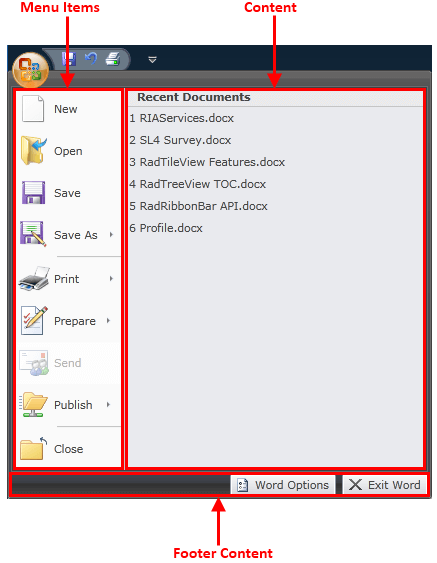
The ApplicationMenu is an ItemsControl (it derives from ItemsControl), which consists of three parts:
Menu Items - they are populated by using the ApplicationMenu's Items property. For items it is handy to use the RadRibbonButton, RadRibbonSplitButton and RadRibbonDropDownButton controls. They will be styled automatically to fit into the ApplicationMenu styles.
Content - this is the right pane of the application menu. To populate it you should use the ApplicationMenu's Content property and set the content you like.
Footer Content - this is the bottom pane of the application menu. Here are usually placed application options and exit buttons. In order to populate this area you need to use the ApplicationMenu's FooterContent property and set the content you like.
Note that the ApplicationMenu can be used as a stand-alone control, independed from RadRibbonView.
Adding Application Menu to a RadRibbonView Control
In order to add an application menu to your RadRibbonView control you need to set the RadRibbonView's ApplicationMenu property. The next several code-snippets show you how to do that in XAML, as well as in the code-behind.
<telerik:RadRibbonView x:Name="radRibbonView">
    <telerik:RadRibbonView.ApplicationMenu>
        <telerik:ApplicationMenu>
        </telerik:ApplicationMenu>
    </telerik:RadRibbonView.ApplicationMenu>
</telerik:RadRibbonView>
this.radRibbonView.ApplicationMenu = new ApplicationMenu();
Me.radRibbonView.ApplicationMenu = New ApplicationMenu()
Adding Menu Items
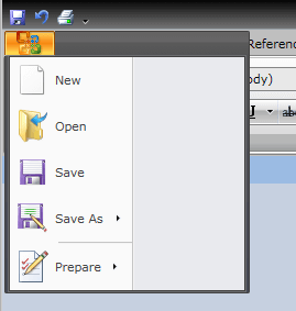
When you want to add menu items to your RadRibbonView's application menu, you need to populate the ApplicationMenu's Items collection. It is handy to use the RadRibbonButton, RadRibbonSplitButton, RadRibbonDropDownButton and Separator controls.
For more information about the different types of RadRibbonButtons and their properties, take a look at the RibbonButtonstopic.
The next example demonstrates how to add several buttons as menu items to your application menu.
<telerik:RadRibbonView.ApplicationMenu>
<telerik:ApplicationMenu telerik:KeyTipService.AccessText="F">
<telerik:RadRibbonButton Text="New" LargeImage="Images/IconPaint/menu/new.png"
Hover="RibbonApplicationMenuItem_Hover"
HoverDelay="0:0:0.3" />
<telerik:RadRibbonButton Text="Open" LargeImage="Images/IconPaint/menu/open.png"
Hover="RibbonApplicationMenuItem_Hover"
HoverDelay="0:0:0.3"/>
<telerik:RadRibbonButton Text="Save" LargeImage="Images/IconPaint/menu/save.png"
Hover="RibbonApplicationMenuItem_Hover"
HoverDelay="0:0:0.3"/>
<telerik:RadRibbonSplitButton Text="Save As" LargeImage="Images/IconPaint/menu/save_as.png">
<telerik:RadRibbonSplitButton.DropDownContent>
<StackPanel HorizontalAlignment="Stretch">
<telerik:RadGroupHeader Content="Save as" />
<telerik:RadRibbonButton Margin="1 0 2 0"
Width="292">
<StackPanel Orientation="Horizontal"
Margin="3 0 5 0">
<Image Stretch="None" Source="Images/IconMSOffice/ApplicationMenu/worddoc.png" />
<StackPanel Margin="5 5 0 0">
<TextBlock Text="Word Document "
FontWeight="Bold" />
<TextBlock TextWrapping="Wrap"
Width="220"
Text="Save the file as a Word Document." />
</StackPanel>
</StackPanel>
</telerik:RadRibbonButton>
<telerik:RadRibbonButton Margin="1 0 2 0"
Width="292">
<StackPanel Orientation="Horizontal"
Margin="3 0 5 0">
<Image Stretch="None"
Source="Images/IconMSOffice/ApplicationMenu/wordtemplate.png" />
<StackPanel Margin="5 5 0 0">
<TextBlock Text="Word Template "
FontWeight="Bold" />
<TextBlock TextWrapping="Wrap"
Width="220"
Text="Save the document as a template that can be used to format future documents." />
</StackPanel>
</StackPanel>
</telerik:RadRibbonButton>
<telerik:RadRibbonButton Margin="1 0 2 0"
Width="292">
<StackPanel Orientation="Horizontal"
Margin="3 0 5 0">
<Image Stretch="None" Source="Images/IconMSOffice/ApplicationMenu/word2003.png" />
<StackPanel Margin="5 5 0 0">
<TextBlock Text="Word 97-2003 Document "
FontWeight="Bold" />
<TextBlock TextWrapping="Wrap"
Width="220"
Text="Save a copy of the document thatis fully compatible with Word 97-2003." />
</StackPanel>
</StackPanel>
</telerik:RadRibbonButton>
<telerik:RadRibbonButton Margin="1 0 2 0"
Width="292">
<StackPanel Orientation="Horizontal"
Margin="3 0 5 0">
<Image Stretch="None" Source="Images/IconMSOffice/ApplicationMenu/wordpdf.png" />
<StackPanel Margin="5 5 0 0">
<TextBlock Text="PDF or XPS "
FontWeight="Bold" />
<TextBlock TextWrapping="Wrap"
Width="220"
Text="Publish a copy of the document as a PDF or XPS file." />
</StackPanel>
</StackPanel>
</telerik:RadRibbonButton>
<telerik:RadRibbonButton Margin="1 0 2 0"
Width="292">
<StackPanel Orientation="Horizontal"
Margin="3 0 5 0">
<Image Stretch="None" Source="Images/IconPaint/menu/save_as.png" />
<StackPanel Margin="5 5 0 0">
<TextBlock Text="Other Format "
FontWeight="Bold" />
<TextBlock TextWrapping="Wrap"
Width="220"
Text="Open the Save As dialog box to select from all possible file types." />
</StackPanel>
</StackPanel>
</telerik:RadRibbonButton>
</StackPanel>
</telerik:RadRibbonSplitButton.DropDownContent>
</telerik:RadRibbonSplitButton>
<telerik:Separator />
<telerik:RadRibbonDropDownButton Text="Prepare"
LargeImage="Images/IconMSOffice/ApplicationMenu/Prepare32.png">
<telerik:RadRibbonDropDownButton.DropDownContent>
<StackPanel HorizontalAlignment="Stretch">
<telerik:RadGroupHeader Content="Prepare" />
<telerik:RadRibbonButton Margin="1 0 2 0"
Width="292">
<StackPanel Orientation="Horizontal"
Margin="3 0 5 0">
<Image Stretch="None" Source="Images/IconPaint/menu/print.png" />
<StackPanel Margin="5 5 0 0">
<TextBlock Text="Properties "
FontWeight="Bold" />
<TextBlock TextWrapping="Wrap"
Width="220"
Text="View and edit document properties." />
</StackPanel>
</StackPanel>
</telerik:RadRibbonButton>
<telerik:RadRibbonButton Margin="1 0 2 0"
Width="292">
<StackPanel Orientation="Horizontal"
Margin="3 0 5 0">
<Image Stretch="None" Source="Images/IconPaint/menu/pagesetup.png" />
<StackPanel Margin="5 5 0 0">
<TextBlock Text="Inspect Document "
FontWeight="Bold" />
<TextBlock TextWrapping="Wrap"
Width="220"
Text="Check the document for hidden metadata or personal information." />
</StackPanel>
</StackPanel>
</telerik:RadRibbonButton>
<telerik:RadRibbonButton Margin="1 0 2 0"
Width="292">
<StackPanel Orientation="Horizontal"
Margin="3 0 5 0">
<Image Stretch="None" Source="Images/IconMSOffice/32/encryptdocument.png" />
<StackPanel Margin="5 5 0 0">
<TextBlock Text="Encrypt document "
FontWeight="Bold" />
<TextBlock TextWrapping="Wrap"
Width="220"
Text="Increase the security of the document by adding encryption." />
</StackPanel>
</StackPanel>
</telerik:RadRibbonButton>
<telerik:RadRibbonButton Margin="1 0 2 0"
Width="292">
<StackPanel Orientation="Horizontal"
Margin="3 0 5 0">
<Image Stretch="None" Source="Images/IconMSOffice/32/restrictpermisions.png" />
<StackPanel Margin="5 5 0 0">
<TextBlock Text="Restrict Permission "
FontWeight="Bold" />
<TextBlock TextWrapping="Wrap"
Width="220"
Text="Grant people access while restricting their ability to edit, copy and print." />
</StackPanel>
</StackPanel>
</telerik:RadRibbonButton>
<telerik:RadRibbonButton Margin="1 0 2 0"
Width="292">
<StackPanel Orientation="Horizontal"
Margin="3 0 5 0">
<Image Stretch="None" Source="Images/IconMSOffice/32/digitalsignature.png" />
<StackPanel Margin="5 5 0 0">
<TextBlock Text="Add a Digital Signature "
FontWeight="Bold" />
<TextBlock TextWrapping="Wrap"
Width="220"
Text="Ensure the integrity of the documentby adding an invisible digital signature." />
</StackPanel>
</StackPanel>
</telerik:RadRibbonButton>
<telerik:RadRibbonButton Margin="1 0 2 0"
Width="292">
<StackPanel Orientation="Horizontal"
Margin="3 0 5 0">
<Image Stretch="None" Source="Images/IconMSOffice/32/markasfinal.png" />
<StackPanel Margin="5 5 0 0">
<TextBlock Text="Mark as Final"
FontWeight="Bold" />
<TextBlock TextWrapping="Wrap"
Width="220"
Text="Let readers know the document is final and make it read-only." />
</StackPanel>
</StackPanel>
</telerik:RadRibbonButton>
</StackPanel>
</telerik:RadRibbonDropDownButton.DropDownContent>
</telerik:RadRibbonDropDownButton>
</telerik:ApplicationMenu>
</telerik:RadRibbonView.ApplicationMenu>
Three ordinary RadRibbonButtons, one RadRibbonSplitButton and one RadRibbonDropDownButton are added. Also note the way for adding a separator element -

Adding Content
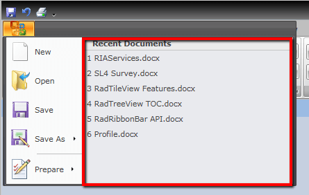
The second element you may want to initialize when building an application menu is the Content. This is the right pane of the application menu. To populate it you should use the ApplicationMenu's Content property and set the content you like.
The next example shows you how to set the ApplicationMenu's Content property. Note that in this example the initialization of the menu items is skipped.
<telerik:RadRibbonView.ApplicationMenu>
    <telerik:ApplicationMenu telerik:KeyTipService.AccessText="F">
        <telerik:ApplicationMenu.Content>
            <StackPanel Width="300">
                <telerik:RadGroupHeader Content="Recent Documents" />
                <telerik:RadRibbonButton Content="1 RIAServices.docx"
                                            HorizontalAlignment="Stretch" />
                <telerik:RadRibbonButton Content="2 SL4 Survey.docx"
                                            HorizontalAlignment="Stretch" />
                <telerik:RadRibbonButton Content="3 RadTileView Features.docx"
                                            HorizontalAlignment="Stretch" />
                <telerik:RadRibbonButton Content="4 RadTreeView TOC.docx"
                                            HorizontalAlignment="Stretch" />
                <telerik:RadRibbonButton Content="5 RadRibbonView API.docx"
                                            HorizontalAlignment="Stretch" />
                <telerik:RadRibbonButton Content="6 Profile.docx"
                                            HorizontalAlignment="Stretch" />
            </StackPanel>
        </telerik:ApplicationMenu.Content>
    </telerik:ApplicationMenu>
</telerik:RadRibbonView.ApplicationMenu>

Adding Footer Content
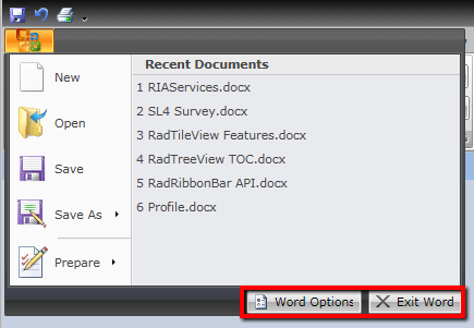
The last element of the application menu is the Footer Content. This is the bottom pane of the application menu. Here are usually placed application options and exit buttons. In order to initialize it you need to set the ApplicationMenu's FooterContent property like in the example below.
<telerik:RadRibbonView.ApplicationMenu>
    <telerik:ApplicationMenu telerik:KeyTipService.AccessText="F">

        <telerik:ApplicationMenu.FooterContent>
            <StackPanel Height="25"
                        Orientation="Horizontal">
                <telerik:RadButton Width="106"
                                    Height="22"
                                    Margin="3 0"
                                    Hover="RibbonApplicationMenuItem_Hover"
                                    HoverDelay="0:0:0.3">
                    <telerik:RadButton.Content>
                        <StackPanel Orientation="Horizontal"
                                    VerticalAlignment="Center"
                                    Margin="3 0  5 0">
                            <Image Width="16"
                                    Height="16" Source="Images/IconPaint/16/options.png" />
                            <TextBlock Margin="4 0 0 0"
                                        VerticalAlignment="Center"
                                        Text="Word Options" />
                        </StackPanel>
                    </telerik:RadButton.Content>
                </telerik:RadButton>
                <telerik:RadButton Width="86"
                                    Height="22"
                                    Margin="3 0 2 0"
                                    Hover="RibbonApplicationMenuItem_Hover"
                                    HoverDelay="0:0:0.3">
                    <telerik:RadButton.Content>
                        <StackPanel Orientation="Horizontal"
                                    VerticalAlignment="Center"
                                    Margin="3 0  5 0">
                            <Image Width="16"
                                    Height="16" Source="Images/IconPaint/16/exit.png" />
                            <TextBlock Margin="4 0 0 0"
                                        VerticalAlignment="Center"
                                        Text="Exit Word" />
                        </StackPanel>
                    </telerik:RadButton.Content>
                </telerik:RadButton>
            </StackPanel>
        </telerik:ApplicationMenu.FooterContent>

    </telerik:ApplicationMenu>
</telerik:RadRibbonView.ApplicationMenu>
In this example, it is assumed that you are familiar with initializing the menu items and content of the application menu. If not, check out the previous two sections where the process of adding menu items and content is described. The result of the last example is shown on the snapshot below.

Customizing the Application Menu Button
In order to learn how to customize the application menu button, disable it or hide it, read the Customize the Application Menu Button article.
Events
The RadRibbonView class exposes the ApplicationButtonDoubleClick event, which is fired when the RibbonView's ApplicationButton is double-clicked.
<telerik:RadRibbonView ApplicationButtonDoubleClick="RadRibbonView_ApplicationButtonDoubleClick"/>
The ApplicationButtonDoubleClick event handler receives two arguments: * The sender argument contains the RadRibbonView. This argument is of type object, but can be cast to the RadRibbonView type. * The second argument is a RadRoutedEventArgs object.
private void RadRibbonView_ApplicationButtonDoubleClick(object sender, RadRoutedEventArgs e)
{
    RadRibbonView ribbonView = sender as RadRibbonView;
    // Do some custom logic here.
}
Private Sub RadRibbonView_ApplicationButtonDoubleClick(sender As Object, e As RadRoutedEventArgs)
    Dim ribbonView As RadRibbonView = TryCast(sender, RadRibbonView)
    ' Do some custom logic here.'
End Sub
One common scenario is to close the application when the user makes a double-click on the application button.
For a full list of the exposed by the RadRibbonView events, take a look at the Events - Overview topic.
The RadRibbonView is a complex control and the application menu is only a small part of it. The RadRibbonView consists of various elements such as:
- Backstage Menu
- Quick Access ToolBar
- Ribbon Tab
- Ribbon Group
- Ribbon Gallery
- RibbonButtons Overview
- Ribbon ComboBox
- Screen Tips
Additional features that you may find interesting are: