Ribbon Window
The RadRibbonWindow control is used to replace the Window control that represents the root UI of a WPF application. Its purpose is to allow a smoother UI when hosting the RadRibbonView at the root level of the application.
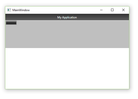
Figure 1 demonstrates the result, after placing a RadRibbonView in the MainWindow of your WPF application.
Figure 1: RadRibbonView inside MainWindow

You will have two title bars which makes the UI messy. The RadRibbonWindow integrates with the RadRibbonView and prevents this. In order to use the RadRibbonWindow you have to replace the Window control in your MainWindow class with the RadRibbonWindow one.
Example 1: Replacing Window with RadRibbonWindow
<telerik:RadRibbonWindow  x:Class="RibbonWindow.MainWindow"
        xmlns="http://schemas.microsoft.com/winfx/2006/xaml/presentation"
        xmlns:x="http://schemas.microsoft.com/winfx/2006/xaml"
        xmlns:telerik="http://schemas.telerik.com/2008/xaml/presentation"
        Title="MainWindow" Height="350" Width="525">
    <Grid>
        <telerik:RadRibbonView />
    </Grid>
</telerik:RadRibbonWindow>
Example 2: Inheriting RadRibbonWindow
public partial class MainWindow : RadRibbonWindow
{
    public MainWindow()
    {
        InitializeComponent();
    }
}
Public Partial Class MainWindow
    Inherits RadRibbonWindow
    Public Sub New()
        InitializeComponent()
    End Sub
End Class
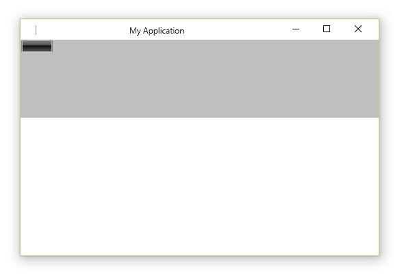
Figure 2: RadRibbonWindow as MainWindow

By default, when you add a RadRibbonView in a RadRibbonWindow, the components are integrated together to create a seamless UI experience. For that purpose the QuickAccessToolbar as well as the ApplicationName and the Title of the RadRibbonView are displayed in the title tray of the RadRibbonWindow. In this case, the value of the RadRibbonWindow Title is ignored.
Icon
In order to provide a custom icon for the RadRibbonWindow, you have to set its Icon property as demonstrated in Example 3.
Example 3: Providing a custom Icon
<telerik:RadRibbonWindow Icon="Images/application-icon.ico">
Title Visibility
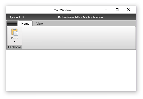
With Q1 2014 we introduced a new property, which you can use to control this behavior. The IsTitleVisible property is of type bool and it defines whether the RadRibbonWindow Title should be displayed. The default value of the property is false, but when changed to true, it makes the RibbonWindow display its own Title. In that case the RadRibbonView title bar - the QuickAccessToolbar, Title and ApplicationName are displayed underneath the window's title.
Example 4: Setting IsTitleVisible
<telerik:RadRibbonWindow x:Class="Example.MainWindow"
                         xmlns="http://schemas.microsoft.com/winfx/2006/xaml/presentation"
                         xmlns:x="http://schemas.microsoft.com/winfx/2006/xaml"
                         xmlns:telerik="http://schemas.telerik.com/2008/xaml/presentation"
                         Title="MainWindow"
                         Width="525"
                         Height="350"
                         IsTitleVisible="True">
    <Grid>
        <telerik:RadRibbonView Title="RibbonView Title" ApplicationName="My Application">
            <telerik:RadRibbonView.QuickAccessToolBar>
                <telerik:QuickAccessToolBar>
                    <telerik:RadRibbonButton Foreground="White" Text="Option 1" />
                </telerik:QuickAccessToolBar>
            </telerik:RadRibbonView.QuickAccessToolBar>
            <telerik:RadRibbonTab Header="Home">
                <telerik:RadRibbonGroup Header="Clipboard">
                    <telerik:RadRibbonSplitButton LargeImage="paste.png"
                                                  Size="Large"
                                                  Text="Paste"
                                                  telerik:ScreenTip.Description="Paste the contents the Clipboard."
                                                  telerik:ScreenTip.Title="Paste(Ctrl+V)">
                        <telerik:RadRibbonSplitButton.DropDownContent>
                            <telerik:RadContextMenu BorderThickness="0">
                                <telerik:RadMenuItem Header="Paste" />
                                <telerik:RadMenuItem Header="Paste Form" />
                            </telerik:RadContextMenu>
                        </telerik:RadRibbonSplitButton.DropDownContent>
                    </telerik:RadRibbonSplitButton>
                </telerik:RadRibbonGroup>
            </telerik:RadRibbonTab>
            <telerik:RadRibbonTab Header="View" />
        </telerik:RadRibbonView>
    </Grid>
</telerik:RadRibbonWindow>
Figure 3: RadRibbonWindow with visible title

Setting a Theme
By default the RadRibbonWindow uses the Windows OS theme. However, you can also apply any of the Telerik predefined themes. In order to do so, you need to set the RadRibbonWindow.IsWindowsThemeEnabled static property to False in the static constructor of the RadRibbonWindow or in the constructor of the App class.
Example 5: Setting IsWindowsThemeEnabled
public partial class MainWindow : RadRibbonWindow
{
    static MainWindow()
    {
        RadRibbonWindow.IsWindowsThemeEnabled = false;
    }
    public MainWindow()
    {
        InitializeComponent();
    }
}
Partial Public Class MainWindow
    Inherits RadRibbonWindow
    Shared Sub New()
        RadRibbonWindow.IsWindowsThemeEnabled = False
    End Sub
    Public Sub New()
        InitializeComponent()
    End Sub
End
In order to apply a Telerik style on the RadRibbonWindow, it is best to use the implicit styling mechanism further described in the Setting a Theme (Using Implicit Styles) tutorial.
Please note that the default RadRibbonWindow implicit style cannot be applied on derived controls as their Type is different than the one defined as a TargetType in the implicit style. This is why in order to apply a Telerik predefined style on a Window/UserControl deriving from RadRibbonWindow you need to define a Style targeting the Window/UserControl type in the Resources of the application. Make sure to define that style after merging the Telerik ResourseDictionaries so that you can base it on the predefined "RadRibbonWindowStyle".
Example 6: Basing the MainWindow style on the RadRibbonWindowStyle
<ResourceDictionary xmlns="http://schemas.microsoft.com/winfx/2006/xaml/presentation"
                    xmlns:x="http://schemas.microsoft.com/winfx/2006/xaml"
                    xmlns:local="clr-namespace:RibbonWindow_ImplicitStylesDemo">
    <Style TargetType="local:MainWindow" BasedOn="{StaticResource RadRibbonWindowStyle}" />
</ResourceDictionary>
Example 7: Merging the needed resources
<Application.Resources>
    <ResourceDictionary>
        <ResourceDictionary.MergedDictionaries>
            <ResourceDictionary Source="/Telerik.Windows.Themes.Office2016;component/Themes/System.Windows.xaml" />
            <ResourceDictionary Source="/Telerik.Windows.Themes.Office2016;component/Themes/Telerik.Windows.Controls.xaml" />
            <ResourceDictionary Source="/Telerik.Windows.Themes.Office2016;component/Themes/Telerik.Windows.Controls.Input.xaml" />
            <ResourceDictionary Source="/Telerik.Windows.Themes.Office2016;component/Themes/Telerik.Windows.Controls.Navigation.xaml" />
            <ResourceDictionary Source="/Telerik.Windows.Themes.Office2016;component/Themes/Telerik.Windows.Controls.RibbonView.xaml" />
            <ResourceDictionary Source="RibbonWindowStyle.xaml" />
        </ResourceDictionary.MergedDictionaries>
    </ResourceDictionary>
</Application.Resources>
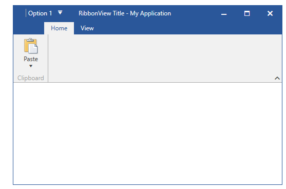
Figure 4: RadRibbonWindow in the Office2016 theme

Customize Appearance
You can customize the window's appearance by setting its various properties via the appropriate style.
Example 8: Adding a CornerRadius to the RadRibbonWindow
<!-- If you're using the StyleManager approach for styling the controls you need to remove the BasedOn attribute. -->
<Style TargetType="local:MainWindow" BasedOn="{StaticResource RadRibbonWindowStyle}"
    xmlns:shell="clr-namespace:Telerik.Windows.Controls.RibbonView.Shell;assembly=Telerik.Windows.Controls.RibbonView">
    <Setter Property="CornerRadius" Value="20"/>
    <Setter Property="shell:WindowChrome.WindowChromeCornerRadius" Value="20"/>
</Style>