Simplified Ribbon
Since the R2 2019 version, you have the option of changing the default layout mode to a simplified one. The idea of the simplified layout is to be more compact and take up less vertical space on the screen.
SimplifiedItems
Before switching the layout, you have to define what will be shown in the simplified state of the RadRibboonView. This is done through the new SimplifiedItems property of the RadRibbonTab. You can also set the SimplifiedContentHeight property in order to control the Height while the layout is simplified.
Example 1: Setting the SimplifiedItems property
<telerik:RadRibbonView x:Name="ribbonView" ApplicationName="Example" Title="RibbonView" ShowLayoutModeButton="True" SimplifiedContentHeight="40">
<telerik:RadRibbonView.Resources>
<DataTemplate x:Key="IconTemplate">
<Image Stretch="Fill" Width="16" Height="16" Source="{Binding}" />
</DataTemplate>
</telerik:RadRibbonView.Resources>
<telerik:RadRibbonTab Header="Home">
<telerik:RadRibbonTab.SimplifiedItems>
<telerik:RadRibbonGroup Header="Clipboard">
<telerik:RadRibbonSplitButton SmallImage="{telerik:RadGlyph Glyph=}"
Size="Small">
<telerik:RadRibbonSplitButton.DropDownContent>
<telerik:RadContextMenu>
<telerik:RadMenuItem Header="Cut" Icon="{telerik:RadGlyph Type=Image, Glyph=}" IconTemplate="{StaticResource IconTemplate}" />
<telerik:RadMenuItem Header="Copy" Icon="{telerik:RadGlyph Type=Image, Glyph=}" IconTemplate="{StaticResource IconTemplate}" />
<telerik:RadMenuItem Header="Paste" Icon="{telerik:RadGlyph Type=Image, Glyph=}" IconTemplate="{StaticResource IconTemplate}" />
</telerik:RadContextMenu>
</telerik:RadRibbonSplitButton.DropDownContent>
</telerik:RadRibbonSplitButton>
</telerik:RadRibbonGroup>
</telerik:RadRibbonTab.SimplifiedItems>
<telerik:RadRibbonGroup Header="Clipboard">
<telerik:RadCollapsiblePanel>
<telerik:RadRibbonButton Text="Cut" SmallImage="{telerik:RadGlyph Glyph=}" />
<telerik:RadRibbonButton Text="Copy" SmallImage="{telerik:RadGlyph Glyph=}" />
<telerik:RadRibbonButton Text="Paste" SmallImage="{telerik:RadGlyph Glyph=}" />
</telerik:RadCollapsiblePanel>
</telerik:RadRibbonGroup>
</telerik:RadRibbonTab>
</telerik:RadRibbonView>
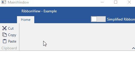
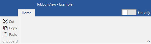
Figure 1: Changing RadRibbonView layout in the Office2016 theme
The SimplifiedResourses property of the RadRibbonTab can be used in order to add any resources that should be applied when the LayoutMode is Simplified.
Data Binding
In an MVVM scenario, the SimplifiedItemTemplate property of the RadRibbonView needs to be set along with the ItemTemplate. Read more about that in the Use MVVM in RadRibbonView article.
If the SimplifiedItemTemplate is not set, the switch layout button will be disabled.
LayoutMode
In order to change the default layout mode, there are two options. Switch the layout through the UI or programmatically.
-
Switch the layout through the UI: By default the button that switches between the default and the simplified layout is not visible. You can set the ShowLayoutModeButton property to True in order to show it. You can also set the LayoutModeButtonContent property in order to change the Content of the switch button.
Example 2: Showing the LayoutMode button and changing its Content
<telerik:RadRibbonView x:Name="ribbonView" ApplicationName="Example" Title="RibbonView" ShowLayoutModeButton="True" LayoutModeButtonContent="Simplify" />Figure 2: LayoutMode button in the Office2016 theme
-
Switch the layout programmatically: In order to change the layout in code, you can set the LayoutMode property to Simplified or execute the ToggleLayoutModeCommand command.
Example 2: Switching the layout in code
    this.ribbonView.LayoutMode = RibbonLayout.Simplified;

    // or

    RibbonCommands.ToggleLayoutModeCommand.Execute(null, this.ribbonView);
Me.ribbonView.LayoutMode = RibbonLayout.Simplified 'or RibbonCommands.ToggleLayoutModeCommand.Execute(Nothing, Me.ribbonView)
Simplifying the Layout
The SimplifiedItems property, described in the first section, gives you full control over what is displayed, when the layout mode of the RadRibbonView is simplified. Here are some tips on how to adapt the default layout accordingly.
Remove elements (buttons, groups) that are not an integral part of your application. The idea of the simplified ribbon is to save vertical space, however, it comes from the cost of the horizontal one. Keep in mind that, if a certain element is missing from the simplified layout, the user can always switch to the default one.
Whenever possible, try to combine multiple elements inside the drop down of a single one. For example, if you have "Cut", "Copy" and "Paste" buttons in the default layout, you can combine them in a single RadRibbonSplitButton in the simplified layout, as demonstrated in Example 1.
If you do not want a particular RadRibbonGroup to be collapsed when the LayoutMode is Simplified, you can utilize the Variants property of the RadRibbonGroup.