Overview
There is a specific set of buttons introduced with the RadRibbonView control. They all inherit and extend the functionality of the standard button controls i.e. RadRibbonToggleButton derives from RadToggleButton, RadRibbonSplitButton derives from RadSplitButton, etc. The additional functionality which they provide allows you to easily implement MS-Office-Ribbon-like behavior in your application. This topic covers the common functionality for all ribbon buttons.
The RadRibbonButtons can be used outside the RadRibbonView control as well.
The following Ribbon buttons are available:
Button States
There are three button states:
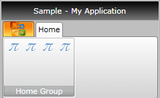
Large - displays the large image and the text label defined for the button.

Medium - displays the small image and the text label defined for the button.

Small - displays the small image defined for the button.

The state of the button depends on the state of the RadRibbonGroup and can be controlled via the CollapseToSmall, CollapseToMedium and the IsAutoSize properties of the ribbon buttons. To learn more about that take a look at the Common Functionality section of this topic.
To learn more about the states of the RadRibbonGroup take a look at this topic.
Common Functionality
As it was mentioned above all RadRibbonButtons derive from the base button controls. Each of them inherits the specifics of the respective button and implements additional functionality. Although they are different controls, there is a common set of properties explained below.
Text - gets or sets the text label that is shown in Medium and Large button state.
SmallImage - gets or sets the image that is shown in Medium and Small button state.
LargeImage - gets or sets the image that is shown in Large button state.
Size - gets or sets the button initial size. This will be the maximum size of the button as well.
SplitText - enables or disables the text wrapping for the large-sized button. This property is available only for the RadRibbonSplitButton, RadRibbonDropDownButton, RadRibbonButton.
CollapseToSmall - specifies when the button will be collapsed to its Small state, depending on the state of the RadRibbonGroup it belongs to.
-
CollapseToMedium - specifies when the button will be collapsed to its Medium state, depending on the state of the RadRibbonGroup to which it belongs.
The CollapseToSmall and CollapseToMedium properties use the CollapseThreshold enumeration. It has the following values:
-
Never - indicates that the button will never collapse to Small/Medium state. This is the default value of the properties.
- WhenGroupIsMedium - indicates that the button will go to the Small/Medium state when its RadRibbonGroup is in Medium state.
-
WhenGroupIsSmall - indicates that the button will go to the Small/Medium state when its RadRibbonGroup is in Small state.
-
Never - indicates that the button will never collapse to Small/Medium state. This is the default value of the properties.
IsAutoSize - specifies whether the button Image will be sized accordingly to the RibbonView guidance specification. If set to False, the button will display its images (both Small and Large) in its original size. Otherwise the SmallImage will be displayed with size of 16x16px and the LargeImage will be displayed with size of 32x32px.
TextRow1 - gets the text that is shown in Medium and Large button state.
TextRow2 - gets the text that is shown in the Large button state.
Example
Here is an example of a RadRibbonButton with the following properties set.
<telerik:RadRibbonButton CollapseToMedium="Never"
                         CollapseToSmall="WhenGroupIsMedium"
                         IsAutoSize="True"
                         LargeImage="Icons/32/Equation.png"
                         Size="Large"
                         SmallImage="Icons/16/Equation.png"
                         Text="Equation" />
This button has its initial size set to Large and its text label set to "Equation". As the IsAutoSize property is set to True, the button will change its size depending on the RadRibbonGroup's size. The button will also never collapse to its Medium size and will collapse to its Small size when the RadRibbonGroup collapses to Medium.

and

Handling the Button Clicks
There are two ways to implement a custom logic upon a button click - via event handler and via commands.
The first one is the standard way. You have to attach an event handler to the Click event of the button.
<telerik:RadRibbonButton CollapseToMedium="Never"
                         ...
                         Text="Equation"
                         Click="RadRibbonButton_Click"/>
private void RadRibbonButton_Click(object sender, RoutedEventArgs e)
{
 //place your custom logic here.
}
Private Sub RadRibbonButton_Click(sender As Object, e As RoutedEventArgs)
    'place your custom logic here.'
End Sub
The other way is to set the Command property to a certain command. Here is an example of the command defined in the code-behind file of your UserControl. In order to create a command you have to create a static read-only instance of System.Windows.Controls.RoutedUICommand and then add execute and you can execute event handlers to the System.Windows.Controls.CommandManager class.
public partial class RibbonButtonsSample : UserControl
{
   public static readonly RoutedUICommand EquationCommand = new RoutedUICommand(
       "Equation",
       "EquationCommand",
       typeof( RibbonButtonsSample ) );
   public RibbonButtonsSample()
   {
       InitializeComponent();
       CommandManager.AddExecutedHandler( this, this.OnExecuted );
       CommandManager.AddCanExecuteHandler( this, this.OnCanExecute );
   }
   private void OnExecuted( object sender, ExecutedRoutedEventArgs e )
   {
       this.LayoutRoot.Background = new SolidColorBrush( Colors.Blue );
   }
   private void OnCanExecute( object sender, CanExecuteRoutedEventArgs e )
   {
       e.CanExecute = true;
   }
}
Public Partial Class RibbonButtonsSample
    Inherits UserControl
        Public Shared ReadOnly EquationCommand As New RoutedUICommand("Equation", "EquationCommand", GetType(RibbonButtonsSample))

        Public Sub New()
            InitializeComponent()
            CommandManager.AddExecutedHandler(Me, AddressOf Me.OnExecuted)
            CommandManager.AddCanExecuteHandler(Me, AddressOf Me.OnCanExecute)
        End Sub
        Private Sub OnExecuted(sender As Object, e As ExecutedRoutedEventArgs)
            Me.LayoutRoot.Background = New SolidColorBrush(Colors.Blue)
        End Sub
        Private Sub OnCanExecute(sender As Object, e As CanExecuteRoutedEventArgs)
            e.CanExecute = True
        End Sub

End Class
After that set the Command property of the RadRibbonButton to the static command defined in code behind.
<telerik:RadRibbonButton Text="Equation"
        ...
        Command="{x:Static local:RibbonButtonsSample.EquationCommand}" />
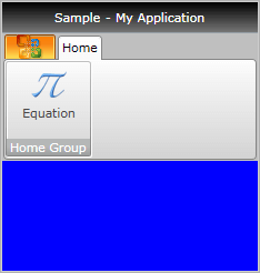
And now if you run your application and hit the 'Equation' button, the background of the user control will be changed to Blue as it is shown on the snapshot below.

ButtonGroup
RadRibbonView allows you to additionally organize your buttons with common functionality (i.e. wrap Increase, Decrease Font buttons) in one panel. For this purpose you should use the RadButtonGroup class. It will automatically apply a Small Size on all buttons wrapped in it. Furthermore, the RadButtonGroup is designed to create a separator between every two buttons in it.
Because the RadRibbonGroup sets the Size of all child RadRibbonButtons to Small, the CollapseToSmall and CollapseToMedium properties of the button won't be respected.
The next example shows you how to use RadButtonGroup.
<telerik:RadRibbonView x:Name="radRibbonView" Title="My Title" ApplicationName="My Application">
    <telerik:RadRibbonTab Header="Home">
        <telerik:RadRibbonGroup Header="Font">
            <telerik:RadOrderedWrapPanel>
                <telerik:RadButtonGroup>
                    <telerik:RadRibbonButton
                            SmallImage="Images/IconMSOffice/16/font-increasesize.png" />
                    <telerik:RadRibbonButton
                            SmallImage="Images/IconMSOffice/16/font-decreasesize.png" />
                </telerik:RadButtonGroup>
                <telerik:RadButtonGroup>
                    <telerik:RadRibbonButton
                            SmallImage="Images/IconMSOffice/16/ClearFormatting16.png"
                            Text="Clear Formatting" />
                </telerik:RadButtonGroup>
            </telerik:RadOrderedWrapPanel>
        </telerik:RadRibbonGroup>
    </telerik:RadRibbonTab>
</telerik:RadRibbonView>
