Group Checkable Menu Items into Radio Group
This tutorial will show you how to group your checkable menu items into a radio group. This will allow you to have only one of them checked at a time.
Creating a sample RadMenu and defining the Radio Groups
Here is a sample RadMenu and one of its items has two radio groups. Notice that the Tag property of the RadMenuItem is used to store the name of the Radio Group. In this case the groups are named "1" and "2".
<telerik:RadMenu x:Name="radMenu">
    <telerik:RadMenuItem Header="File">
        <telerik:RadMenuItem Header="Exit" />
    </telerik:RadMenuItem>
    <telerik:RadMenuItem Header="Options">
        <telerik:RadMenuItem Header="Radio Button 1.1"
                             Tag="1"
                             IsCheckable="True"
                             StaysOpenOnClick="True" />
        <telerik:RadMenuItem Header="Radio Button 1.2"
                             Tag="1"
                             IsCheckable="True"
                             StaysOpenOnClick="True" />
        <telerik:RadMenuItem Header="Radio Button 1.3"
                             Tag="1"
                             IsCheckable="True"
                             StaysOpenOnClick="True" />
        <telerik:RadMenuItem IsSeparator="True" />
        <telerik:RadMenuItem Header="Radio Button 2.1"
                             Tag="2"
                             IsCheckable="True"
                             StaysOpenOnClick="True" />
        <telerik:RadMenuItem Header="Radio Button 2.2"
                             Tag="2"
                             IsCheckable="True"
                             StaysOpenOnClick="True" />
        <telerik:RadMenuItem Header="Radio Button 2.3"
                             Tag="2"
                             IsCheckable="True"
                             StaysOpenOnClick="True" />
    </telerik:RadMenuItem>
</telerik:RadMenu>
Handling the ItemClick Event
The next step is to handle the ItemClick event of the RadMenu. It gets fired each time an item gets clicked .
<telerik:RadMenu x:Name="radMenu1" ItemClick="radMenu_ItemClick">
    ...
</telerik:RadMenu>
In the event handler you get the item that has been clicked and check if it is checkable or is placed in a group.
private void radMenu_ItemClick(object sender, RadRoutedEventArgs e)
{
    var currentItem = e.OriginalSource as RadMenuItem;
    if (currentItem.IsCheckable && currentItem.Tag != null)
    {
        //the place for the radio items logic
    }
}
Private Sub radMenu_ItemClick(sender As Object, e As RadRoutedEventArgs)
    Dim currentItem = TryCast(e.OriginalSource, RadMenuItem)
    If currentItem.IsCheckable AndAlso currentItem.Tag <> Nothing Then
        'the place for the radio items logic
    End If
End Sub
The next step is to get the sibling items of the clicked one, which are from the same group.
Getting All Sibling Items from the same Group
In order the uncheck the other items from the same group, you have to get them first. Here is a method that takes as a parameter the clicked item and returns the sibling items which are from the same group.
private List<RadMenuItem> GetSiblingGroupItems(RadMenuItem currentItem)
{
    var parentItem = currentItem.ParentOfType<RadMenuItem>();
    if (parentItem == null)
    {
        return null;
    }
    List<RadMenuItem> items = new List<RadMenuItem>();
    foreach (var item in parentItem.Items)
    {
        RadMenuItem container = parentItem.ItemContainerGenerator.ContainerFromItem(item) as RadMenuItem;
        if (container == null || container.Tag == null)
        {
            continue;
        }
        if (container.Tag.Equals(currentItem.Tag))
        {
            items.Add(container);
        }
    }
    return items;
}
Private Function GetSiblingGroupItems(currentItem As RadMenuItem) As List(Of RadMenuItem)
    Dim parentItem = currentItem.ParentOfType(Of RadMenuItem)()
    If parentItem Is Nothing Then
        Return Nothing
    End If
    Dim items As New List(Of RadMenuItem)()
    For Each item In parentItem.Items
        Dim container As RadMenuItem = TryCast(parentItem.ItemContainerGenerator.ContainerFromItem(item), RadMenuItem)
        If container Is Nothing OrElse container.Tag = Nothing Then
            Continue For
        End If
        If container.Tag.Equals(currentItem.Tag) Then
            items.Add(container)
        End If
    Next
    Return items
End Function
First you get the parent item of the clicked one and then you iterate through its Items collection. The Items collection doesn't hold the container itself, so you have to get the container of each item and check if it belongs to the same group as the clicked item. The matching containers are returned as List.
Checking only the Clicked Item
Now as the sibling items from the same group are available, the only things that's left is to unmark those of them which are different from the clicked one as unchecked.
private void radMenu_ItemClick(object sender, Telerik.Windows.RadRoutedEventArgs e)
{
    var currentItem = e.OriginalSource as RadMenuItem;
    if (currentItem.IsCheckable && currentItem.Tag != null)
    {
        var siblingItems = this.GetSiblingGroupItems(currentItem);
        if (siblingItems != null)
        {
            foreach (var item in siblingItems)
            {
                if (item != currentItem)
                {
                    item.IsChecked = false;
                }
            }
        }
    }
}
Private Sub radMenu_ItemClick(ByVal sender As Object, ByVal e As Telerik.Windows.RadRoutedEventArgs)
    Dim currentItem = TryCast(e.OriginalSource, RadMenuItem)
    If currentItem.IsCheckable AndAlso currentItem.Tag IsNot Nothing Then
        Dim siblingItems = Me.GetSiblingGroupItems(currentItem)
        If siblingItems IsNot Nothing Then
            For Each item In siblingItems
                If item IsNot currentItem Then
                    item.IsChecked = False
                End If
            Next item
        End If
    End If
End Sub
Using this Logic with Dynamic Data
Before you continue, please, Take a look at the topic about Binding to Dynamic Data.
An entirely business object oriented approach about handling radio groups within dynamic data can be found in the online demo.
When having RadMenu with dynamic data in it, the logic remains the same, but you have to modify the data items a bit, so they can provide the needed information. You need your business object to expose several properties.
Header - indicates header text of the item. It will be bound to the Header property of the RadMenuItem.
IsCheckable - indicates whether the item is checkable. It will be bound to the IsCheckable property of the RadMenuItem.
IsSeparator - indicates whether the item is a separator. It will be bound to the IsSeparator property of the RadMenuItem.
RadioGroup - represents the radio group to which the item belongs. It will be bound to the Tag property of the RadMenuItem.
SubMenuItems - represents a collection with the sub menu items of the item. It will be bound to the ItemsSource property of the RadMenuItem.
public class MenuItem
{
    public string Header { get; set; }
    public bool IsCheckable { get; set; }
    public string RadioGroup { get; set; }
    public bool IsSeparator { get; set; }
    public ObservableCollection<MenuItem> SubMenuItems { get; set; }
}
Public Class MenuItem
    Public Property Header() As String
    Public Property IsCheckable() As Boolean
    Public Property RadioGroup() As String
    Public Property IsSeparator() As Boolean
    Public Property SubMenuItems() As ObservableCollection(Of MenuItem)
End Class
These properties should be bound in the Style for the RadMenuItem container to its respective properties:
<Style x:Key="MenuItemStyle" TargetType="telerik:RadMenuItem">
    <Setter Property="Header" Value="{Binding Header}" />
    <Setter Property="IsCheckable" Value="{Binding IsCheckable}" />
    <Setter Property="StaysOpenOnClick" Value="{Binding IsCheckable}" />
    <Setter Property="IsSeparator" Value="{Binding IsSeparator}" />
    <Setter Property="Tag" Value="{Binding RadioGroup}" />
    <Setter Property="ItemsSource" Value="{Binding SubMenuItems}" />
</Style>
Next step will be to initialize the collection with the MenuItem objects which will be bound to ItemsSource property of the RadMenu.
The ViewModel should look as shown below:
public class ViewModel
{
    public ObservableCollection<MenuItem> MenuItems { get; set; }

    public ViewModel()
    {
        this.MenuItems = new ObservableCollection<MenuItem>
    {
        new MenuItem { Header = "File", SubMenuItems = new ObservableCollection<MenuItem>
        {
            new MenuItem { Header = "Exit", IsCheckable = true, RadioGroup = "1" },
        }},
        new MenuItem { Header = "Options", SubMenuItems = new ObservableCollection<MenuItem>
        {
            new MenuItem { Header = "Radio Button 1.1", IsCheckable = true, RadioGroup = "1" },
            new MenuItem { Header = "Radio Button 1.2", IsCheckable = true, RadioGroup = "1" },
            new MenuItem { Header = "Radio Button 1.3", IsCheckable = true, RadioGroup = "1" },
            new MenuItem { IsSeparator = true },
            new MenuItem { Header = "Radio Button 2.1", IsCheckable = true, RadioGroup = "2" },
            new MenuItem { Header = "Radio Button 2.2", IsCheckable = true, RadioGroup = "2" },
            new MenuItem { Header = "Radio Button 2.3", IsCheckable = true, RadioGroup = "2" },
        }},
    };
    }
}
Public Class ViewModel
    Public Property MenuItems() As ObservableCollection(Of MenuItem)

    Public Sub New()
        Me.MenuItems = New ObservableCollection(Of MenuItem) From {
            New MenuItem With {.Header = "File", .SubMenuItems = New ObservableCollection(Of MenuItem) From {
                    New MenuItem With {.Header = "Exit", .IsCheckable = True, .RadioGroup = "1"}}},
            New MenuItem With {.Header = "Options", .SubMenuItems = New ObservableCollection(Of MenuItem) From {
                    New MenuItem With {.Header = "Radio Button 1.1", .IsCheckable = True, .RadioGroup = "1"},
                    New MenuItem With {.Header = "Radio Button 1.2", .IsCheckable = True, .RadioGroup = "1"},
                    New MenuItem With {.Header = "Radio Button 1.3", .IsCheckable = True, .RadioGroup = "1"},
                    New MenuItem With {.IsSeparator = True},
                    New MenuItem With {.Header = "Radio Button 2.1", .IsCheckable = True, .RadioGroup = "2"},
                    New MenuItem With {.Header = "Radio Button 2.2", .IsCheckable = True, .RadioGroup = "2"},
                    New MenuItem With {.Header = "Radio Button 2.3", .IsCheckable = True, .RadioGroup = "2"}}}
        }
    End Sub
End Class
Finally you need to set the created style to the ItemContainerStyle property and bind the collection to the ItemsSource property of the RadMenu.
<telerik:RadMenu x:Name="radMenu2"
                 VerticalAlignment="Top"
                 ItemClick="radMenu_ItemClick"
                 Orientation="Horizontal"
                 ItemsSource="{Binding MenuItems}"
                 ItemContainerStyle="{StaticResource MenuItemStyle}" />
From here on, the things work the same as in the scenario with the static items.
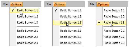
This will be the result: