Checkable Items
In order to enhance the functionality of the RadMenu control, the RadMenuItem can behave like a checkable item. This means that it can be checked and unchecked like a simple CheckBox. In order to toggle this behavior you have to set the IsCheckable property of the RadMenuItem to either True or False. The default value is False.
To learn how to group the checkable items into radio groups read here.
Upon checking and unchecking the respective events are raised - Checked and Unchecked. You can subscribe to them in order to implement your custom logic against the respective action. To learn more about them read here.
Here is an example of a definition of a checkable RadMenuItem:
Example 1: Define a checkable menu item
<telerik:RadMenuItem Header="Status Bar" IsCheckable="True" />
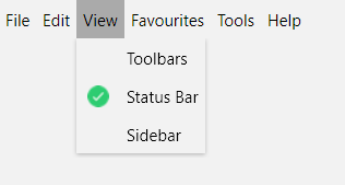
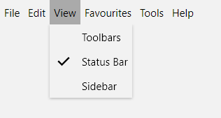
Upon clicking on the item it will get checked and the tick will appear as an icon for the item.
Note that after clicking on the item the menu will collapse. In order to keep the menu open you can set the StaysOpenOnClick property of the RadMenuItem to True. This will keep the menu open when this item is clicked.
If you want to programmatically mark an item as checked, you have to set the IsChecked property to True.
Checked Icon
As of R1 2022, the menu items also expose CheckedIcon and CheckedIconTemplate properties which you can use to replace the default checkmark glyph with your custom icon which is used when the item is checked.
Example 2: Using a custom check icon
<telerik:RadMenuItem IsCheckable="True" Header="Status Bar" CheckedIconTemplate="{x:Null}">
    <telerik:RadMenuItem.CheckedIcon>
        <Image Source="check-icon.png" Width="16" Height="16" Stretch="UniformToFill" />
    </telerik:RadMenuItem.CheckedIcon>
</telerik:RadMenuItem>
Note that you also need to set the CheckedIconTemplate to null to override the default icon.
If you're generating the items dynamically, you can define the CheckedIconTemplate as shown in Example 3.
Example 3: Setting the checked icon for dynamically generated items
<!-- If you are using the NoXaml binaries, you need to base the style on the default one for the theme like so:
<Style TargetType="telerik:RadMenuItem" BasedOn="{StaticResource RadMenuItemStyle}"> -->

<Style x:Key="MenuItemStyle" TargetType="telerik:RadMenuItem">
    <!-- ... -->
    <Setter Property="CheckedIcon" Value="{Binding CheckedIconUrl}" />
    <Setter Property="CheckedIconTemplate">
        <Setter.Value>
            <DataTemplate>
                <Image Source="{Binding}" Width="16" Height="16" Stretch="UniformToFill"/>
            </DataTemplate>
        </Setter.Value>
    </Setter>
</Style>