Visual Structure
This section defines terms and concepts used in the scope of RadMenu that you need to get familiar with prior to continue reading this help. They can also be helpful when contacting our support service in order to describe your issue better. Below you can see snapshots and explanations of the main states and visual elements of the standard RadMenu control.
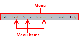
The RadMenu is a user interface control that presents users with navigation in the form of menu. The contents can be shown and hidden as the menu items expand and collapse. In its default state, the items are collapsed, displaying only their headers as it is shown on the snapshot below.
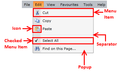
When a menu item is selected it gets expanded and its sub items appear. See the following snapshots for more detailed information.
Menu - the container that holds the top-level menu items.
Menu Item - a RadMenuItem, that provides a way to display data in a hierarchical structure. Each RadMenuItem can have other RadMenuItems as children.
Checkable Item - a RadMenuItem that can have two states - checked and unchecked (similar to the CheckBox control).
Separator - a RadMenuItem that is defined as a separator between the different groups of items.
Icon - part of the RadMenuItem that allows you to display a picture.
Popup Area - the part of the RadMenuItem that contains the child RadMenuItems. It appears only when the parent RadMenuItem is selected.