WPF Menu Overview
Thank you for choosing Telerik RadMenu!
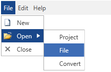
Telerik RadMenu for WPF provides the power to build the entire navigation of your web application. Combining the ability to display hierarchical views and the advanced styling mechanism, RadMenu lets you build even the most complicated site-menu systems. The control provides a number of advanced features like hierarchical data binding, different opening modes, integration with commands and different type of items, as well as full layout and appearance customization capabilities.
The RadMenu is part of Telerik UI for WPF, a
professional grade UI library with 160+ components for building modern and feature-rich applications. To try it out sign up for a free 30-day trial.

Key Features
This is a list with short descriptions of the top-of-the-line features of the RadMenu control.
Hierarchical data binding: RadMenu allows you to bind and visualize sets of hierarchical data. You can also populate it by consuming data from XML files, WCF services, RIA services etc. Read more about this in the Populating with Data section.
Icons: The menu items expose an Icon property that can be used to define an icon are another custom UI element display at the left side of the item. Read more about this in the Icons article.
Opening modes: You to open the menu by click or mouse over. Read more about this in the Opening Modes article.
Orientation: You can set the orientation of the items to either horizontal or vertical by changing a single property. Read more about this in the Orientation article.
Check/uncheck items: RadMenu allows you to check/uncheck items and manage the collection of the checked items. Using the corresponding events you can entirely handle the check/uncheck action. Read more about this in the Checkable Items article.
Commands support: The control support commands, thus allowing you to integrate its menu items with commands and pass parameters to them. Read more about this in the Keyboard Navigation article.
Keyboard navigation: You can easily navigate through the items via the arrow keys on the keyboard. Read more about this in the Commands article.
Get started with the control with its Getting Started help article that shows how to use it in a basic scenario.
Check out the control's demos at demos.telerik.com
Telerik UI for WPF Support and Learning Resources
- Telerik UI for WPF Menu Homepage
- Get Started with the Telerik UI for WPF Menu
- Telerik UI for WPF API Reference
- Getting Started with Telerik UI for WPF Components
- Telerik UI for WPF Virtual Classroom (Training Courses for Registered Users)
- Telerik UI for WPF Menu Forums
- Telerik UI for WPF Knowledge Base