Getting Started with WPF Menu
This tutorial will walk you through the creation of a RadMenu and will show you how to:
Before reading this tutorial you should get familiar with the Visual Structure of the
RadMenucontrol.
Adding Telerik Assemblies Using NuGet
To use RadMenu when working with NuGet packages, install the Telerik.Windows.Controls.Navigation.for.Wpf.Xaml package. The package name may vary slightly based on the Telerik dlls set - Xaml or NoXaml
Read more about NuGet installation in the Installing UI for WPF from NuGet Package article.
With the 2025 Q1 release, the Telerik UI for WPF has a new licensing mechanism. You can learn more about it here.
Adding Assembly References Manually
If you are not using NuGet packages, you can add a reference to the following assemblies:
- Telerik.Licensing.Runtime
- Telerik.Windows.Controls
- Telerik.Windows.Controls.Navigation
Adding RadMenu
You can include the control in your application by either dragging it from the toolbox in Visual Studio, or by manually declaring it. Below is an example of how to include the RadMenu control in XAML code:
Adding RadMenu
<Grid>
    <telerik:RadMenu/>
</Grid>
If you run your application now you will see an empty RadMenu that contains no items.
Add Menu Items
You can populate the control by either adding the RadMenuItems to its Items collection, or by utilizing its data binding support.
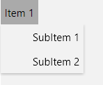
Adding RadMenuItems
<telerik:RadMenu>
    <telerik:RadMenuItem Header="Item 1">
        <telerik:RadMenuItem Header="SubItem 1" />
        <telerik:RadMenuItem Header="SubItem 2" />
    </telerik:RadMenuItem>
</telerik:RadMenu>
RadMenu with added items
Populating the RadMenu with Data
The scenario described in the previous sections shows the usage of static items. To learn more about these type of scenarios read here.
However, in most of the cases you have to bind your RadMenu to a collection of business objects. Check out the following topics which describe in details how to work with dynamic data.
Data Binding Support Overview - describes the various data sources for the RadMenu and shows you many tips and tricks. Read this topics in order to achieve basic knowledge about how the binding mechanism works at the RadMenu.
Binding to Dynamic Data - shows you how to bind the RadMenu to a collection of business objects.
Template and Styles Selectors - describes the possibilities to adjust the appearance of the RadMenu's items depending on the data they hold.
Styles and Templates
Take a look at the Styles and Templates section which is entirely dedicated to styling and templating the RadMenu control.
Work with the RadMenu
In order to learn how to use the RadMenu and what capabilities it holds, read the various topics that describe its features.
Setting a Theme
The controls from our suite support different themes. You can see how to apply a theme different than the default one in the Setting a Theme help article.
Changing the theme using implicit styles will affect all controls that have styles defined in the merged resource dictionaries. This is applicable only for the controls in the scope in which the resources are merged.
To change the theme, you can follow the steps below:
Choose between the themes and add reference to the corresponding theme assembly (example: Telerik.Windows.Themes.Windows8.dll). You can see the different themes applied in the Theming examples from our WPF Controls Examples application.
-
Merge the ResourceDictionaries with the namespace required for the controls that you are using from the theme assembly. For the
RadMenu, you will need to merge the following resources:- Telerik.Windows.Controls
- Telerik.Windows.Controls.Navigation
The next example demonstrates how to merge the ResourceDictionaries so that they are applied globally for the entire application.
Merge the ResourceDictionaries
<Application.Resources>
    <ResourceDictionary>
        <ResourceDictionary.MergedDictionaries>
            <ResourceDictionary Source="/Telerik.Windows.Themes.Windows8;component/Themes/System.Windows.xaml"/>
            <ResourceDictionary Source="/Telerik.Windows.Themes.Windows8;component/Themes/Telerik.Windows.Controls.xaml"/>
            <ResourceDictionary Source="/Telerik.Windows.Themes.Windows8;component/Themes/Telerik.Windows.Controls.Navigation.xaml"/>
        </ResourceDictionary.MergedDictionaries>
    </ResourceDictionary>
</Application.Resources>
Alternatively, you can use the theme of the control via the StyleManager.
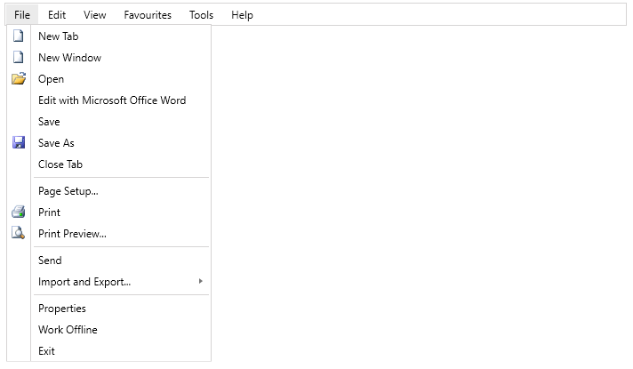
The following image shows a RadMenu with the Windows8 theme applied.
RadMenu with the Windows8 theme
Telerik UI for WPF Learning Resources
- Telerik UI for WPF Menu Component
- Getting Started with Telerik UI for WPF Components
- Telerik UI for WPF Installation
- Telerik UI for WPF and WinForms Integration
- Telerik UI for WPF Visual Studio Templates
- Setting a Theme with Telerik UI for WPF
- Telerik UI for WPF Virtual Classroom (Training Courses for Registered Users)
- Telerik UI for WPF License Agreement