Getting Started with WinUI DataGrid
This guide provides the information you need to start using the Telerik UI for WinUI DataGrid by adding the component to your project.
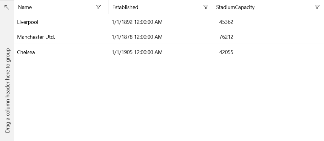
At the end, you will be able to achieve the following result.

Prerequisites
Before adding the DataGrid, you need to:
-
Create your Telerik UI for WinUI application and install the Telerik UI for WinUI components depending on the required installation approach:
Add the Assembly References
To use the RadDataGrid component, add references to Telerik.WinUI.Controls.dll and Telerik.Licensing.Runtime.dll.
Define the Component
After you have included the necessary references, add the Telerik.UI.Xaml.Controls.Grid namespace and define the DataGrid in XAML.
Define the DataGrid
<Page
    x:Class="GettingStarted.MainPage"
    xmlns="http://schemas.microsoft.com/winfx/2006/xaml/presentation"
    xmlns:x="http://schemas.microsoft.com/winfx/2006/xaml"
    xmlns:local="using:GettingStarted"
    xmlns:d="http://schemas.microsoft.com/expression/blend/2008"
    xmlns:mc="http://schemas.openxmlformats.org/markup-compatibility/2006"
    xmlns:telerikGrid="using:Telerik.UI.Xaml.Controls.Grid"
    mc:Ignorable="d"
    Background="{ThemeResource ApplicationPageBackgroundThemeBrush}">
    <Grid>
        <telerikGrid:RadDataGrid x:Name="dataGrid" />
    </Grid>
</Page>
Add Sample Data
At this point, your application displays an empty grid with no columns and rows. Since the DataGrid is a data-bound component, to add data, you have to create a data model and set its ItemsSource to a collection of those models.
The following example demonstrates how to implement a sample Model and ViewModel in the DataGrid. Note that the ViewModelBase class is located in the Telerik.Core namespace and provides an implementation of the INotifyPropertyChanged interface.
Define the Model and ViewModel of the DataGrid
public class Club : ViewModelBase
{
    private string name;
    private DateTime established;
    private int stadiumCapacity;

    public Club(string name, DateTime established, int stadiumCapacity)
    {
        this.name = name;
        this.established = established;
        this.stadiumCapacity = stadiumCapacity;
    }

    public string Name
    {
        get { return this.name; }
        set
        {
            if (value != this.name)
            {
                this.name = value;
                this.OnPropertyChanged("Name");
            }
        }
    }

    public DateTime Established
    {
        get { return this.established; }
        set
        {
            if (value != this.established)
            {
                this.established = value;
                this.OnPropertyChanged("Established");
            }
        }
    }

    public int StadiumCapacity
    {
        get { return this.stadiumCapacity; }
        set
        {
            if (value != this.stadiumCapacity)
            {
                this.stadiumCapacity = value;
                this.OnPropertyChanged("StadiumCapacity");
            }
        }
    }
}

public class MyViewModel : ViewModelBase
{
    private ObservableCollection<Club> clubs;

    public ObservableCollection<Club> Clubs
    {
        get
        {
            if (this.clubs == null)
            {
                this.clubs = this.CreateClubs();
            }

            return this.clubs;
        }
    }

    private ObservableCollection<Club> CreateClubs()
    {
        ObservableCollection<Club> clubs = new ObservableCollection<Club>();
        Club club;

        club = new Club("Liverpool", new DateTime(1892, 1, 1), 45362);
        clubs.Add(club);

        club = new Club("Manchester Utd.", new DateTime(1878, 1, 1), 76212);
        clubs.Add(club);

        club = new Club("Chelsea", new DateTime(1905, 1, 1), 42055);
        clubs.Add(club);

        return clubs;
    }
}
Display the Sample Data
Each DataGrid row represents an object in the data source and each DataGrid column shows the value for one property of the bound object. The following examples demonstrate how to display the sample data from the previous one by setting the DataContext of the page and the ItemsSource of the DataGrid.
Set the ItemsSource in XAML
<Page
    x:Class="GettingStarted.MainPage"
    xmlns="http://schemas.microsoft.com/winfx/2006/xaml/presentation"
    xmlns:x="http://schemas.microsoft.com/winfx/2006/xaml"
    xmlns:local="using:GettingStarted"
    xmlns:d="http://schemas.microsoft.com/expression/blend/2008"
    xmlns:mc="http://schemas.openxmlformats.org/markup-compatibility/2006"
    xmlns:telerikGrid="using:Telerik.UI.Xaml.Controls.Grid"
    mc:Ignorable="d"
    Background="{ThemeResource ApplicationPageBackgroundThemeBrush}">
    <Page.DataContext>
        <local:MyViewModel />
    </Page.DataContext>
    <Grid>
        <telerikGrid:RadDataGrid x:Name="dataGrid" ItemsSource="{Binding Clubs}"/>
    </Grid>
</Page>
Set the ItemsSource in code
public sealed partial class MainPage : Page
{
    public MainPage()
    {
        this.InitializeComponent();
        this.dataGrid.ItemsSource = new MyViewModel().Clubs;
    }
}
DataTable.
Using a DataTable as the ItemsSource
public MainPage()
{
    this.InitializeComponent();
    this.dataGrid.ItemsSource = this.GetDataTable();
}

private DataTable GetDataTable()
{
    DataTable clubs = new DataTable();
    clubs.TableName = "Clubs";
    clubs.Columns.Add("Name", typeof(string));
    clubs.Columns.Add("Established", typeof(DateTime));
    clubs.Columns.Add("StadiumCapacity", typeof(int));

    clubs.Rows.Add("Liverpool", new DateTime(1892, 1, 1), 45362);
    clubs.Rows.Add("Manchester Utd.", new DateTime(1878, 1, 1), 76212);
    clubs.Rows.Add("Chelsea", new DateTime(1905, 1, 1), 42055);

    return clubs;
}
Style the Component
Let's now add some styles to the DataGrid by merging the Generic.xaml ResourceDictionary in App.xaml.
Style the DataGrid
<Application.Resources>
    <ResourceDictionary>
        <ResourceDictionary.MergedDictionaries>
            <XamlControlsResources xmlns="using:Microsoft.UI.Xaml.Controls" />
            <ResourceDictionary Source="ms-appx:///Telerik.WinUI.Controls/Themes/Generic.xaml"/>
            <!-- Other merged dictionaries here -->
        </ResourceDictionary.MergedDictionaries>
        <!-- Other app resources here -->
    </ResourceDictionary>
</Application.Resources>
Define Columns Manually
The RadGridView from the previous examples contains three automatically generated columns, one for each of the properties of the Club class. The type of the generated column depends on the type property of the bound object. If you want to prevent the automatic generation of the columns and define them manually, set the AutoGenerateColumns property to False.
Define the Columns Manually
<telerikGrid:RadDataGrid x:Name="dataGrid" AutoGenerateColumns="False" ItemsSource="{Binding Clubs}">
    <telerikGrid:RadDataGrid.Columns>
        <telerikGrid:DataGridTextColumn PropertyName="Name" />
        <telerikGrid:DataGridDateColumn PropertyName="Established" />
    </telerikGrid:RadDataGrid.Columns>
</telerikGrid:RadDataGrid>
Implement Data Selection
By default, when the user clicks the DataGrid, the entire row is selected. To override this built-in behavior and specify whether rows or cells can be selected on user interaction, set the SelectionUnit property. To opt for a single or multiple selection, set the SelectionMode property.
Sort, Group, and Filter the Data
By default, the sorting, grouping, and filtering features of the DataGrid are enabled. To disable any of these functionalities, set the respective UserSortMode, UserFilterMode, or UserGroupMode DataGrid properties, or the CanUserSort, CanUserGroup, or CanUserFilter property of the corresponding DataGrid column.
Telerik UI for WinUI Learning Resources
- Telerik UI for WinUI DataGrid Component
- Getting Started with Telerik UI for WinUI Components
- Telerik UI for WinUI Installation
- Telerik UI for WinUI Examples
- Telerik UI for WinUI Accessibility
- Telerik UI for WinUI License Agreement