First Steps with UI for WinUI by Installing with Telerik VS Extension
The Telerik UI for WinUI library provides an option for installing its controls with the Telerik Visual Studio (VS) extension, which contains the Telerik UI for WinUI DLLs and referenced assembly files.
This tutorial describes how to get up and running with Telerik UI for WinUI by using the Telerik VS extension.
- First, you will set up your WinUI project and create the WinUI application.
- Next, you'll install the Telerik UI for WinUI library from a ZIP file, declare the namespace, and define the DataGrid control.
- Then, you will show some sample data in the DataGrid.
- Finally, you will add styles to the DataGrid and populate it with data.
Step 1: Set Up Your WinUI Project
Install Windows 10, version 1809 (build 17763) or later.
-
Install Visual Studio 2019, version 16.9 or later. Visual Studio 2022 is recommended for WinUI development.
For WinUI application development, you should install the
.NET Desktop Developmentworkload.Telerik is developed for
Windows 10 SDK (10.0.22621.0)and Windows App SDK version 1.7.250401001. Create a Telerik account.
Step 2: Create the WinUI Application
Open Visual Studio.
-
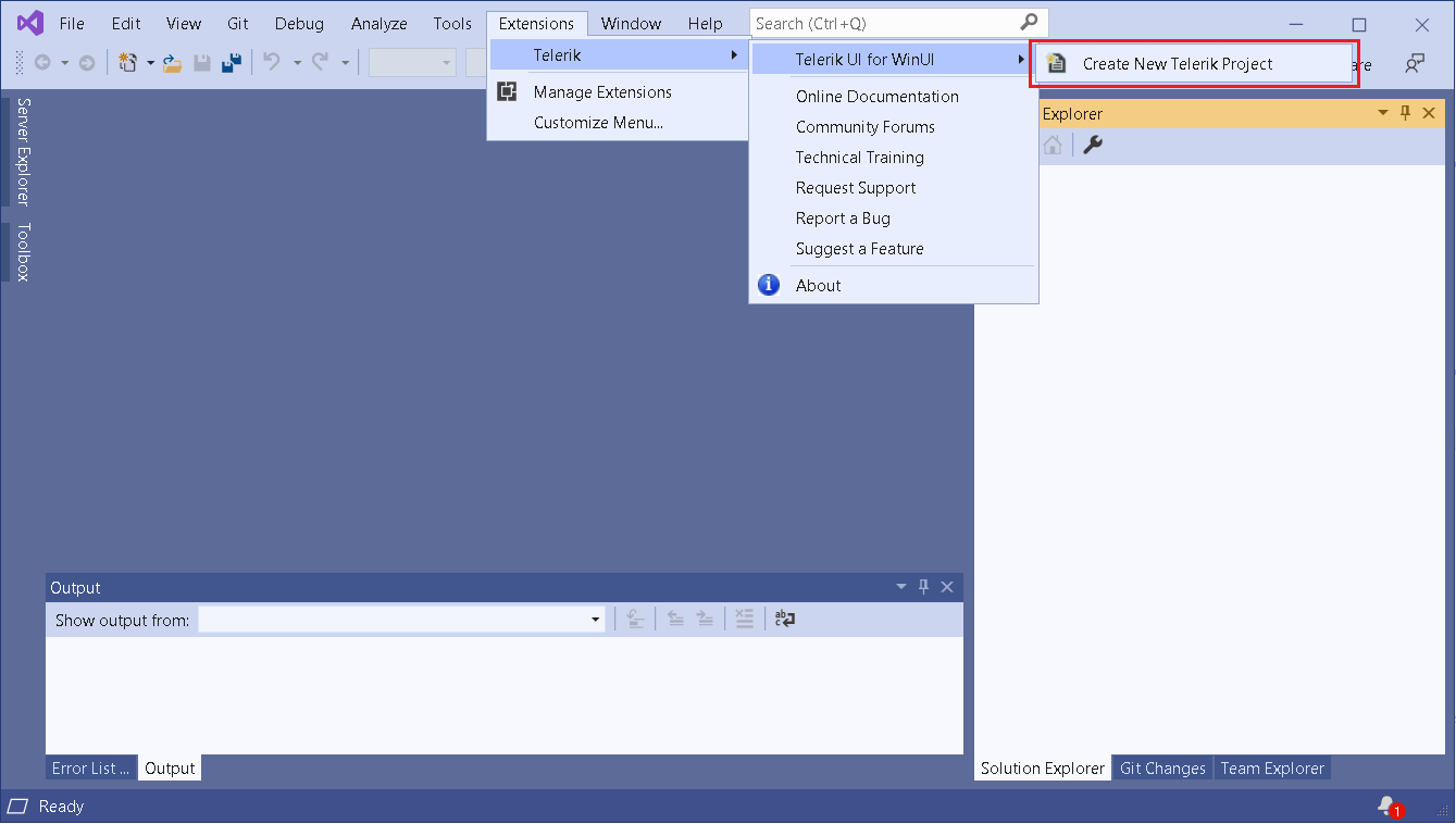
Open the Telerik VS extension menu and select the Create New Telerik Project option.
VS Extension Installation: Create New WinUI Application
-
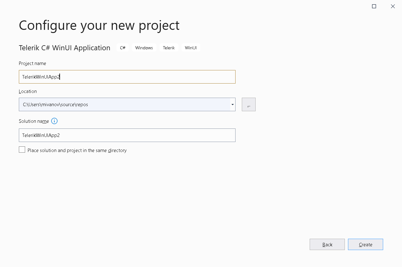
In the dialog that opens, configure the basic project settings.
VS Extension Installation: Project Settings
-
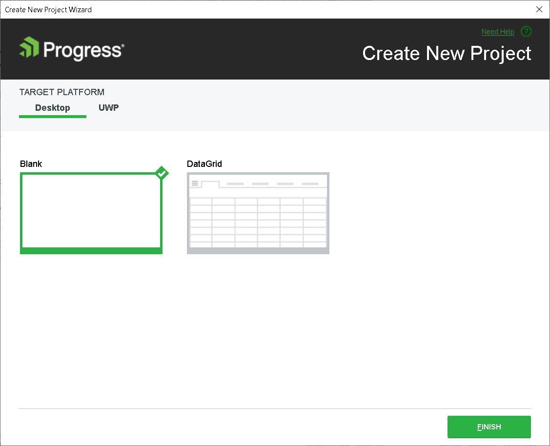
The Create New Project Wizard dialog provides the options to select the project template (Empty or DataGrid).
For the purposes of this tutorial, let's select Empty. As a result, the template creates an empty project with the referenced Telerik assemblies as opposed to the DataGrid template, which creates a basic setup for the DataGrid control.
VS Extension Installation: Create Empty Project
-
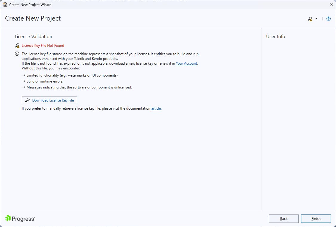
Download and install a valid license key. If you already have installed a valid key, the License Validation dialog won't be displayed.
-
Click Finish to create the new WinUI project.
VS Extension Installation: Confirm Project Creation
Step 3: Add Styles to the DataGrid
In order for the DataGrid to receive some styles, you need to merge the Generic.xaml ResourceDictionary in App.xaml as demonstrated in the following example. This should already be present when using our Project Template, but it is an important thing to confirm.
<Application.Resources>
    <ResourceDictionary>
        <ResourceDictionary.MergedDictionaries>
            <XamlControlsResources xmlns="using:Microsoft.UI.Xaml.Controls" />
            <ResourceDictionary Source="ms-appx:///Telerik.WinUI.Controls/Themes/Generic.xaml"/>
            <!-- Other merged dictionaries here -->
        </ResourceDictionary.MergedDictionaries>
        <!-- Other app resources here -->
    </ResourceDictionary>
</Application.Resources>
Step 4: Declare the Namespace and Define the DataGrid
Let's add the Telerik UI for WinUI DataGrid control—declare its namespace and then define the control.
-
In
MainPage.xaml, add the following line to declare the namespace:xmlns:telerikGrid="using:Telerik.UI.Xaml.Controls.Grid" -
Add the following code to define the DataGrid:
As a result,<telerikGrid:RadDataGrid x:Name="dataGrid" />MainPage.xamlwill look as demonstrated in the following example.
<Page x:Class="GettingStarted.MainPage"
        xmlns="http://schemas.microsoft.com/winfx/2006/xaml/presentation"
        xmlns:x="http://schemas.microsoft.com/winfx/2006/xaml"
        xmlns:local="using:GettingStarted"
        xmlns:d="http://schemas.microsoft.com/expression/blend/2008"
        xmlns:mc="http://schemas.openxmlformats.org/markup-compatibility/2006"
        xmlns:telerikGrid="using:Telerik.UI.Xaml.Controls.Grid"
        mc:Ignorable="d"
        Background="{ThemeResource ApplicationPageBackgroundThemeBrush}">
    <Grid>
        <telerikGrid:RadDataGrid x:Name="dataGrid" />
    </Grid>
</Page>
If you have chosen WinUI3 Desktop project type, this will be
Windowobject instead of aPageobject.
If you run the application at this point, you will see an empty grid with no columns and rows. Now you'll learn how to display some data.
Step 5: Render the Sample Data
Since the DataGrid is a data-bound control, you have to create a data model and set the ItemsSource of the control to a collection of those models.
To define the Model and the ViewModel:
-
In
MainPage.xaml.cs, add references to theTelerik.CoreandSystem.Collections.ObjectModelnamespaces:using Telerik.Core; using System.Collections.ObjectModel; -
Add the code from the following example. It demonstrates a sample implementation of a
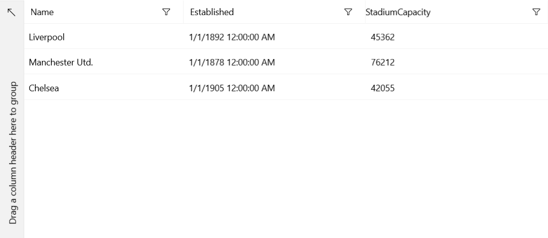
modelandViewModel. TheViewModelBaseclass from the example is located in theTelerik.Corenamespace and provides an implementation of the theINotifyPropertyChangedinterface.public class Club : ViewModelBase { private string name; private DateTime established; private int stadiumCapacity; public Club(string name, DateTime established, int stadiumCapacity) { this.name = name; this.established = established; this.stadiumCapacity = stadiumCapacity; } public string Name { get { return this.name; } set { if (value != this.name) { this.name = value; this.OnPropertyChanged("Name"); } } } public DateTime Established { get { return this.established; } set { if (value != this.established) { this.established = value; this.OnPropertyChanged("Established"); } } } public int StadiumCapacity { get { return this.stadiumCapacity; } set { if (value != this.stadiumCapacity) { this.stadiumCapacity = value; this.OnPropertyChanged("StadiumCapacity"); } } } } public class MyViewModel : ViewModelBase { private ObservableCollection<Club> clubs; public ObservableCollection<Club> Clubs { get { if (this.clubs == null) { this.clubs = this.CreateClubs(); } return this.clubs; } } private ObservableCollection<Club> CreateClubs() { ObservableCollection<Club> clubs = new ObservableCollection<Club>(); Club club; club = new Club("Liverpool", new DateTime(1892, 1, 1), 45362); clubs.Add(club); club = new Club("Manchester Utd.", new DateTime(1878, 1, 1), 76212); clubs.Add(club); club = new Club("Chelsea", new DateTime(1905, 1, 1), 42055); clubs.Add(club); return clubs; } }Step 6: Populate the DataGrid with Data
Each row in the DataGrid represents an object in the data source and each column shows the value for one property of the bound object.
The following example demonstrates how to display the sample data from Step 5 by setting the DataContext of the Window and the ItemsSource of the RadDataGrid.
<Window x:Class="GettingStarted.MainWindow"
        xmlns="http://schemas.microsoft.com/winfx/2006/xaml/presentation"
        xmlns:x="http://schemas.microsoft.com/winfx/2006/xaml"
        xmlns:local="using:GettingStarted"
        xmlns:d="http://schemas.microsoft.com/expression/blend/2008"
        xmlns:mc="http://schemas.openxmlformats.org/markup-compatibility/2006"
        xmlns:telerikGrid="using:Telerik.UI.Xaml.Controls.Grid"
        mc:Ignorable="d"
        Background="{ThemeResource ApplicationPageBackgroundThemeBrush}">
    <Grid>
        <Grid.DataContext>
            <local:MyViewModel />
        </Grid.DataContext>
        <telerikGrid:RadDataGrid x:Name="dataGrid" ItemsSource="{Binding Clubs}"/>
    </Grid>
</Window>
Telerik UI for WinUI DataGrid Displaying Data
That was it! Now you are ready to dive more deeply into Telerik UI for Win UI and take full advantage of its slick functionalities!
Next Steps
- Available Product Files for Download
- Installation Approaches for Telerik UI for WinUI
- Usage Specifics for License Types
- Update to Latest Windows App SDK