.NET MAUI ListPicker Templates
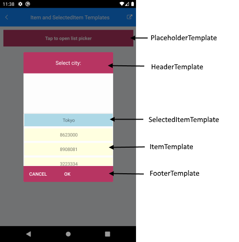
The ListPicker for .NET MAUI provides the following templates:
-
ItemTemplate(DataTemplate)—Defines the template used for displaying the list of items. -
SelectedItemTemplate(DataTemplate)—Specifies the template used for visualizing the selected item from the list. -
PlaceholderTemplate(ControlTemplate)—Defines the template visualized for the placeholder.
-
DisplayTemplate(ControlTemplate)—Defines the template visualized when an item from the list is selected.
Using SelectorSettings property (of type Telerik.Maui.Controls.PickerPopupSelectorSettings) you can define the following templates:
-
HeaderTemplate(ControlTemplate)—Defines what will be displayed inside the dialog(popup) header. -
FooterTemplate(ControlTemplate)—Defines what will be displayed inside the dialog(popup) footer.
This is the Visual Structure of the ListPicker templates:
In addition, the ListPicker for .NET MAUI provides the following properties:
-
ItemsSource(IList)—Specifies the collection used to generate the content of the list picker. -
ItemLength(double)—Defines the length of the items inside the list. -
ItemSpacing(double)—Defines the spacing between the items inside the list. -
SelectedItem(object)—Specifies the selected item of the list picker -
DisplayMemberPath(string)—Defines the path of the property which is to be displayed asDisplayString.
Example
The following example demonstrates how to define a sample ListPicker:
<telerik:RadListPicker PlaceholderTemplate="{StaticResource placeholderTemplate}"
                       ItemTemplate="{StaticResource itemTemplate}"
                       SelectedItemTemplate="{StaticResource selectedItemTemplate}"
                       ItemLength="40"
                       ItemSpacing="4"
                       ItemsSource="{Binding Items}"
                       DisplayMemberPath="Name"
                       x:Name="listPicker"
                       AutomationId="listPicker">
    <telerik:RadListPicker.BindingContext>
        <local:CitiesViewModel/>
    </telerik:RadListPicker.BindingContext>
    <telerik:RadListPicker.PopupSettings>
        <telerik:PickerPopupSettings HeaderTemplate="{StaticResource headerTemplate}"
                                     FooterTemplate="{StaticResource footerTemplate}"/>
    </telerik:RadListPicker.PopupSettings>
    <telerik:RadListPicker.DropDownSettings>
        <telerik:PickerDropDownSettings FooterTemplate="{StaticResource footerTemplate}"/>
    </telerik:RadListPicker.DropDownSettings>
</telerik:RadListPicker>
Define the templates in the page resources:
Item Template
<DataTemplate x:Key="itemTemplate">
    <Label Text="{Binding Population}"
           BackgroundColor="LightYellow"
           HorizontalTextAlignment="Center"
           VerticalTextAlignment="Center"/>
</DataTemplate>
Template for the Selected Item
<DataTemplate x:Key="selectedItemTemplate">
    <Label Text="{Binding Name}"
           BackgroundColor="LightBlue"
           HorizontalTextAlignment="Center"
           VerticalTextAlignment="Center"/>
</DataTemplate>
Placeholder Template
<ControlTemplate x:Key="placeholderTemplate">
    <Grid>
        <Button Text="Tap to open list picker"
               FontAttributes="Bold"
               TextColor="White"
               BackgroundColor="#B73562"
               Padding="20"
               Command="{TemplateBinding ToggleCommand}" />
    </Grid>
</ControlTemplate>
Display Template
<ControlTemplate x:Key="displayTemplate">
    <StackLayout>
        <Label Text="This is the DisplayTemplate of the ListPicker" FontSize="10"/>
        <Label Text="{TemplateBinding DisplayString}" TextColor="Black" FontSize="15" Grid.Row="1" VerticalTextAlignment="Center"/>
        <StackLayout.GestureRecognizers>
            <TapGestureRecognizer Command="{TemplateBinding ToggleCommand}" />
        </StackLayout.GestureRecognizers>
    </StackLayout>
</ControlTemplate>
Header Template
<ControlTemplate x:Key="headerTemplate">
    <Grid>
        <Label Text="Select city:"
               TextColor="White"
               Padding="20"
               FontSize="16"
               VerticalTextAlignment="Center"
               HorizontalTextAlignment="Center"
               BackgroundColor="#B73562"/>
    </Grid>
</ControlTemplate>
Footer Template
<ControlTemplate x:Key="footerTemplate">
    <StackLayout Orientation="Horizontal" Spacing="0" HorizontalOptions="FillAndExpand" BackgroundColor="#B73562">
        <telerik:RadButton Text="Cancel"
                           WidthRequest="80"
                           TextColor="White"
                           BackgroundColor="Transparent"
                           Command="{TemplateBinding CancelCommand}" />
        <telerik:RadButton Text="OK"
                           WidthRequest="80"
                           TextColor="White"
                           BackgroundColor="Transparent"
                           Command="{TemplateBinding AcceptCommand}" />
    </StackLayout>
</ControlTemplate>
Set a sample business model:
public class City
{
    public string Name { get; set; }
    public int Population { get; set; }
}
Define the ViewModel:
public class CitiesViewModel
{
    public CitiesViewModel()
    {
        this.Items = new ObservableCollection<City>
        {
            new City { Name = "Tokyo", Population = 13929286 },
            new City { Name = "New York", Population = 8623000 },
            new City { Name = "London", Population = 8908081 },
            new City { Name = "Madrid", Population = 3223334 },
            new City { Name = "Los Angeles", Population = 4000000},
            new City { Name = "Paris", Population = 2141000 },
            new City { Name = "Beijing", Population = 21540000 },
            new City { Name = "Singapore", Population = 5612000 },
            new City { Name = "New Delhi", Population = 18980000 },
            new City { Name = "Bangkok", Population = 8305218 },
            new City { Name = "Berlin", Population = 3748000 },
        };
    }

    public ObservableCollection<City> Items { get; set; }
}
Add the following namespace:
xmlns:telerik="http://schemas.telerik.com/2022/xaml/maui"
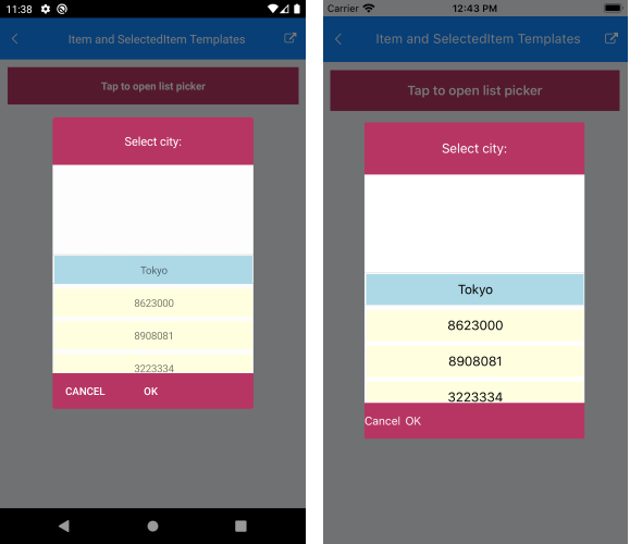
The following image shows the end result:
For a sample templates example, refer to the ListPicker/Templates folder of the Telerik UI for .NET MAUI SDKBrowser Application.