.NET MAUI ListPicker Visual Structure
Here are described all visual elements used in the List Picker for .NET MAUI.
Before and After an Item Is Selected

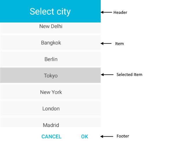
Popup Visual Structure

Legend
-
Placeholder—The text visualized before picking an item from the list of items. A placeholder can be customized through the
PlaceholderTemplateproperty. - DisplayStringFormat—The text visualized after an item from the list of items is picked.
-
Header—The text displayed in the popup header. You can set a direct text through the
HeaderLabelTextproperty or customize the popup header by using theHeaderTemplateproperty. - ItemTemplate—Defines the template used for displaying the list of items. For more information review Templates article.
- SelectedItemTemplate—Specifies the template used for visualizing the selected item from the list. For more information review the Templates article.
-
Footer—The footer of the popup. By default, it contains the OK and Cancel buttons. You can customize it through the
FooterTemplateproperty. For more information, review the Templates article.