.NET MAUI ListPicker Styling
The ListPicker control for .NET MAUI provides styling options for customizing its appearance. You can style the ListPicker itself, as well as its popup or dropdown depending on the PickerMode setting.
The control supports the following styling properties:
-
ItemStyle(of typeStylewith target typetelerik:SpinnerItemView)—Defines the style applied to the list of items. -
SelectedItemStyle(of typeStylewith target typetelerik:SpinnerItemView)—Defines the style applied to the selected item. -
SelectionHighlightStyle(of typeStylewith target typetelerik:RadBorder)—Specifies the style applied to the border where the current selection is.
-
PlaceholderLabelStyle(of typeStylewith target typeLabel)—Defines the style applied to the placeholder label. -
DisplayLabelStyle(of typeStylewith target typeLabel)—Defines the style applied to the label which is visualized when item of the list is selected. -
BackgroundColor—Defines the background color of the picker. -
BorderColor—Defines the border color of the picker. -
BorderThickness—Specifies the border thickness of the picker. The default value isnew Thickness(0,0,0,1). -
CornerRadius—Specifies the corner radius of the picker. -
ToggleButtonStyle(of typeStylewith target typeRadButton)—Specifies the style of the Toggle button. -
ClearButtonStyle(of typeStylewith target typeRadButton)—Defines the style applied to the Clear button.
Namespaces
Using ItemStyle, SelectedItemStyle, PopupViewStyle, HeaderStyle, FooterStyle, SelectionHighlightStyle you need to add the following namespace:
xmlns:telerik="http://schemas.telerik.com/2022/xaml/maui"
Styling Examples
The following examples show how the styling properties are applied.
- Define the ListPicker:
<telerik:RadListPicker BorderColor="#8660C5"
                       Placeholder="Pick a City Name!"
                       ItemsSource="{Binding Items}"
                       DisplayMemberPath="Name"
                       IsLooping="True"
                       DisplayStringFormat="You have picked: {0}"
                       DisplayLabelStyle="{StaticResource displayLabelStyle}"
                       ItemStyle="{StaticResource ItemStyle}"
                       SelectedItemStyle="{StaticResource SelectedItemStyle}"
                       PlaceholderLabelStyle="{StaticResource placeholderLabelStyle}"
                       SelectionHighlightStyle="{StaticResource selectionHighlightStyle}"
                       ClearButtonStyle="{StaticResource clearButtonStyle}"
                       ToggleButtonStyle="{StaticResource toggleButtonStyle}"
                       IsClearButtonVisible="True"
                       IsToggleButtonVisible="True"
                       AutomationId="listPicker">
    <telerik:RadListPicker.BindingContext>
        <local:CitiesViewModel/>
    </telerik:RadListPicker.BindingContext>
</telerik:RadListPicker>
Define the styles in the page resources:
Define the ItemStyle
<Style TargetType="telerik:SpinnerItemView" x:Key="ItemStyle">
    <Setter Property="BackgroundColor" Value="#F8F8F8"/>
    <Setter Property="CornerRadius" Value="0"/>
    <Setter Property="TextColor" Value="#919191" />
    <Setter Property="FontSize" Value="12"/>
</Style>
Define the SelectedItemStyle
<Style TargetType="telerik:SpinnerItemView" x:Key="SelectedItemStyle">
    <Setter Property="BackgroundColor" Value="#F0F0F0"/>
    <Setter Property="CornerRadius" Value="0"/>
    <Setter Property="BorderThickness" Value="0"/>
    <Setter Property="TextColor" Value="#4A4949" />
    <Setter Property="FontSize" Value="16"/>
</Style>
Define the PlaceholderLabelStyle
<Style TargetType="Label" x:Key="placeholderLabelStyle">
    <Setter Property="TextColor" Value="#4A4949"/>
    <Setter Property="VerticalTextAlignment" Value="Center"/>
    <Setter Property="HorizontalTextAlignment" Value="Center"/>
</Style>
Define the DisplayLabelStyle
<Style TargetType="Label" x:Key="displayLabelStyle">
    <Setter Property="TextColor" Value="#151950"/>
    <Setter Property="VerticalTextAlignment" Value="Center"/>
    <Setter Property="HorizontalTextAlignment" Value="Center"/>
</Style>
-
Define a sample business model:
public class City { public string Name { get; set; } public int Population { get; set; } } -
Set a
ViewModel:public class CitiesViewModel { public CitiesViewModel() { this.Items = new ObservableCollection<City> { new City { Name = "Tokyo", Population = 13929286 }, new City { Name = "New York", Population = 8623000 }, new City { Name = "London", Population = 8908081 }, new City { Name = "Madrid", Population = 3223334 }, new City { Name = "Los Angeles", Population = 4000000}, new City { Name = "Paris", Population = 2141000 }, new City { Name = "Beijing", Population = 21540000 }, new City { Name = "Singapore", Population = 5612000 }, new City { Name = "New Delhi", Population = 18980000 }, new City { Name = "Bangkok", Population = 8305218 }, new City { Name = "Berlin", Population = 3748000 }, }; } public ObservableCollection<City> Items { get; set; } } -
Add the following namespaces:
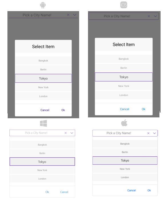
xmlns:telerik="http://schemas.telerik.com/2022/xaml/maui"The following image shows how the ListPicker looks when the styling properties are applied:
For a sample styling example, refer to the ListPicker/Styling folder of the Telerik UI for .NET MAUI SDKBrowser Application.