.NET MAUI ListPicker Overview
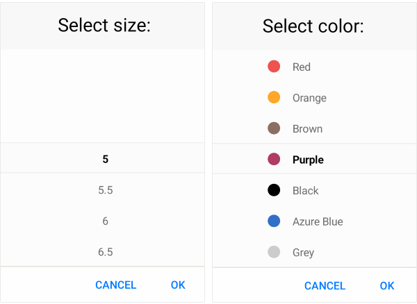
The Telerik UI for .NET MAUI ListPicker allows the user to select an item from a list of items and visualizes that items list inside a popup or a dropdown. The ListPicker control has a number of features which enable you to loop through its items infinitely while scrolling, to fully customize the dialog appearance and style the items, to define templates for the items, and more.
The ListPicker is part of Telerik UI for .NET MAUI, the most comprehensive UI suite for .NET MAUI! To try it out, sign up for a free 30-day trial and kickstart your cross-platform app development today.

.NET MAUI ListPicker Video Tutorial
If you prefer video instructions, watch this short MAUI ListPicker video tutorial. It covers to following topics:
- Overview of the .NET MAUI ListPicker control.
- Replace MAUI Picker with Telerik MAUI ListPicker.
Key Features of the .NET MAUI ListPicker
- Looping—The ListPicker enables you to loop through its items infinitely while scrolling.
-
Picker mode—You can choose between
PopupandDropDownUI for showing the items inside the list picker. For Desktop the default picker mode isDropDownwhile for mobile it'sPopup. - Templates—The ListPicker provides templates for its header and footer as well as exposes templates for its placeholder and display text.
-
Display String format—You can choose what text that will be displayed when an item is selected by using the
DisplayStringFormatproperty of the ListPicker. - Flexible styling API—The ListPicker provides a number of styling capabilities, which enable you to style its spinners, the popup and popup header and footer, the displayed text after an item is selected, and more.
- Commands support—The ListPicker exposes commands that allow you to clear the selected item and to open and close the popup.
-
Localization support—Translate the used across the ListPicker text for
Placeholder, Accept and Cancel buttons to other languages, so that your app can be adapted to different regions.