New to Telerik UI for .NET MAUI? Start a free 30-day trial

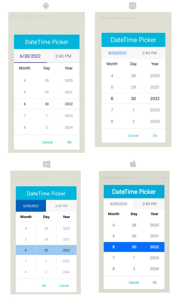
.NET MAUI DateTimePicker Popup Styling

By using the PopupSettings property (of type Telerik.Maui.Controls.PickerPopupSettings) of the DateTimePicker, you can modify the appearance of the dialog (popup). The PickerPopupSettings class exposes the following Style properties:

  • PopupViewStyle(of type Style with target type telerik:PickerPopupContentView)—Defines the popup view style.
  • HeaderStyle(of type Style with target type telerik:PickerPopupHeaderView)—Defines the popup header style.
  • HeaderLabelStyle(of type Style with target type Label)—Defines the popup header label style.
  • FooterStyle(of type Style with target type telerik:PickerPopupFooterView)—Defines the popup footer style.
  • AcceptButtonStyle(of type Style with target type Button)—Defines the Accept button style.
  • CancelButtonStyle(of type Style with target type Button)—Defines the Cancel button style.

The PickerPopupSettings also provides the following properties for popup customization:

  • PopupOutsideBackgroundColor—Defines the color outside of the popup.
  • IsPopupModal(bool)—Defines a Boolean value indicating if the popup will be closed when tapped outside of the popup. By default, the value of the IsPopupModal is false.

    When IsPopupModal="True", the UI behind the popup gets inactive and cannot be used until the popup is closed.

    When IsPopupModal="False", the popup can be closed when clicking outside the popup.

  • HeaderLabelText (string)—Specifies the text visualized in the popup header.

  • IsHeaderVisible (bool)—Specifies whether the Popup header is currently visible. By default, the value is True
  • IsFooterVisible (bool)—Specifies whether the Popup footer is currently visible. By default, the value is True.
  • AcceptButtonText (string)—Defines the text visualized for the Accept button. By default, the text is OK.
  • CancelButtonText (string)—Defines the text visualized for the Cancel button. By default, the text is Cancel.

PopupSettings provides styling options for the popup, its header and footer, outside background color and other. If you need to customize the look&feel of the spinner controls that show the available date values, please refer to SpinnerStyle, SpinnerHeaderStyle and SelectionHighlightStyle properties of the DateTimePicker. For more detailed information on them go to DateTimePicker Styling topic.

Namespaces

When you use PopupViewStyle, HeaderStyle, FooterStyle, you will need to add the following namespace:

Styling Examples

The following examples demonstrate how to define use the styling properties of the DateTimePicker.

Define the RadDateTimePicker

<telerik:RadDateTimePicker PickerMode="Popup"
                           DefaultHighlightedDate="2020,05,15"
                           AutomationId="dateTimePicker">
    <telerik:RadDateTimePicker.PopupSettings>
        <telerik:PickerPopupSettings PopupOutsideBackgroundColor="#D9D9D9CC"
                                     PopupViewStyle="{StaticResource popupViewStyle}"
                                     HeaderStyle="{StaticResource headerStyle}"
                                     HeaderLabelStyle="{StaticResource headerLabelStyle}"
                                     FooterStyle="{StaticResource footerStyle}"
                                     AcceptButtonStyle="{StaticResource acceptButtonStyle}"
                                     CancelButtonStyle="{StaticResource cancelButtonStyle}"
                                     AcceptButtonText="{StaticResource acceptButtonText}"
                                     CancelButtonText="{StaticResource cancelButtonText}"
                                     IsHeaderVisible="True"
                                     HeaderLabelText="DateTime Picker" />
    </telerik:RadDateTimePicker.PopupSettings>
</telerik:RadDateTimePicker>

Define the Spinner Style

<Style TargetType="telerik:RadSpinner" x:Key="spinnerStyle">
    <Setter Property="ItemStyle">
        <Setter.Value>
            <Style TargetType="telerik:SpinnerItemView">
                <Setter Property="TextColor" Value="#4A4949"/>
            </Style>
        </Setter.Value>
    </Setter>
    <Setter Property="SelectedItemStyle">
        <Setter.Value>
            <Style TargetType="telerik:SpinnerItemView">
                <Setter Property="TextColor" Value="Black"/>
                <Setter Property="FontAttributes" Value="Bold"/>
            </Style>
        </Setter.Value>
    </Setter>
    <Setter Property="HeightRequest" Value="240"/>
</Style>

Define the SpinnerHeader Style

<Style TargetType="Label" x:Key="spinnerHeaderStyle">
    <Setter Property="TextColor" Value="Black"/>
    <Setter Property="FontAttributes" Value="Bold"/>
    <Setter Property="HorizontalOptions" Value="FillAndExpand"/>
    <Setter Property="VerticalOptions" Value="FillAndExpand"/>
    <Setter Property="HorizontalTextAlignment" Value="Center"/>
    <Setter Property="VerticalTextAlignment" Value="Center"/>
</Style>

Define the PopupView Style

<Style TargetType="telerik:PickerPopupContentView" x:Key="popupViewStyle">
    <Setter Property="BackgroundColor" Value="White"/>
    <Setter Property="WidthRequest" Value="270"/>
</Style>

Define the Header Style

<Style TargetType="telerik:PickerPopupHeaderView" x:Key="headerStyle">
    <Setter Property="BackgroundColor" Value="#00B5DC"/>
    <Setter Property="HeightRequest" Value="60"/>
    <Setter Property="Margin" Value="0"/>
    <Setter Property="Padding" Value="0"/>
    <Setter Property="HorizontalOptions" Value="FillAndExpand"/>
    <Setter Property="VerticalOptions" Value="FillAndExpand"/>
</Style>

Define the HeaderLabel Style

<Style TargetType="Label" x:Key="headerLabelStyle">
    <Setter Property="TextColor" Value="White"/>
    <Setter Property="HorizontalOptions" Value="Center"/>
    <Setter Property="VerticalOptions" Value="Center"/>
    <Setter Property="FontSize" Value="Title"/>
</Style>

Define the Footer Style

<Style TargetType="telerik:PickerDropDownFooterView" x:Key="footerStyle">
    <Setter Property="BackgroundColor" Value="Transparent"/>
</Style>

Define the AcceptButton Style

<Style TargetType="Button" x:Key="acceptButtonStyle">
    <Setter Property="BackgroundColor" Value="Transparent"/>
    <Setter Property="TextColor" Value="#00B5DC"/>
</Style>

Define the CancelButton Style

<Style TargetType="Button" x:Key="cancelButtonStyle">
    <Setter Property="BackgroundColor" Value="Transparent"/>
    <Setter Property="TextColor" Value="#00B5DC"/>
</Style>

In addition, add the following namespaces:

The following image shows what the DateTimePicker control looks like when the styles described above are applied:

DateTimePicker Popup Style

See Also

In this article