New to Telerik UI for .NET MAUI? Start a free 30-day trial

.NET MAUI DateTimePicker Templates

The DateTimePicker provides a set of templates for customizing its elements.

To customize the control, use any of the templates it supports:

  • PlaceholderTemplate(ControlTemplate)—Defines the template visualized for the placeholder.
  • DisplayTemplate(ControlTemplate)—Defines the template visualized when the picked date/time is displayed.
  • HeaderTemplate(ControlTemplate)—Defines what will be displayed inside the dialog (popup) header.
  • FooterTemplate(ControlTemplate)—Defines what will be displayed inside the dialog (popup) footer.
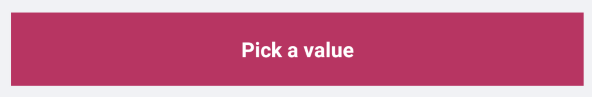
PlaceholderTemplate

The following example demonstrates how to use the PlaceholderTemplate.

<ControlTemplate x:Key="Picker_PlaceholderView_ControlTemplate">
    <Grid>
        <Grid.GestureRecognizers>
            <TapGestureRecognizer Command="{TemplateBinding ToggleCommand}" />
        </Grid.GestureRecognizers>
        <Label Text="{TemplateBinding Placeholder}"
               Style="{TemplateBinding PlaceholderLabelStyle}"
               AutomationId="PickerPlaceholderLabel"/>
    </Grid>
</ControlTemplate>

DisplayTemplate

The following example demonstrates how to use the DisplayTemplate.

<ControlTemplate x:Key="Picker_DisplayView_ControlTemplate">
    <Grid>
        <Grid.GestureRecognizers>
            <TapGestureRecognizer Command="{TemplateBinding ToggleCommand}" />
        </Grid.GestureRecognizers>
        <Label Text="{TemplateBinding DisplayString}"
               Style="{TemplateBinding DisplayLabelStyle}"
               AutomationId="PickerDisplayLabel"/>
    </Grid>
</ControlTemplate>

HeaderTemplate

The following example demonstrates how to use the HeaderTemplate.

<ControlTemplate x:Key="PopupView_Header_ControlTemplate">
    <telerik:RadBorder BackgroundColor="{TemplateBinding BackgroundColor}"
                       BorderColor="{TemplateBinding BorderColor}"
                       BorderThickness="{TemplateBinding BorderThickness}"
                       CornerRadius="{TemplateBinding CornerRadius}"
                       HeightRequest="{TemplateBinding HeightRequest}">
        <Label Text="{TemplateBinding HeaderLabelText}"
               Style="{TemplateBinding HeaderLabelStyle}"
               AutomationId="PickerPopupHeaderLabel"/>
    </telerik:RadBorder>
</ControlTemplate>

FooterTemplate

The following example demonstrates how to use the FooterTemplate.

<ControlTemplate x:Key="PopupView_Footer_ControlTemplate">
    <telerik:RadBorder BackgroundColor="{TemplateBinding BackgroundColor}"
                       BorderColor="{TemplateBinding BorderColor}"
                       BorderThickness="{TemplateBinding BorderThickness}"
                       CornerRadius="{TemplateBinding CornerRadius}">
        <OnPlatform x:TypeArguments="View">
            <On Platform="Android, iOS, MacCatalyst">
                <HorizontalStackLayout Spacing="0" HorizontalOptions="End">
                    <telerik:RadButton Text="{TemplateBinding CancelButtonText}"
                                       Style="{TemplateBinding CancelButtonStyle}"
                                       Command="{TemplateBinding CancelCommand}"
                                       AutomationId="PickerPopupCancelButton"/>
                    <telerik:RadButton Text="{TemplateBinding AcceptButtonText}"
                                       Style="{TemplateBinding AcceptButtonStyle}"
                                       Command="{TemplateBinding AcceptCommand}"
                                       AutomationId="PickerPopupOkButton"/>
                </HorizontalStackLayout>
            </On>
            <On Platform="WinUI">
                <HorizontalStackLayout Spacing="0" HorizontalOptions="End">
                    <Button Text="{TemplateBinding AcceptButtonText}"
                            Style="{TemplateBinding AcceptButtonStyle}"
                            Command="{TemplateBinding AcceptCommand}"
                            AutomationId="PickerPopupOkButton"/>
                    <Button Text="{TemplateBinding CancelButtonText}"
                            Style="{TemplateBinding CancelButtonStyle}"
                            Command="{TemplateBinding CancelCommand}" 
                            AutomationId="PickerPopupCancelButton"/>
                </HorizontalStackLayout>
            </On>
        </OnPlatform>
    </telerik:RadBorder>
</ControlTemplate>

Add the DateTimePicker definition:

<telerik:RadDateTimePicker MinimumDate="2020,01,1"
                            MaximumDate="2025,12,31"
                            SpinnerFormat="MMM/dd/yyyy"
                            PlaceholderTemplate="{StaticResource Picker_PlaceholderView_ControlTemplate}"
                            DisplayTemplate="{StaticResource Picker_DisplayView_ControlTemplate}">
    <telerik:RadDateTimePicker.SelectorSettings>
        <telerik:PickerPopupSelectorSettings HeaderTemplate="{StaticResource PopupView_Header_ControlTemplate}"
                                                  HeaderLabelText="Date Picker"
                                                  FooterTemplate="{StaticResource PopupView_Footer_ControlTemplate}"/>
    </telerik:RadDateTimePicker.SelectorSettings>
</telerik:RadDateTimePicker>

Customization Examples

The snippet below shows a simple Date Picker definition:

<telerik:RadDatePicker MinimumDate="2020,01,1" 
                       MaximumDate="2025,12,31"
                       SpinnerFormat="MMM/dd/yyyy"
                       PlaceholderTemplate="{StaticResource placeholderTemplate}"
                       DisplayTemplate="{StaticResource displayTemplate}"
                       AutomationId="datePicker">
    <telerik:RadDatePicker.PopupSettings>
        <telerik:PickerPopupSettings HeaderTemplate="{StaticResource headerTemplate}" 
                                     HeaderLabelText="This is the Header Template"
                                     FooterTemplate="{StaticResource footerTemplate}"/>
    </telerik:RadDatePicker.PopupSettings>
    <telerik:RadDatePicker.DropDownSettings>
        <telerik:PickerDropDownSettings FooterTemplate="{StaticResource footerTemplate}"/>
    </telerik:RadDatePicker.DropDownSettings>
</telerik:RadDatePicker>

Now, let's add the templates definition to the page resources:

Define Custom PlaceholderTemplate

<ControlTemplate x:Key="placeholderTemplate">
    <Button Text="{TemplateBinding Placeholder}" 
            FontAttributes="Bold" 
            TextColor="White"
            BackgroundColor="#B73562" 
            HeightRequest="50"
            Command="{TemplateBinding ToggleCommand}" />
</ControlTemplate>

DateTimePicker PlaceholderTemplate

Define Custom DisplayTemplate

<ControlTemplate x:Key="displayTemplate">
    <Button Text="{TemplateBinding DisplayString}" 
            TextColor="White" 
            BackgroundColor="#7BAEFF"
            HeightRequest="50"
            Command="{TemplateBinding ToggleCommand}" />
</ControlTemplate>

DateTimePicker DisplayTemplate

Define Custom HeaderTemplate

<ControlTemplate x:Key="headerTemplate">
    <Grid>
        <Label Text="Date Picker"
               Padding="20"
               TextColor="White"
               VerticalTextAlignment="Center"
               HorizontalTextAlignment="Center"
               BackgroundColor="#B73562"/>
    </Grid>
</ControlTemplate>

Define Custom FooterTemplate

<ControlTemplate x:Key="footerTemplate">
    <HorizontalStackLayout Spacing="0" HorizontalOptions="FillAndExpand" BackgroundColor="#B73562">
        <telerik:RadButton Text="Cancel"
                           WidthRequest="80"
                           TextColor="White"
                           BackgroundColor="Transparent"
                           Command="{TemplateBinding CancelCommand}" />
        <telerik:RadButton Text="OK"
                           WidthRequest="80"
                           TextColor="White"
                           BackgroundColor="Transparent"
                           Command="{TemplateBinding AcceptCommand}" />
    </HorizontalStackLayout>
</ControlTemplate>

In addition to this, you need to add the following namespace:

xmlns:telerik="http://schemas.telerik.com/2022/xaml/maui"

DateTimePicker FooterTemplate

See Also

In this article