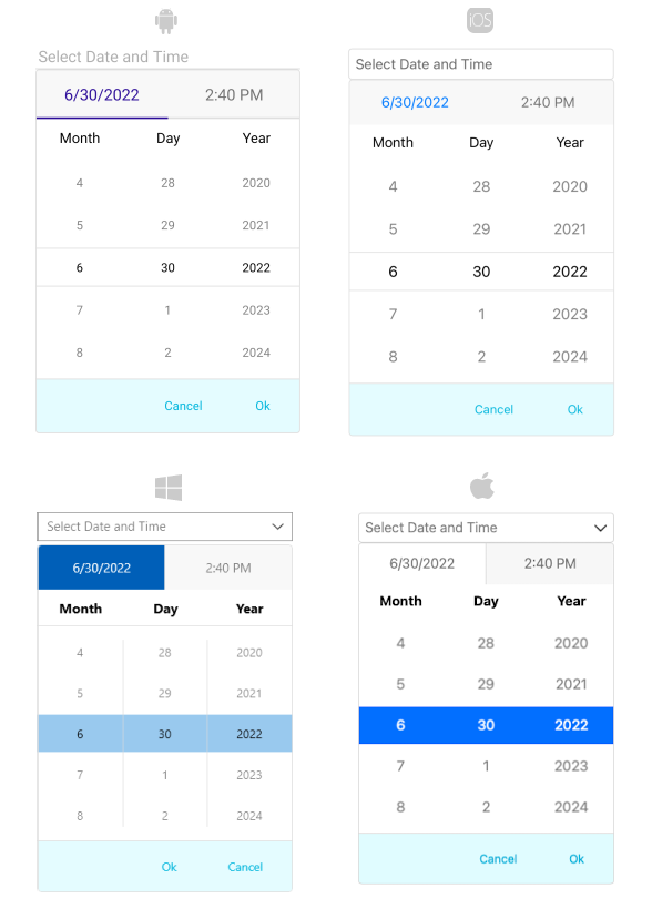
.NET MAUI DateTimePicker Drop-Down Styling
By using the DropDownSettings property (of type Telerik.Maui.Controls.PickerDropDownSettings) of the DateTimePicker, you can modify the appearance of the drop-down. The PickerDropDownSettings class exposes the following Style properties:
-
DropDownViewStyle(of typeStylewith target typetelerik:PickerDropDownContentView)—Defines the drop-down view style. -
FooterStyle(of typeStylewith target typetelerik:PickerPopupFooterView)—Defines the drop-down footer style. -
AcceptButtonStyle(of typeStylewith target typeButton)—Defines the Accept button style. -
CancelButtonStyle(of typeStylewith target typeButton)—Defines the Cancel button style.
The DropDownSettings also provides the following properties for drop-down customization:
-
Placement(of typePlacementMode)—Specifies the position of the drop-down, can be set to Bottom, Right, Left, Top, Center or Relative. -
HorizontalOffset\VerticalOffset—Specifies the horizontal\vertical distance between the drop-down and the DateTimePicker. -
IsFooterVisible(bool)—Specifies whether the drop-down footer is currently visible. By default, the value isTrue. -
AcceptButtonText(string)—Defines the text visualized for theAcceptbutton. By default, the text isOK. -
CancelButtonText(string)—Defines the text visualized for theCancelbutton. By default, the text isCancel.
DropDownSettingsprovides styling options for the drop-down, its footer and position, and other. If you need to customize the look&feel of the spinner controls that show the available date values, please refer toSpinnerStyle,SpinnerHeaderStyleandSelectionHighlightStyleproperties of the DateTimePicker. For more detailed information on them go to DateTimePicker Styling topic.
Namespaces
When you use DropDownViewStyle, FooterStyle, you will need to add the following namespace:
xmlns:telerik="http://schemas.telerik.com/2022/xaml/maui"
Styling Examples
The following examples demonstrate how to define use the styling properties of the DateTimePicker.
Define the RadDateTimePicker
<telerik:RadDateTimePicker PickerMode="DropDown"
                           DefaultHighlightedDate="2020,05,15"
                           AutomationId="dateTimePicker">
    <telerik:RadDateTimePicker.DropDownSettings>
        <telerik:PickerDropDownSettings DropDownViewStyle="{StaticResource dropDownViewStyle}"
                                        FooterStyle="{StaticResource footerStyle}"
                                        AcceptButtonStyle="{StaticResource acceptButtonStyle}"
                                        CancelButtonStyle="{StaticResource cancelButtonStyle}"
                                        AcceptButtonText="{StaticResource acceptButtonText}"
                                        CancelButtonText="{StaticResource cancelButtonText}" />
    </telerik:RadDateTimePicker.DropDownSettings>
</telerik:RadDateTimePicker>
Define the DropDownViewStyle
<Style TargetType="telerik:PickerDropDownContentView" x:Key="dropDownViewStyle">
    <Setter Property="BackgroundColor" Value="#E4FCFF"/>
</Style>
Define the Footer Style
<Style TargetType="telerik:PickerPopupFooterView" x:Key="footerStyle">
    <Setter Property="BackgroundColor" Value="Transparent"/>
</Style>
Define the AcceptButton Style
<Style TargetType="Button" x:Key="acceptButtonStyle">
    <Setter Property="BackgroundColor" Value="Transparent"/>
    <Setter Property="TextColor" Value="#00B5DC"/>
</Style>
Define the CancelButton Style
<Style TargetType="Button" x:Key="cancelButtonStyle">
    <Setter Property="BackgroundColor" Value="Transparent"/>
    <Setter Property="TextColor" Value="#00B5DC"/>
</Style>
In addition, add the following namespaces:
xmlns:telerik="http://schemas.telerik.com/2022/xaml/maui"