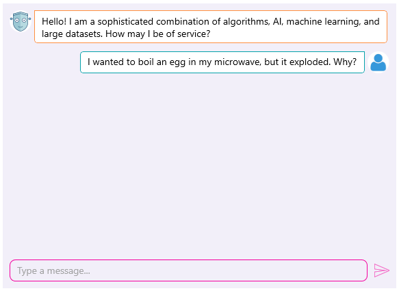
.NET MAUI Chat Styling
Any change in the appearance of the RadChat components depends on the referenced styles. The default templates contain a RadBorder control (used to achieve the rounded edges), an Image control (used for the avatar of the single and first message), and a Label for the text message itself.
To customize the different parts of the control, you can use the following built-in styles:
MessageImageStyle(target typeImage)—Defines the style referred to the send button image.OutgoingMessageImageStyle(target typeImage)—Defines the style of the outgoing message image.IncomingBorderStyle(target typeRadBorder)—Defines the style of the incoming message border.OutgoingBorderStyle(target typeRadBorder)—Defines the style of the outgoing message border.DefaultLabelStyle(target typeLabel)—Defines the default label style.OutgoingLabelStyle(target typeLabel)—Defines the style of the label of the outgoing message.
In addition, the following properties set the background of the Chat:
-
BackgroundColor(Color)—Defines the background color of the Chat control. -
InputAreaBackgroundColor(Color)—Defines the bacgkround color of the area that the input elements (entry and button) reside.
Customize the Chat Entry
You can customize the ChatEntry with an implicit style. The example below shows how to customize the chat entry in your Chat control. The ChatEntry represents the entry used for writing messages in the Telerik UI for .NET MAUI Chat control.
Customize the Send Button
The example below shows how to customize the Send button in your Chat control.