.NET MAUI Chat ItemTemplateSelector
The RadChat control exposes an ItemTemplateSelector property which you can use to apply different templates to each Chat item depending on a specific condition.
Default ItemTemplateSelector
Any change in the appearance of the Chat items depends on the ChatItemTemplateSelector and the containing templates and referenced styles. The default selector includes separate templates for the incoming and outgoing messages (so they're aligned to the left or right) and for single, first, middle, and last messages (in the case there area a few messages in a row)—this is needed to achieve the "balloon" look & feel of the messages. In addition, the TimeBreak template is also assigned through the ItemTemplateSelector.
Below you can find the default ItemTemplateSelector, which you can use as a base for any further customizations to the way the messages look.
The default templates contain:
- a
RadBordercontrol (used to achieve the rounded edges). - an
Imagecontrol (used for the avatar image only for the single and first messages). - a
Labelfor the text message itself.
The code snippet below contains the default templates and the accompanying styles:
You can apply any changes to the templates and then assign the template selector to the ItemTemplateSelector property of the Chat control:
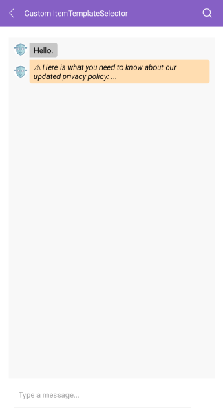
Custom ItemTemplateSelector
You can create a custom ChatItemTemplateSelector to conditionally apply different message styles depending on any of the used Chat item properties.
The following example demonstrates how to create a custom ChatItemTemplateSelector:
1. To apply a distinct style to the important messages, add the following ChatItem class with a custom MessageCategory property:
2. Add a few sample Items to the Chat's ItemsSource:
You need to supply an
ItemsConverteras you're using custom items as demonstrated inside MVVM Support topic.
3. Create a CustomChatItemTemplateSelector class that derives from the ChatItemTemplateSelector:
4. Create the needed XAML resources:
5. Set it to the Chat's ItemTemplateSelector property:
The image below shows how the customized Chat control can look: