Applying Theming Strategies (Basic Concepts)
In ThemeBuilder, you can utilize various theming strategies to style your application. By implementing these strategies, you ensure consistent styling across your application, achieving optimal results with minimal effort.
Start from Left to Right, Top to Bottom
For maximum impact, start working from the top left down to the right of the Components canvas. Left to right, top to bottom. In that way, the changes you apply to simple components will automatically be set for complex components that contain the simple components. This strategy allows you to style more components with less style definitions.
To understand why this strategy is vital, consider the following basic HTML and CSS example.
<!DOCTYPE html>
<html>

<head>
  <style>
    .my-button {
      background-color: blue;
    }
  </style>
</head>

<body>
  <button class="my-button">Button 1</button>

  <div class="button-wrapper">
    <button class="my-button">Button 2</button>
  </div>
</body>

</html>
In the example above, the two buttons will have the same background colors because of the same classes. Here, specifying the CSS properties in the my-button class will have maximum impact. This approach will style every HTML element which has the my-button class in its class attribute value.
However, if you want to change the background color only of the button inside the div element, you have the following:
<!DOCTYPE html>
<html>

<head>
  <style>
    .my-button {
      background-color: blue;
    }

    .button-wrapper .my-button {
      background-color: yellow;
    }
  </style>
</head>

<body>
  <button class="my-button">Button 1</button>

  <div class="button-wrapper">
    <button class="my-button">Button 2</button>
  </div>
</body>

</html>
Taking into account how the CSS specificity is calculated, the .button-wrapper .my-button selector will match only the button inside the div and will change its background color to yellow. This is because the .button-wrapper .my-button has a higher specificity than the .my-button class.
Now, let’s look at ThemeBuilder and examine the following scenario: you are a front-end developer working with the following requirements:
- The primary Button components must have a blue background.
- The primary Button components in a Grid component must have a yellow background.
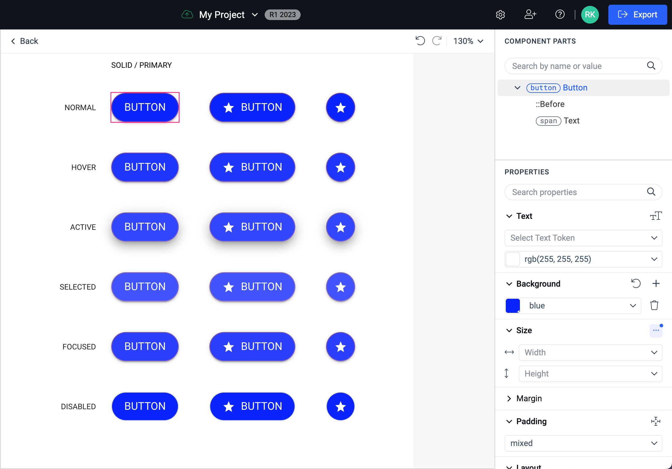
To achieve that, you will take advantage of the way how the properties are being applied—the complex components are composited from simple ones. To have a blue background color in all the Buttons, set the background only of the base Button component.
On the image below, you can see the results from setting a blue background in the Button's normal state:
And here is what happened with the primary Buttons which are in a Grid:
Changing the background at the most base level resulted in changed backgrounds for all Button components although they are in a Grid, Pager, and so on. This is similar to the first code example above, which demonstrates the styling with the maximum impact.
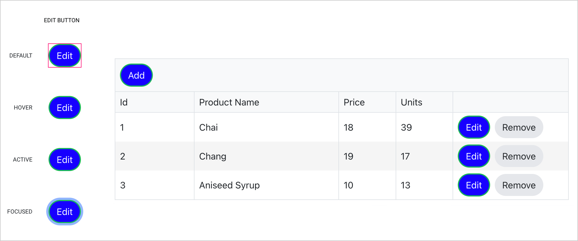
Your next front-end task is to change the background color to the primary Buttons in a Grid. Let’s do this and see what happens.
On the image below, you can see how the Button components inside a Grid cell look like:
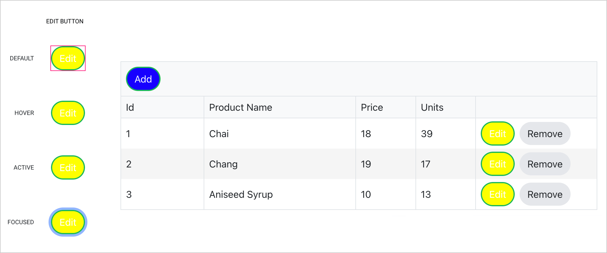
And here is how the rest of the primary Buttons look like:
When you set a property to a given component in ThemeBuilder, the selector for that style is generated through an algorithm which detects and estimates what the style specificity should be so that style has a maximum impact. At the same time, the selector must be specific enough to be applied to the correct components.
Use Variables instead of Hard-Coded Values
An effective strategy for achieving smooth changes in the styling of components and improving the documentation of the styling process is to use variables instead of hard-coded values whenever possible.
For example, if you need to change the background colors for all components that have a selected state, you can create a variable called selected-state-background and use this variable wherever necessary.
Now, suppose your designer decides that the color initially provided for the background of the selected states is too light and needs to be darkened. Thanks to the strategy you implemented, you can simply update the value of the variable in one location rather than having to manually change the hard-coded values across all components. This makes the process much more efficient and streamlined.