Creating and Styling Component Variants
Environment
| Product Version | 06/07/2023 | |
| Product | ThemeBuilder Ultimate, ThemeBuilder Enterprise |
Description
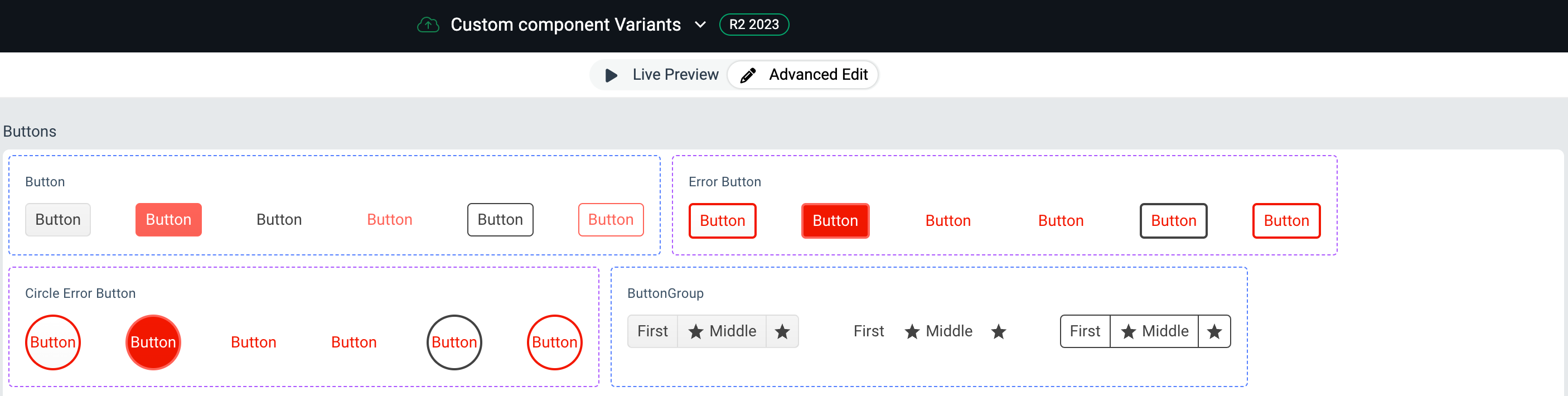
How can I create a new component variant of the Button by duplicating the base Telerik and Kendo UI components? Next, I want to use the new variant and build upon its custom styles.
Solution
-
Duplicate the Button component:
- In the Name field, enter
Error Button. - In the Class name field, enter
my-error-button.
- In the Name field, enter
-
Create another variant by duplicating the duplicate that you created in the previous step.
- In the Name field, enter
Circle Error Button. - In the Class name field, enter
my-circle-error-button.
- In the Name field, enter
The steps above will result in the following:
- A new Error Button component variant will appear. It will inherit all styles from the base Button component.
- A new Circle Error Button component variant will appear. It will inherit all styles from the base Button component and from the Error Button variant.
The code snippet below demonstrates how to use the component variants in real-life applications. Part of the exported package is the following SCSS targeting the Error Button and Circle Error Button.
// Some of the Error Button styles
.my-error-button.k-button.k-button-solid-base {
  background-color: white;
  background-image: linear-gradient(rgba(0, 0, 0, 0), rgba(0, 0, 0, 0.02));
  color: $tb-error;
  border-bottom-color: $tb-error;
  border-left-color: $tb-error;
  border-right-color: $tb-error;
  border-top-color: $tb-error;
}
.my-error-button.k-button {
  border-bottom-width: 2px;
  border-left-width: 2px;
  border-right-width: 2px;
  border-top-width: 2px;
}

// Circle Error Button styles
.my-error-button.my-circle-error-button.k-button.k-rounded-md {
  border-bottom-left-radius: 100px;
  border-bottom-right-radius: 100px;
  border-top-left-radius: 100px;
  border-top-right-radius: 100px;
}
.my-error-button.my-circle-error-button.k-button {
  width: 50px;
  height: 50px;
}
To apply these styles work to the Telerik and Kendo UI Button component, set the component's CSS class property to the desired value. The rendered HTML component will look like this:
<button class="k-button k-button-md k-button-solid k-button-solid-base k-rounded-md my-error-button">
  <span class="k-button-text">Error Button</span>
</button>
...

<button class="k-button k-button-md k-button-solid k-button-solid-base k-rounded-md my-error-button my-circle-error-button">
  <span class="k-button-text">Circle Error Button</span>
</button>
To use the Error Button, set the button's class attribute to
my-error-button.To use the Circle Error Button, set the button's class attribute to
my-error-button my-circle-error-buttonin order to chain both class names.
Setting the class attribute depends on the Telerik and Kendo UI components's API for the used technology.
You can see the result from the snippets above this StackBlitz example.