Key Features
The purpose of this help article is to show you the key features of the RadComboBox control.
Data Binding
You could set static items to the control's ItemsSource or binding it to a complex object using the DisplayMemberPath property. For more information please check the ComboBox Data Binding article.
Placeholder
- Placeholder(string): The text which is used to give guidance to the end user on what should be entered/searched in the input. The watermark text is displayed when the input field is empty, or the selected item/s is/are cleared.
- PlaceholderColor(Color): Defines the color for the watermark text.
Here is an example of setting the Placeholder property:
<telerikInput:RadComboBox Placeholder="Select City!"
                          ItemsSource="{Binding Items}"
                          DisplayMemberPath="Name"/>
and the result:

Text
- Text(string): Specifies the Text of the control. This is the Text that gets visualized when the control is editable or when it is non-editable and the selection mode is single.
ClearButton Visibility
The visibility state of the Clear X button can be changed using the IsClearButtonVisible(bool) property. By default its value is true.
Here is an example with IsClearButtonVisible property set:
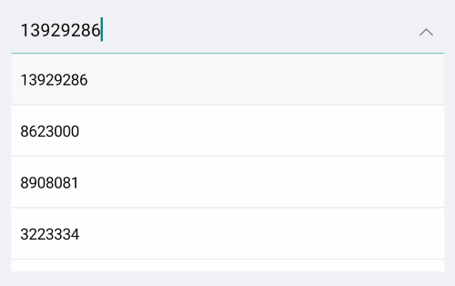
<telerikInput:RadComboBox IsClearButtonVisible="False"
                          ItemsSource="{Binding Items}"
                          DisplayMemberPath="Population"
                          IsEditable="True"
                          SearchTextPath="Population"
                          Keyboard="Numeric"/>
and the result:
DropDown Behavior
ComboBox provides the following properties for managing the drop down visbility:
-
IsDropDownOpen(bool): Defines whether the drop down part of the control is opened. Default value is
true. -
IsDropdownClosedOnSelection(bool): Defines whether the drop down should be closed when item is selected/deselected. The default value is
true.
Here is an example with IsDropdownClosedOnSelection property set:
<telerikInput:RadComboBox IsDropDownClosedOnSelection="False"
                          ItemsSource="{Binding Items}"
                          DisplayMemberPath="Name"/>
-
OpenOnFocus(bool):Defines whether the drop down should be opened when the control is focused. The default value is
true. It is only applicable for Editable ComboBox.
Here is an example with OpenOnFocus property set:
<telerikInput:RadComboBox OpenOnFocus="False"
                          ItemsSource="{Binding Items}"
                          IsEditable="True"
                          SearchTextPath="Name"
                          DisplayMemberPath="Name"/>
Keyboard
The Keyboard property of type Xamarin.Forms.Keyboard allows you to define the type of the keyboard that will be visualized by the device. The default value is Text.
Editing
ComboBox supports both editable and noneditable state. When the control is in edit mode searching can be performed. For more details please check the Editing article.
Searching
ComboBox provides both case-sensitive and case-insensitive searching modes. The available options are: Contains, StartsWith, ContainsCaseSensitive and StartsWithCaseSensitive. Please check the Searching article for more details and a sample demo.
Selection
ComboBox control has a support for single and multiple selection. You can easily specify the required selection using the SelectionMode property. You can check all properties, event and commands provided for the selection feature in the Combobox Selection article.
The Key Features example can be found in our SDK Browser Application. You can find the applications in the Examples folder of your local Telerik UI for Xamarin installation or in the following GitHub repo.