ComboBox Header and Footer
You can easily add Header and Footer to the Drop Down list of the ComboBox control through the following propertes:
- HeaderTemplate(DataTemplate): Defines the template of the header that will be visualized in the drop down list.
- FooterTemplate(DataTemplate): Defines the template of the footer that will be visualized in the drop down list.
It is not recommended to add controls in the Header and Footer which steal the focus (like Entry, editor, etc.) from the ComboBox control, as unexpected behavior may occur.
Example
Here is the ComboBox definition in XAML:
<telerikInput:RadComboBox ItemsSource="{Binding Items}"
                          DisplayMemberPath="Name"
                          IsEditable="True"
                          SearchMode="Contains"
                          SearchTextPath="Name"
                          Placeholder="Select which city you want to visit"
                          SelectionMode="Multiple"
                          DropDownHeight="300"
                          x:Name="comboBox">
    <telerikInput:RadComboBox.HeaderTemplate>
        <DataTemplate>
            <StackLayout BackgroundColor="LightBlue">
                <Label Text="To Visit List!"
                       FontSize="20"
                       TextColor="Black"
                       BackgroundColor="LightBlue"
                       VerticalOptions="Center"
                       HorizontalOptions="Center"/>
            </StackLayout>
        </DataTemplate>
    </telerikInput:RadComboBox.HeaderTemplate>
    <telerikInput:RadComboBox.FooterTemplate>
        <DataTemplate>
            <StackLayout>
                <Button Text="Add Items" Clicked="Button_Clicked" BackgroundColor="LightBlue"/>
            </StackLayout>
        </DataTemplate>
    </telerikInput:RadComboBox.FooterTemplate>
</telerikInput:RadComboBox>
the sample business model
public class City
{
    public string Name { get; set; }
    public int Population { get; set; }
}
and the ViewModel used:
public class ViewModel : NotifyPropertyChangedBase
{
    public ViewModel()
    {
        this.Items = new ObservableCollection<City>
        {
            new City { Name = "Tokyo", Population = 13929286 },
            new City { Name = "New York", Population = 8623000 },
            new City { Name = "London", Population = 8908081 },
            new City { Name = "Madrid", Population = 3223334 },
            new City { Name = "Los Angeles", Population = 4000000},
            new City { Name = "Paris", Population = 2141000 },
            new City { Name = "Beijing", Population = 21540000 },
            new City { Name = "Singapore", Population = 5612000 },
            new City { Name = "New Delhi", Population = 18980000 },
            new City { Name = "Bangkok", Population = 8305218 },
            new City { Name = "Berlin", Population = 3748000 },
        };
    }

    public ObservableCollection<City> Items { get; set; }
}
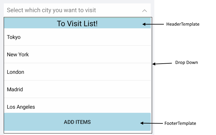
This is how the Header and Footer Templates look:
Header and Footer Template example can be found in our SDK Browser Application. You can find the applications in the Examples folder of your local Telerik UI for Xamarin installation or in the following GitHub repo.