Visual Structure of ComboBox for Xamarin
Here are described all visual elements used in the ComboBox for Xamarin.
ComboBox Visual Structure

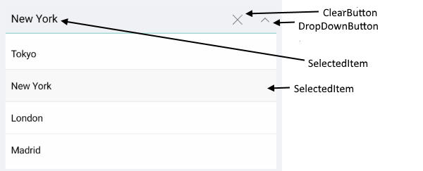
Single Selection

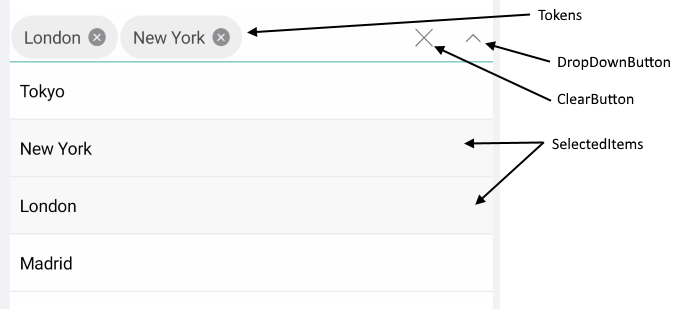
Multiple Selection

DropDown Visual Structure
Single Selection

Multiple Selection

Legend
- Placeholder - The text which is used to give guidance to the end user on what should be entered/searched in the input.
- ClearButton - Clears the selection of the control both multiple and single.
- Tokens - When multiple items are selected from the dropdown list, these items appear as tokens. They can easily be deselected using their close button.
- SelectedItem - The currently selected item.
- SelectedItems - The selected items, when mulptiple selection is used.
- DropDownButton - A button used for opening and closing the DropDown part of the control – the arrow icon of the button indicates whether it is currently opened or closed.
SDK Browser and QSF applications contain different examples that show RadComboBox's main features. You can find the applications in the Examples and QSF folders of your local Telerik UI for Xamarin installation.