Theming and Style
ComboBox Styling
ComboBox control for Xamarin provides the following Style properties for customizing its look:
- PlaceholderColor(Xamarin.Forms.Color): Defines the color for the placeholder text.
- TextColor(Xamarin.Forms.Color): Defines the color of the text when the control is editable and color of the selected item when it is not editable and selection mode is single.
- BackgroundColor(Xamarin.Forms.Color): Defines the background color of the control.
- BorderColor(Xamarin.Forms.Color): Defines the color of the border.
- BorderThickness(Xamarin.Forms.Color): Defines the thickness of the border.
- FocusedBorderColor(Xamarin.Forms.Color): Defines the color of the nborder when the control is focused.
- ClearButtonStyle(of type Style with target type Xamarin.Forms.Button): Defines the style for the clear button.
-
Font Options(
FontAttributes,FontFamily,FontSize): Define the font options to the text of the RadComboBox. It is applied to the Placeholder, Selected Text(for single selection) and when the control is in Editable Mode.
Example for ComboBox Styling
Here is the ComboBox definition in XAML:
<telerikInput:RadComboBox ItemsSource="{Binding Items}"
                          Placeholder="Select City!"
                          PlaceholderColor="Blue"
                          BackgroundColor="LightGray"
                          FocusedBorderColor="Blue"
                          BorderColor="Black"
                          BorderThickness="2"
                          ClearButtonStyle="{StaticResource ClearButtonStyle}"
                          DisplayMemberPath="Name">
    <telerikInput:RadComboBox.BindingContext>
        <local:ViewModel/>
    </telerikInput:RadComboBox.BindingContext>
</telerikInput:RadComboBox>
in addition you will need to add the following namespace:
xmlns:telerikInput="clr-namespace:Telerik.XamarinForms.Input;assembly=Telerik.XamarinForms.Input"
the sample business model
public class City
{
    public string Name { get; set; }
    public int Population { get; set; }
}
and the ViewModel used:
public class ViewModel : NotifyPropertyChangedBase
{
    public ViewModel()
    {
        this.Items = new ObservableCollection<City>
        {
            new City { Name = "Tokyo", Population = 13929286 },
            new City { Name = "New York", Population = 8623000 },
            new City { Name = "London", Population = 8908081 },
            new City { Name = "Madrid", Population = 3223334 },
            new City { Name = "Los Angeles", Population = 4000000},
            new City { Name = "Paris", Population = 2141000 },
            new City { Name = "Beijing", Population = 21540000 },
            new City { Name = "Singapore", Population = 5612000 },
            new City { Name = "New Delhi", Population = 18980000 },
            new City { Name = "Bangkok", Population = 8305218 },
            new City { Name = "Berlin", Population = 3748000 },
        };
    }

    public ObservableCollection<City> Items { get; set; }
}
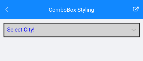
Here is how the Combobox looks when styling is applied:
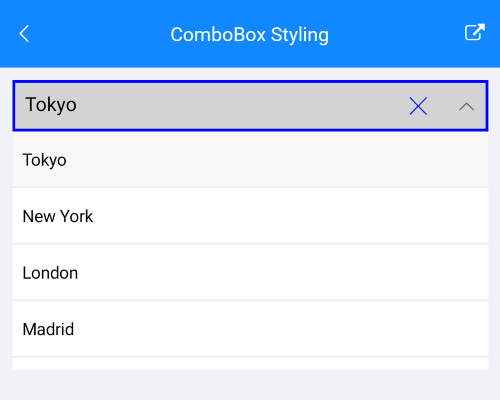
Here is how the styling is applied when the control is focused and item is selected:
The ComboBox Styling example can be found in our SDK Browser Application. You can find the applications in the Examples folder of your local Telerik UI for Xamarin installation or in the following GitHub repo.
DropDown Styling
The following properties styles the ComboBox Drop Down:
- DropDownBorderColor(Xamarin.Forms.Color): Defines the color of the border around the drop down part of the control.
- DropDownBorderThickness(Xamarin.Forms.Thickness): Defines the thickness of the border that is around of the drop down part of the control.
- DropDownBorderCornerRadius(Xamarin.Forms.Thickness): Defines the corner radius of the border that is around the drop down part of the control
- DropDownBackgroundColor(Xamarin.Forms.Color): Defines the background color of the drop down part of the control.
- DropDownButtonStyle(of type Style with target type Xamarin.Forms.Button): Defines the style for the drop down button.
Example Drop Down Styling
Here is the ComboBox definition in XAML:
<telerikInput:RadComboBox ItemsSource="{Binding Items}"
                          IsEditable="True"
                          SearchTextPath="Name"
                          DisplayMemberPath="Name"
                          SelectionMode="Multiple"
                          HighlightTextColor="Black"
                          DropDownBorderColor="Blue"
                          DropDownBorderThickness="2"
                          DropDownCornerRadius="5"
                          DropDownBackgroundColor="LightBlue"
                          DropDownButtonStyle="{StaticResource DropDownButtonStyle}">
    <telerikInput:RadComboBox.BindingContext>
        <local:ViewModel/>
    </telerikInput:RadComboBox.BindingContext>
</telerikInput:RadComboBox>
add the following namespace:
xmlns:telerikInput="clr-namespace:Telerik.XamarinForms.Input;assembly=Telerik.XamarinForms.Input"
The DropDown Button Style is defined in the Page's ResourceDictionary:
<Style TargetType="Button" x:Key="DropDownButtonStyle">
    <Setter Property="FontSize" Value="14"/>
    <Setter Property="HorizontalOptions" Value="Center"/>
    <Setter Property="VerticalOptions" Value="Center"/>
    <Setter Property="WidthRequest" Value="24"/>
    <Setter Property="HeightRequest" Value="24"/>
    <Setter Property="Padding" Value="0"/>
    <Setter Property="BackgroundColor">
        <Setter.Value>
            <OnPlatform x:TypeArguments="Color">
                <On Platform="Android">Transparent</On>
            </OnPlatform>
        </Setter.Value>
    </Setter>
    <Setter Property="TextColor" Value="Blue"/>
    <Setter Property="Margin">
        <Setter.Value>
            <OnPlatform x:TypeArguments="Thickness">
                <On Platform="Android">8, 0, 4, 0</On>
                <On Platform="iOS">8, 6, 4, 7</On>
                <On Platform="UWP">6, 1, 10, 1</On>
            </OnPlatform>
        </Setter.Value>
    </Setter>
</Style>
the sample business model
public class City
{
    public string Name { get; set; }
    public int Population { get; set; }
}
and the ViewModel used:
public class ViewModel : NotifyPropertyChangedBase
{
    public ViewModel()
    {
        this.Items = new ObservableCollection<City>
        {
            new City { Name = "Tokyo", Population = 13929286 },
            new City { Name = "New York", Population = 8623000 },
            new City { Name = "London", Population = 8908081 },
            new City { Name = "Madrid", Population = 3223334 },
            new City { Name = "Los Angeles", Population = 4000000},
            new City { Name = "Paris", Population = 2141000 },
            new City { Name = "Beijing", Population = 21540000 },
            new City { Name = "Singapore", Population = 5612000 },
            new City { Name = "New Delhi", Population = 18980000 },
            new City { Name = "Bangkok", Population = 8305218 },
            new City { Name = "Berlin", Population = 3748000 },
        };
    }

    public ObservableCollection<City> Items { get; set; }
}
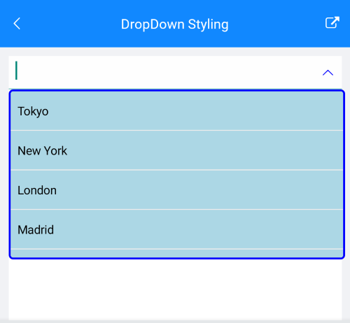
Here is how the Drop Down Styling looks:
The DropDown Styling example can be found in our SDK Browser Application. You can find the applications in the Examples folder of your local Telerik UI for Xamarin installation or in the following GitHub repo.