Templates
If the default templates of the control do not suit your needs, you can easily define custom ones. The available templates for customizing are:
- ItemTemplate(DataTemplate): Defines the template of the items that are visualized in the drop-down list.
When the selection mode is single and the control is not editable if there is ItemTemplate set the same template will be visualized in the box part of the control when item is selected.
- SelectedItemTemplate(DataTemplate): Defines the template of the selected items that are visualized in the drop-down list.
- TokenTemplate(DataTemplate): Defines the template of the tokens that are visualized when multiple selection is performed.
- ShowMoreTemplate(DataTemplate): Defines the Template of the show more UI that gets visualized when the control is not focused and there is not enough space for all Tokens to be visualized when the selection mode is multiple.
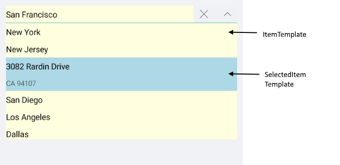
Example with ItemTemplate and SelectedItemTemplate
Here is the ComboBox definition in XAML:
<telerikInput:RadComboBox ItemsSource="{Binding Stores}"
                          DisplayMemberPath="City"
                          Placeholder="Select Store">
    <telerikInput:RadComboBox.ItemTemplate>
        <DataTemplate>
            <StackLayout BackgroundColor="LightYellow" VerticalOptions="Center">
                <Label Text="{Binding City}"
                       Style="{StaticResource labelStyle}"/>
            </StackLayout>
        </DataTemplate>
    </telerikInput:RadComboBox.ItemTemplate>
    <telerikInput:RadComboBox.SelectedItemTemplate>
        <DataTemplate>
            <StackLayout BackgroundColor="LightBlue">
                <Label Text="{Binding Street}" Style="{StaticResource labelStyle}"/>
                <Label Text="{Binding Code}" FontSize="12" Margin="10,0,0,5"/>
            </StackLayout>
        </DataTemplate>
    </telerikInput:RadComboBox.SelectedItemTemplate>
</telerikInput:RadComboBox>
you need to add the following namespace:
xmlns:telerikInput="clr-namespace:Telerik.XamarinForms.Input;assembly=Telerik.XamarinForms.Input"
the sample business model
public class StoreAddress
{
    public string City { get; set; }
    public string Street { get; set; }
    public string Code { get; set; }
    public string WorkHours { get; set; }
}
and the ViewModel used:
public class ViewModel : NotifyPropertyChangedBase
{
    private SearchMode searchMode;

    public ViewModel()
    {
        this.Stores = new ObservableCollection<StoreAddress>();
        this.Stores.Add(new StoreAddress() { City = "New York", Street = "536 Halifax Road", Code = "Woodside, NY 11377", WorkHours = "Open 11am to 6pm" });
        this.Stores.Add(new StoreAddress() { City = "New Jersey", Street = "4759 Cherry Camp Road", Code = "NJ 07097", WorkHours = "Open 10am to 7pm" });
        this.Stores.Add(new StoreAddress() { City = "San Francisco", Street = "3082 Rardin Drive", Code = "CA 94107", WorkHours = "Open 10am to 7pm" });
        this.Stores.Add(new StoreAddress() { City = "San Diego", Street = "1593 Hood Avenue", Code = "CA 92123", WorkHours = "Open 11am to 6pm" });
        this.Stores.Add(new StoreAddress() { City = "Los Angeles", Street = "28 Woodstock Drive", Code = "CA 90017", WorkHours = "Open 6am to 9pm" });
        this.Stores.Add(new StoreAddress() { City = "Dallas", Street = "2586 Sardis Sta", Code = "X 75201", WorkHours = "Open 10am to 9pm" });
        this.Stores.Add(new StoreAddress() { City = "Austin", Street = "3684 Sundown Lane", Code = "TX 78741", WorkHours = "Open 10am to 67pm" });
    }

    public ObservableCollection<StoreAddress> Stores { get; set; }

    public SearchMode SearchMode
    {
        get
        {
            return this.searchMode;
        }
        set
        {
            if (this.searchMode != value)
            {
                this.searchMode = value;
                this.OnPropertyChanged();
            }
        }
    }
}
The final result:
The Item and SelectedItem Template example can be found in our SDK Browser Application. You can find the applications in the Examples folder of your local Telerik UI for Xamarin installation or in the following GitHub repo.
Example with TokenTemplate and ShowMoreTemplate
Here is the ComboBox definition in XAML:
<telerikInput:RadComboBox ItemsSource="{Binding Items}"
Placeholder="Select City!"
SelectionMode="Multiple"
DisplayMemberPath="Name"
x:Name="comboBox">
<telerikInput:RadComboBox.TokenTemplate>
<DataTemplate>
<telerikPrimitives:RadBorder BackgroundColor="LightBlue"
CornerRadius="10"
Margin="2">
<StackLayout Orientation="Horizontal"
Margin="3">
<Label Text="{Binding Name}"
TextColor="Black"
VerticalTextAlignment="Center"
Margin="2" />
<Label FontFamily="{StaticResource IconsFontFamily}"
Text="" FontSize="10"
VerticalTextAlignment="Center"
TextColor="Black"
Margin="2">
<Label.GestureRecognizers>
<TapGestureRecognizer Tapped="TapGestureRecognizer_Tapped"/>
</Label.GestureRecognizers>
</Label>
</StackLayout>
</telerikPrimitives:RadBorder>
</DataTemplate>
</telerikInput:RadComboBox.TokenTemplate>
<telerikInput:RadComboBox.ShowMoreTemplate>
<DataTemplate>
<Label Text="{Binding Path=., StringFormat='+{0} more items'}"
VerticalTextAlignment="Center"/>
</DataTemplate>
</telerikInput:RadComboBox.ShowMoreTemplate>
</telerikInput:RadComboBox>
add the following namespace:
xmlns:telerikInput="clr-namespace:Telerik.XamarinForms.Input;assembly=Telerik.XamarinForms.Input"
the sample business model
public class City
{
    public string Name { get; set; }
    public int Population { get; set; }
}
and the ViewModel used:
public class ViewModel : NotifyPropertyChangedBase
{
    public ViewModel()
    {
        this.Items = new ObservableCollection<City>
        {
            new City { Name = "Tokyo", Population = 13929286 },
            new City { Name = "New York", Population = 8623000 },
            new City { Name = "London", Population = 8908081 },
            new City { Name = "Madrid", Population = 3223334 },
            new City { Name = "Los Angeles", Population = 4000000},
            new City { Name = "Paris", Population = 2141000 },
            new City { Name = "Beijing", Population = 21540000 },
            new City { Name = "Singapore", Population = 5612000 },
            new City { Name = "New Delhi", Population = 18980000 },
            new City { Name = "Bangkok", Population = 8305218 },
            new City { Name = "Berlin", Population = 3748000 },
        };
    }

    public ObservableCollection<City> Items { get; set; }
}
when the default TokenTemplate is overriden, you will need to implement custom logic for removing the tokens from the ComboBox:
here is a sample logic removing the token when adding TapGestureRecognizer to the Label:
private void TapGestureRecognizer_Tapped(object sender, System.EventArgs e)
{
    var closeLabel = sender as Label;
    if (closeLabel != null)
    {
        var item = closeLabel.BindingContext as City;
        if (item != null)
        {
            this.comboBox.SelectedItems.Remove(item);
        }
    }
}
Here is the how the Token and ShowMore Templates look:
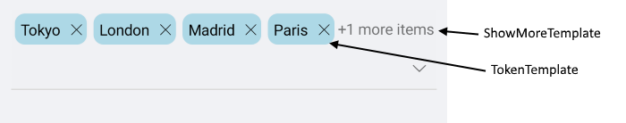
The Token and ShowMore Template example can be found in our SDK Browser Application. You can find the applications in the Examples folder of your local Telerik UI for Xamarin installation or in the following GitHub repo.
Default Templates
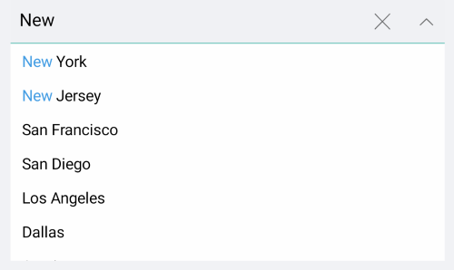
Default ItemTemplate and SelectedItemTemplate of RadComboBox provide highlighting of the matching text while searching - this is implemented through a small auxiliary control in the templates, named RadHighlightLabel. RadHighlightLabel exposes UnformattedText property that should be set to the complete text shown in the label and HighlightText that should be set to the highlighted part of that text.
The example below shows the default ItemTemplate and SelectedItemTemplate with the RadHighlightLabel properly setup to highlight the search text coming from the RadComboBox input field.
First, add the required DataTemplates inside the Resources of your page:
<ResourceDictionary>
    <DataTemplate x:Key="CustomItemTemplate">
        <telerikPrimitives:RadBorder BorderColor="Transparent"
                                     BorderThickness="0">
            <telerikPrimitives:RadHighlightLabel UnformattedText="{Binding City}"
                                                 HighlightText="{Binding Source={x:Reference comboBox}, Path=SearchText, Mode=OneWay}"
                                                 VerticalTextAlignment="Center"
                                                 TextColor="Black"
                                                 HighlightTextColor="#429CE3"
                                                 MinimumHeightRequest="32"
                                                 Padding="10, 6, 0, 6"/>
        </telerikPrimitives:RadBorder>
    </DataTemplate>
    <DataTemplate x:Key="CustomSelectedItemTemplate">
        <telerikPrimitives:RadBorder BorderColor="Transparent"
                                     BorderThickness="0"
                                     BackgroundColor="#FFF7DD">
            <telerikPrimitives:RadHighlightLabel UnformattedText="{Binding City}"
                                                 HighlightText="{Binding Source={x:Reference comboBox}, Path=SearchText, Mode=OneWay}"
                                                 VerticalTextAlignment="Center"
                                                 TextColor="Black"
                                                 HighlightTextColor="#429CE3"
                                                 MinimumHeightRequest="32"
                                                 Padding="10, 6, 0, 6"/>
        </telerikPrimitives:RadBorder>
    </DataTemplate>
</ResourceDictionary>
Add the required namespace:
xmlns:telerikPrimitives="clr-namespace:Telerik.XamarinForms.Primitives;assembly=Telerik.XamarinForms.Primitives"
xmlns:telerikInput="clr-namespace:Telerik.XamarinForms.Input;assembly=Telerik.XamarinForms.Input"
And here is the RadComboBox definition with the defined templates referenced:
<telerikInput:RadComboBox x:Name="comboBox"
                          ItemsSource="{Binding Stores}"
                          DisplayMemberPath="City"
                          IsEditable="true"
                          SearchTextPath="City"
                          Placeholder="Select Store"
                          ItemTemplate="{StaticResource CustomItemTemplate}"
                          SelectedItemTemplate="{StaticResource CustomSelectedItemTemplate}"/>
Check the result in the screenshot below: