Agenda View
With R1 2020 RadCalendar comes with new Agenda view mode which shows a list of the scheduled appointments grouped by date. With AgendaView you can enable the app users to quickly check on everything coming up in their calendars.
In addition, you have full control over the way the Agenda view is visualized - you can set custom date and time formats as well as modify the style (text color, font, alignment) of each text label shown across the view separately.
AgendaView provides convenient way to display appointments chronologically. For more details on the Appointments feature of RadCalendar refer to Appointments topic.
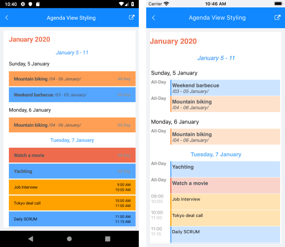
In order to enable AgendaView, just set ViewMode property of RadCalendar to "Agenda". The image below shows Calendar AgendaView with its default look:
AgendaView is available only on Android and iOS.
Date and Time Format Settings
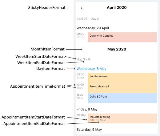
You can find below a full list of the available date and time format settings for Agenda View:
- MonthItemFormat: Defines the format of the label shown at the beginning of each month.
- WeekItemStartDateFormat: Sets the format of the start date of each week;
- WeekItemEndDateFormat: Sets the format of the end date of each week;
- DayItemFormat: Specifies the format of the label shown at the beginning of each day;
- AppointmentItemTimeFormat: Defines the time format shown for the appointments;
- AppointmentItemStartDateFormat: Sets the format of the start date of the multi-day appointments;
- AppointmentItemEndDateFormat: Specifies the format of the end date of the multi-day appointments;
- StickyHeaderFormat: Specifies the format of the label shown in the "frozen" header at the top of the view. For more details on this go to Sticky Headers section.
The next image shows more clearly which format property to which agenda item corresponds:
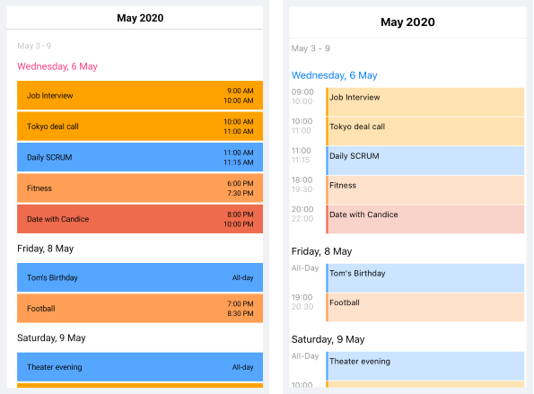
All of the above are applied using the AgendaViewSettings property of RadCalendar. Here is a quick example on how they could be set:
<telerikInput:RadCalendar x:Name="calendar"
                          ViewMode="Agenda">
    <telerikInput:RadCalendar.AgendaViewSettings>
        <telerikInput:AgendaViewSettings MonthItemFormat="YYYY MMM"
                                         WeekItemStartDateFormat="dd MMMM"
                                         WeekItemEndDateFormat="dd"
                                         DayItemFormat="EEE d MMM"
                                         AppointmentItemTimeFormat="HH mm"
                                         AppointmentItemEndDateFormat="MMM d"
                                         AppointmentItemStartDateFormat="MMM d"
                                         IsHeaderSticky="True"
                                         StickyHeaderFormat="YYYY MMM"/>
    </telerikInput:RadCalendar.AgendaViewSettings>
</telerikInput:RadCalendar>
The next image shows Agenda view with the AgendaViewSettings applied:

Sticky Headers
Starting with R2 2020 AgendaView provides sticky month headers. This means the current month header will "freeze" while scrolling through the items until the whole month is scrolled away. As you scroll through the next month, the currently sticked month header will be pushed by the next month header.
Sticky headers behavior is enabled by default, you have the option to disable it by setting the IsHeaderSticky property of the AgendaViewSettings to False.
<telerikInput:RadCalendar x:Name="calendar"
                          ViewMode="Agenda">
    <telerikInput:RadCalendar.AgendaViewSettings>
        <telerikInput:AgendaViewSettings IsHeaderSticky="False" />
    </telerikInput:RadCalendar.AgendaViewSettings>
</telerikInput:RadCalendar>
In addition, AgendaView provides means for customizing the look & feel of the sticky header through the StickyHeaderStyle property of the AgendaViewSettings.
StickyHeaderStyle is of type AgendaStickyHeaderStyle and exposes the following properties:
- DecorationColor, DecorationHeight - related to the decoration line which separates the sticky header from the rest of the view;
- TextColor, Padding, FontSize, FontFamily, FontAttributes and HorizontalTextAlignment - standard styling settings related to the header label.
Check below a quick example on how StickyHeaderStyle can be applied:
Let's have the following sample Calendar definition:
<telerikInput:RadCalendar x:Name="calendar"
                          ViewMode="Agenda">
    <telerikInput:RadCalendar.AgendaViewSettings>
        <telerikInput:AgendaViewSettings IsHeaderSticky="True"
                                         StickyHeaderFormat="MMMM, YYYY"
                                         StickyHeaderStyle="{StaticResource MyStickyHeaderStyle}"/>
    </telerikInput:RadCalendar.AgendaViewSettings>
</telerikInput:RadCalendar>
Add the referenced Style in the Resources section of the page:
<telerikInput:AgendaStickyHeaderStyle x:Key="MyStickyHeaderStyle"
                                      TextColor="#EE6D4C"
                                      FontAttributes="Bold"
                                      FontSize="20"
                                      HorizontalTextAlignment="Center"
                                      DecorationColor="#EE6D4C"
                                      DecorationHeight="5"/>
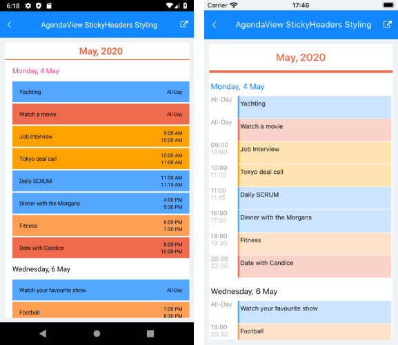
And here is the result on Android and iOS:
Agenda Items Styling
RadCalendar provides means for customizing the look & feel of each element of the AgendaView, such as text labels for months, weeks and days as well as the appointments. This is implemented through the AgendaItemStyleSelector property of the AgendaViewSettings class.
In order to modify the default styles, you would need to create a custom selector class based on the AgendaItemStyleSelector and override the following methods that handle the styling of different agenda view items:
- SelectMonthItemStyle: Sets the style of the labels shown at the beginning of each month; Through the parameter of type AgendaMonthItem you can receive the exact month the style refers to.
- SelectWeekItemStyle: Specifies the style of the labels shown for each week; Through the parameter of type AgendaWeekItem you can get the start and end dates of the week the style refers to.
-
SelectDayItemStyle: Sets the style of the labels displayed for the days inside the agenda view; Through the parameter of type AgendaDayItem you can receive the date the style refers to.
All of the above methods return an object of type AgendaTextItemStyle which provides standard styling settings such as TextColor, Padding, FontSize, FontFamily, FontAttributes and HorizontalTextAlignment.
-
SelectAppointmentItemStyle: Specifies the style of the appointment agenda items; Through the parameter of type AgendaAppointmentItem you can receive the date the appointment is shown for (in case of multi-day appointments) as well as the Appointment instance;
SelectAppointmentItemStyle returns an object of type AgendaAppointmentItemStyle, which in turn, provides the listed below settings:
- TitleTextColor, TitleFontSize, TitleFontFamily, TitleFontAttributes: Refer to the appointment title label;
- DaysDurationTextColor, DaysDurationFontSize, DaysDurationFontFamily, DaysDurationFontAttributes: Refer to the start and end dates of the multi-day appointments;
- TimeDurationTextColor, TimeDurationFontSize, TimeDurationFontFamily, TimeDurationFontAttributes: Refer to the start and end times of the appointments.
Below you can find a sample implementation of a custom class that derives from AgendaItemStyleSelector and overrides its methods for selecting styles for various agenda items:
public class CustomAgendaViewItemStyleSelector : AgendaItemStyleSelector
{
    private DateTime now;
    public CustomAgendaViewItemStyleSelector()
    {
        this.now = DateTime.Now;
    }

    public AgendaTextItemStyle CurrentMonthStyle { get; set; }
    public AgendaTextItemStyle CurrentMonthWeeksStyle { get; set; }
    public AgendaTextItemStyle TodayStyle { get; set; }
    public AgendaAppointmentItemStyle AllDayAppointmentStyle { get; set; }

    public override AgendaTextItemStyle SelectMonthItemStyle(AgendaMonthItem item)
    {
        if (this.now.Month == item.Date.Month && this.now.Year == item.Date.Year)
        {
            return this.CurrentMonthStyle;
        }

        return null;
    }

    public override AgendaTextItemStyle SelectWeekItemStyle(AgendaWeekItem item)
    {
        if (this.now.Month == item.StartDate.Month && this.now.Year == item.StartDate.Year)
        {
            return this.CurrentMonthWeeksStyle;
        }

        return null;
    }

    public override AgendaTextItemStyle SelectDayItemStyle(AgendaDayItem item)
    {
        if (this.now.Date == item.Date.Date)
        {
            return this.TodayStyle;
        }

        return null;
    }

    public override AgendaAppointmentItemStyle SelectAppointmentItemStyle(AgendaAppointmentItem item)
    {
        if (item.Appointment.IsAllDay)
        {
            return this.AllDayAppointmentStyle;
        }

        return null;
    }
}
Next, you'd need to add the CustomAgendaViewItemStyleSelector as a resource to your page and define the previously created AgendaTextItemStyle and AgendaAppointmentItemStyle properties:
<ResourceDictionary>
    <local:CustomAgendaViewItemStyleSelector x:Key="CustomAgendaViewItemStyleSelector">
        <local:CustomAgendaViewItemStyleSelector.CurrentMonthStyle>
            <telerikInput:AgendaTextItemStyle TextColor="#EE6D4C"
                                              FontAttributes="Bold"
                                              FontSize="20"
                                              HorizontalTextAlignment="Start"/>
        </local:CustomAgendaViewItemStyleSelector.CurrentMonthStyle>
        <local:CustomAgendaViewItemStyleSelector.CurrentMonthWeeksStyle>
            <telerikInput:AgendaTextItemStyle TextColor="#218CFF"
                                              FontAttributes="Italic"
                                              FontSize="16"
                                              HorizontalTextAlignment="Center"/>
        </local:CustomAgendaViewItemStyleSelector.CurrentMonthWeeksStyle>
        <local:CustomAgendaViewItemStyleSelector.TodayStyle>
            <telerikInput:AgendaTextItemStyle TextColor="#5EB1FF"
                                              FontAttributes="Bold"
                                              FontSize="15"
                                              HorizontalTextAlignment="Center"/>
        </local:CustomAgendaViewItemStyleSelector.TodayStyle>
        <local:CustomAgendaViewItemStyleSelector.AllDayAppointmentStyle>
            <telerikInput:AgendaAppointmentItemStyle TitleTextColor="#4B5157"
                                                     TitleFontAttributes="Bold"
                                                     TitleFontSize="14"
                                                     DaysDurationFontAttributes="Italic"
                                                     DaysDurationFontSize="13"
                                                     DaysDurationTextColor="#4B5157"
                                                     TimeDurationFontAttributes="Bold"
                                                     TimeDurationFontSize="12"
                                                     TimeDurationTextColor="#929293"/>
        </local:CustomAgendaViewItemStyleSelector.AllDayAppointmentStyle>
    </local:CustomAgendaViewItemStyleSelector>
</ResourceDictionary>
Lastly, add RadCalendar with ViewMode set to "Agenda" and apply the CustomAgendaViewItemStyleSelector through the AgendaViewSettings property:
<telerikInput:RadCalendar x:Name="calendar"
                          ViewMode="Agenda">
    <telerikInput:RadCalendar.AgendaViewSettings>
        <telerikInput:AgendaViewSettings AgendaItemStyleSelector="{StaticResource CustomAgendaViewItemStyleSelector}"/>
    </telerikInput:RadCalendar.AgendaViewSettings>
</telerikInput:RadCalendar>
Here is the result after running the example: