WPF NavigationView Overview
RadNavigationView is an adaptive component, used to build a consistent navigational experience in WPF applications. The control can automatically adjust its display mode based on the amount of screen space available to it, thus improving the overall user experience (UX) of your applications.
RadNavigationView is part of the powerful UI for WPF navigation controls framework, which includes components as RadToolBar, RadTreeView, RadPanelBar, RadWindow, RadMenu and more.
The RadNavigationView is part of Telerik UI for WPF, a
professional grade UI library with 160+ components for building modern and feature-rich applications. To try it out sign up for a free 30-day trial.
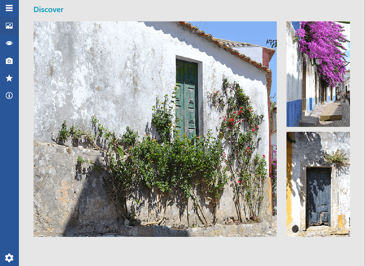
Figure 1: RadNavigationView in the Office 2016 theme

As every control from UI for WPF, RadNavigationView comes with a set of pre-defined themes. Of course, if you choose to do so, you can design your own templates for a completely custom look using Blend for Visual Studio.
Key Features
Adaptive Display Mode: The control dynamically adjusts its layout depending on the size that is available to it.
Powerful Data Binding: You can bind the control and its components to different sources such as Objects and Collections. Read more about this in the Data Binding section of the documentation.
Sub Items Support: This feature allows you to create a navigation menu with multiple levels of items in a tree-like structure. Read more about this in the Hierarchy article.
Flexible Header and Footer Content: Customize your headers and footers any way you want using direct content or data templates. Read more about this in the Header and Footer section of the documentation.
Keyboard Support: RadNavigationView allows you to perform navigation, selection and other tasks without using the mouse. Read more about this in the Keyboard Support article.
UI Automation Support: Check the UI Automation Support common article.
Enhanced Routed Events Framework: The events system of the control will help your code become even more elegant and concise.
Built-in Animations: NavigationView provides predefined and customizable open/close animations of the navigation pane.
Get started with the control with its Getting Started help article that shows how to use it in a basic scenario.
Check out the online demos at demos.telerik.com.
Telerik UI for WPF Support and Learning Resources
- Telerik UI for WPF NavigationView Homepage
- Get Started with the Telerik UI for WPF NavigationView
- Telerik UI for WPF API Reference
- Getting Started with Telerik UI for WPF Components
- Telerik UI for WPF Virtual Classroom (Training Courses for Registered Users)
- Telerik UI for WPF NavigationView Forums
- Telerik UI for WPF Knowledge Base