WPF TreeView Overview
Thank you for choosing Telerik RadTreeView!
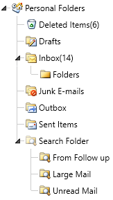
Do you have need of building complicated navigation systems which perform with the speed of light? With RadTreeView you can achieve all of this and much more. With its powerful databinding and load on demand mechanism, the control lets you display hierarchical structures, such as directories and relational data. With its drag and drop functionality and other advanced capabilities, RadTreeView significantly improves the navigation and performance of your application.
The RadTreeView is part of Telerik UI for WPF, a
professional grade UI library with 160+ components for building modern and feature-rich applications. To try it out sign up for a free 30-day trial.

Key Features
This is a list with short descriptions of the top-of-the-line features of Telerik's RadTreeView control.
Powerful DataBinding to Objects, Collections, XML and WCF services: Binding RadTreeView is as simple as setting a single property. The binding sources which the treeview supports include Objects, XML, WCF services. Read more about this in the Data binding section.
Load on Demand: The performance of the RadTreeView control when operating with huge amount of items is significantly optimized through its load on demand feature. This mechanism lets the nodes load their child nodes as the user expands the parent by clicking on the expand icon. Read more about this in the Load on Demand article.
Drag and Drop Behavior: The RadTreeView control enhances further your application’s capabilities through the rich drag-and-drop functionality. Your users can create and re-order any hierarchical structures and easily perform the following drag-and-drop operations: drag and drop onto another node or between two nodes; drag and drop between treeviews; drag and drop multiple nodes. Read more about this in the Drag and Drop article.
UI Virtualization: The RadTreeView API supports UI Virtualization, which processes only information loaded in the viewable area, which reduces the memory footprint of the application and speeds up loading time thus enhancing additionally the UI performance. Read more about this in the UI Virtualization article.
BringIntoView Support: The RadTreeView API offers BringIntoView support, which brings the provided item into view. Read more about this in the BringIntoView Support article.
Styling and Appearance: The control ships with several pre-defined themes that can be used to style the treeview control. Furthermore, Telerik's unique style building mechanism allows you to change the skin’s color scheme with just a few clicks. Read more about this in the Styles and Templates section.
Keyboard Support: Navigate through the nodes of the treeview without using the mouse. The keyboard can entirely replace the mouse by allowing you to perform navigation, editing, expanding, collapsing and selecting the nodes. Read more about this in the Keyboard Support article.
Lines Support: You can easily show/hide the connecting lines between the nodes by simply setting a single property. Read more about this in the Lines Support article.
Item Editing: RadTreeView supports editing the displayed text of the item. Read more about this in the Item Editing article.
Item Images: RadTreeView gives you the ability to define images for each item state (default, expanded, collapsed). Read more about this in the Item Images article.
Expanding and Collapsing Items: RadTreeView gives you the ability to expand and collapse items with your mouse, programmatically, recursively or just expanding a single branch of the treeview. Read more about this in the Expanding and Collapsing Items article.
Multi-node Selection: The treeview let users to select multiple nodes by simply setting a single property. Read more about this in the Selection article.
UI Automation Support: As the WPF platform exposes a full accessibility tree through UIA(UI Automation), Telerik UI for WPF fully support UI Automation for UI elements access/manipulation, screen readers and other accessibility tools. Read more about this in the UI Automation Support article.
Expression Blend Support: All UI for WPF controls can be easily customized using Expression Blend.
Get started with the control with its Getting Started help article that shows how to use it in a basic scenario.
Check out the control demos at demos.telerik.com
Telerik UI for WPF Support and Learning Resources
- Telerik UI for WPF TreeView Homepage
- Get Started with the Telerik UI for WPF TreeView
- Telerik UI for WPF API Reference
- Getting Started with Telerik UI for WPF Components
- Telerik UI for WPF Virtual Classroom (Training Courses for Registered Users)
- Telerik UI for WPF TreeView Forums
- Telerik UI for WPF Knowledge Base