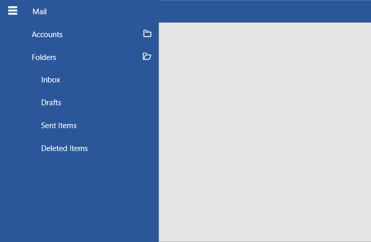
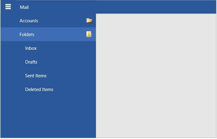
Hierarchy
RadNavigationView allows you to define sub-items in order to achieve hierarchical menu visualization.
Each RadNavigationViewItem element has an Items collection that can be populated with RadNavigationViewItem elements, thus allowing multiple levels of items to be defined in the hierarchy.
Setting up hierarchical navigation view in XAML
<telerik:RadNavigationView PaneHeader="Mail">
    <telerik:RadNavigationView.Items>
        <telerik:RadNavigationViewItem Content="Accounts">
            <telerik:RadNavigationViewItem.Items>
                <telerik:RadNavigationViewItem Content="Martin Ivanov (mi@prgs.com)" />
                <telerik:RadNavigationViewItem Content="Jon Doe (jd@prgs.com)" />
            </telerik:RadNavigationViewItem.Items>
        </telerik:RadNavigationViewItem>
        <telerik:RadNavigationViewItem Content="Folders">
            <telerik:RadNavigationViewItem.Items>
                <telerik:RadNavigationViewItem Content="Inbox"/>
                <telerik:RadNavigationViewItem Content="Drafts"/>
                <telerik:RadNavigationViewItem Content="Sent Items"/>
                <telerik:RadNavigationViewItem Content="Deleted Items"/>
            </telerik:RadNavigationViewItem.Items>
        </telerik:RadNavigationViewItem>
    </telerik:RadNavigationView.Items>
</telerik:RadNavigationView>
Hierarchical RadNavigationView

Multiple Expanded Items
By default, multiple RadNavigationViewItem elements with child items can be expanded at once. To change this and allow only a single expanded item, set the AllowMultipleExpandedItems property of RadNavigationView to False.
Disabling multiple expanded items at once
<telerik:RadNavigationView AllowMultipleExpandedItems="False" />
Child Items Indentation
To change the default horizontal offset (indent) of the child items relative to their parent, set the SubItemsIndentation property of RadNavigationView.
Setting the indent of sub items
<telerik:RadNavigationView SubItemsIndentation="10" />

Expand and Collapse Icon
RadNavigationViewItem has default expand and collapse icons shown in the right part of the item when it has children. To replace the icons, set the ExpandedIcon and CollapsedIcon properties of RadNavigationViewItem. The default icon template uses RadGlyph and you can set the properties to a glyph string from the glyphs reference sheet.
Setting the expand and collapse icons
<telerik:RadNavigationViewItem ExpandedIcon="" CollapsedIcon="">
To change this behavior and use other UI for the icons like a customized RadGlyph, an Image, or any other element, set the ExpandedIconTemplate and CollapsedIconTemplate properties. The properties expect DataTemplate values.
Setting the expand and collapse icon templates
<Window.Resources>
    <DataTemplate x:Key="ExpandedCollapsedIconTemplate">
        <Image Source="{Binding}" Width="16" Height="16" />
    </DataTemplate>
</Window.Resources>

<telerik:RadNavigationViewItem ExpandedIcon="Images/expanded-icon.png"
                               CollapsedIcon="Images/collapsed-icon.png"
                               ExpandedIconTemplate="{StaticResource ExpandedCollapsedIconTemplate}"
                               CollapsedIconTemplate="{StaticResource ExpandedCollapsedIconTemplate}" />
In data binding scenarios or when there are many items, you can use the ItemContainerStyle property to set the icon properties.
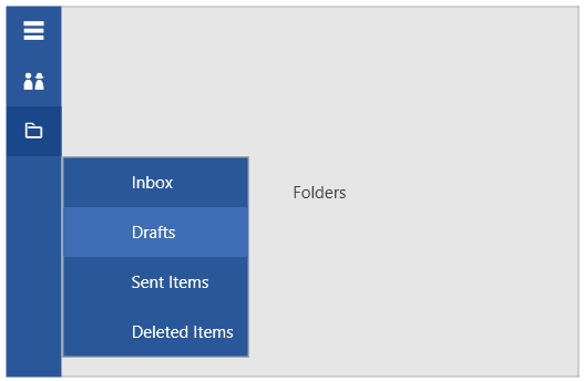
Flyout
When RadNavigationView is collapsed and its current DisplayMode Compact, you can display the nested menu items by clicking on the collapsed RadNavigationViewItems.
Sub menu flyout visualization
AllowSingleClickExpandInCompactMode
RadNavigationView exposes the AllowSingleClickExpandInCompactMode property. It allows you to choose if the top-level RadNavigationViewItem elements can expand with a single click when hosted in a flyout. The default value of the AllowSingleClickExpandInCompactMode property is True. If the property is set to false, two clicks will need to be performed, in order to open a different top-level RadNavigationViewItem element.
Setting the AllowSingleClickExpandInCompactMode property
<telerik:RadNavigationView PaneHeader="Mail"
                           DisplayMode="Compact"
                           AllowSingleClickExpandInCompactMode="False">
    <telerik:RadNavigationView.Items>
        <telerik:RadNavigationViewItem Content="Accounts">
            <telerik:RadNavigationViewItem.Items>
                <telerik:RadNavigationViewItem Content="Martin Ivanov (mi@prgs.com)"/>
                <telerik:RadNavigationViewItem Content="Stenly Grigorov (sg@prgs.com)"/>
            </telerik:RadNavigationViewItem.Items>
        </telerik:RadNavigationViewItem>
        <telerik:RadNavigationViewItem Content="Folders">
            <telerik:RadNavigationViewItem.Items>
                <telerik:RadNavigationViewItem Content="Inbox"/>
                <telerik:RadNavigationViewItem Content="Drafts"/>
                <telerik:RadNavigationViewItem Content="Sent Items"/>
                <telerik:RadNavigationViewItem Content="Deleted Items"/>
            </telerik:RadNavigationViewItem.Items>
        </telerik:RadNavigationViewItem>
    </telerik:RadNavigationView.Items>
</telerik:RadNavigationView>

Events
The expanding and collapsing actions fire the ItemExpanded and ItemCollapsed events of RadNavigationView.
Additionally, the RadNavigationViewItem exposes Expanded and Collapsed events.
Subscribing to ItemExpanded event
<telerik:RadNavigationView ItemExpanded="RadNavigationView_ItemExpanded" />
ItemExpanded event handler
private void RadNavigationView_ItemExpanded(object sender, RoutedEventArgs e)
{
    var expandedItem = (RadNavigationViewItem)e.OriginalSource;
}
The Expanded/Collapsed event of RadNavigationViewItem is fired before the ItemExpanded/ItemCollapsed event of RadNavigationView.
Data Binding
RadNavigationViewItem exposes ItemsSource and few other data related properties that allow setting up the hierarchy in a data binding scenario. Read more about this in the Hierarchical Data Binding article.