Header and Footer
The RadNavigationView's header and footer parts are fully customizable. This article will demonstrate how this can be achieved.
Customizing the Header
RadNavigationView's header can be customized with the following properties: PaneHeader, PaneHeaderTemplate and PaneHeaderHeight. Example 1 demonstrates how you set the RadNavigationView's PaneHeader property.
Example 1: Setting the PaneHeader property
<telerik:RadNavigationView PaneHeader="My Header" />
Figure 1: Result from Example 1 in the Office 2016 theme

It is possible to further customize the header by setting the PaneHeaderTemplate property. The DataContext inside the PaneHeaderTemplate will be whatever is set to the PaneHeader property of the RadNavigationView. Example 2 demonstrates how you can set this property along with the PaneHeaderHeight property which controls the height of the pane header.
Example 2: Setting the PaneHeaderTemplate and PaneHeaderHeight properties
<Grid>
<Grid.Resources>
<DataTemplate x:Key="PaneHeaderTemplate">
<Border BorderBrush="White" BorderThickness="1" Margin="3">
<TextBlock Text="{Binding}" Margin="5"/>
</Border>
</DataTemplate>
</Grid.Resources>
<telerik:RadNavigationView PaneHeader="My Header" PaneHeaderTemplate="{StaticResource PaneHeaderTemplate}" PaneHeaderHeight="35">
<telerik:RadNavigationView.Items>
<telerik:RadNavigationViewItem Content="Bookmarks">
<telerik:RadNavigationViewItem.Icon>
<telerik:RadGlyph Glyph="" FontSize="16"/>
</telerik:RadNavigationViewItem.Icon>
</telerik:RadNavigationViewItem>
</telerik:RadNavigationView.Items>
</telerik:RadNavigationView>
</Grid>
Figure 2: Result from Example 2 in the Office 2016 theme

The pane header's Background and Foreground can also be changed with the PaneHeaderBackground and PaneHeaderForeground properties.
RadNavigationView also exposes a PaneHeaderTemplateSelector property which allows you to specify a different data template based on the value of the Header property.
Customizing the Footer
RadNavigationView's footer can be customized with the following properties: PaneFooter, PaneFooterTemplate. The approach for doing so is identical to customizing its header which is described in the previous section.
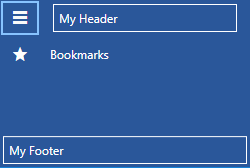
Example 3: Setting the PaneFooter and PaneFooterTemplate properties
<Grid>
<Grid.Resources>
<DataTemplate x:Key="PaneHeaderTemplate">
<Border BorderBrush="White" BorderThickness="1" Margin="3">
<TextBlock Text="{Binding}" Margin="5"/>
</Border>
</DataTemplate>
<DataTemplate x:Key="PaneFooterTemplate">
<Border BorderBrush="White" BorderThickness="1" Margin="3">
<TextBlock Text="{Binding}" Margin="5"/>
</Border>
</DataTemplate>
</Grid.Resources>
<telerik:RadNavigationView PaneHeader="My Header" PaneHeaderTemplate="{StaticResource PaneHeaderTemplate}" PaneFooter="My Footer" PaneFooterTemplate="{StaticResource PaneFooterTemplate}">
<telerik:RadNavigationView.Items>
<telerik:RadNavigationViewItem Content="Bookmarks">
<telerik:RadNavigationViewItem.Icon>
<telerik:RadGlyph Glyph="" FontSize="16"/>
</telerik:RadNavigationViewItem.Icon>
</telerik:RadNavigationViewItem>
</telerik:RadNavigationView.Items>
</telerik:RadNavigationView>
</Grid>
Figure 3: Result from Example 3 in the Office 2016 theme
RadNavigationView also exposes a PaneFooterTemplateSelector property which allows you to specify a different data template based on the value of the Footer property.
Define Items and Subitems in the Footer
As of R3 2020, you can also define RadNavigationViewItems in the footer section of the control. For the items to function as expected, participate in the selection of the control, and hold subitems, however, you need to place them inside of a NavigationViewSubItemsHost.
Example 4: Place items in the footer
<DataTemplate x:Key="PaneFooterTemplate">
    <telerik:NavigationViewSubItemsHost>
        <telerik:RadNavigationViewItem Content="Footer Item 1">
            <telerik:RadNavigationViewItem.Items>
                <telerik:RadNavigationViewItem Content="Footer SubItem 1" />
                <telerik:RadNavigationViewItem Content="Footer SubItem 2" />
            </telerik:RadNavigationViewItem.Items>
        </telerik:RadNavigationViewItem>
        <telerik:RadNavigationViewItem Content="Footer Item 2" />
        <telerik:RadNavigationViewItem Content="Footer Item 3" />
    </telerik:NavigationViewSubItemsHost>
</DataTemplate>
Customizing the Pane Toggle Button
RadNavigationView has a RadToggleButton next to its header which allows for expanding or closing the navigation pane. This button is specially designed to show RadGlyphs ,since it has a RadGlyph in its ContentTemplate. You can easily change which glyph is displayed by setting the PaneToggleButtonContent property to the desired glyph string. Example 4 demonstrates how this can be achieved.
Example 5: Setting the PaneToggleButtonContent
<telerik:RadNavigationView x:Name="navigationView" PaneHeader="Header" PaneToggleButtonContent="" />
Figure 4: Result from Example 4 in the Office 2016 theme

If do not want to show a RadGlyph as the Content of the toggle button, you can modify the PaneToggleButtonContentTemplate as demosntrated in Example 5.
Example 6: Setting the PaneToggleButtonContentTemplate
<DataTemplate x:Key="PaneToggleButtonContentTemplate">
    <Rectangle Width="15" Height="15" Fill="White" />
</DataTemplate>

 <telerik:RadNavigationView x:Name="navigationView" PaneHeader="Header" PaneToggleButtonContentTemplate="{StaticResource PaneToggleButtonContentTemplate}" />
Figure 5: Result from Example 5 in the Office 2016 theme

The Pane Toggle Button can be customized further by setting the PaneToggleButtonStyle property. It can also be hidden by setting the PaneToggleButtonVisibility property.