Hierarchical Data Binding
This article shows how to data bind hierarchical data to RadNavigationView.
The control can be populated with business objects via its ItemsSource property. Then the DisplayMemberPath and ItemContainerStyle properties can be used to further customize the items and allow sub-items.
Defining the Model
The following model is defining a string property to serve as the content of the items and a collection for the child data items. An additional string property is used for the icon glyph.
Example 1: Creating the model
public class NavigationItemModel
{
    public string Title { get; set; }
    public string IconGlyph { get; set; }
    public ObservableCollection<NavigationItemModel> Children { get; set; }
}
Example 2: Populating the collection with data
public MainWindow()
{
InitializeComponent();
var source = new ObservableCollection<NavigationItemModel>()
{
new NavigationItemModel()
{
Title = "Accounts",
IconGlyph = "",
Children = new ObservableCollection<NavigationItemModel>()
{
new NavigationItemModel() { Title = "Martin Ivanov (mi@prgs.com)", IconGlyph = "" },
new NavigationItemModel() { Title = "Jon Doe (jd@prgs.com)", IconGlyph = "" },
}
},
new NavigationItemModel()
{
Title = "Folders",
IconGlyph = "",
Children = new ObservableCollection<NavigationItemModel>()
{
new NavigationItemModel() { Title = "Inbox", IconGlyph = "" },
new NavigationItemModel() { Title = "Drafts", IconGlyph = "" },
new NavigationItemModel() { Title = "Sent Items", IconGlyph = "" },
new NavigationItemModel() { Title = "Deleted Items", IconGlyph = "" },
}
}
};
this.DataContext = source;
}
Defining the View
To assign the data collection to the RadNavigationView control, set its ItemsSource property.
To data bind the content of the RadNavigationViewItem elements set the DisplayMemberPath property of RadNavigationView. Alternatively, you can use the ItemContainerStyle and set the Content property of the RadNavigationViewItems.
To customize the appearance of the RadNavigationViewItems and also allow sub-items to be shown, use an implicit style. This allows to set the ItemsSource and DisplayMemberPath properties of the RadNavigationViewItems.
Example 3: Setting up the view
<telerik:RadNavigationView x:Name="radNavigationView"
                           ItemsSource="{Binding}"
                           PaneHeader="Header"
                           DisplayMemberPath="Title"
                           DisplayMode="Expanded">
    <telerik:RadNavigationView.Resources>
        <telerik:StringToGlyphConverter x:Key="StringToGlyphConverter" />
        <!-- If you are using the NoXaml binaries, you will have to base the style on the default one for the theme like so:
        <Style TargetType="telerik:RadNavigationViewItem" BasedOn="{StaticResource RadNavigationViewItemStyle}">-->
        <Style TargetType="telerik:RadNavigationViewItem">
            <Setter Property="ItemsSource" Value="{Binding Children}" />
            <Setter Property="DisplayMemberPath" Value="Title" />
            <Setter Property="Icon" Value="{Binding IconGlyph}" />
            <Setter Property="IconTemplate">
                <Setter.Value>
                    <DataTemplate>
                        <telerik:RadGlyph Glyph="{Binding Converter={StaticResource StringToGlyphConverter}}" />
                    </DataTemplate>
                </Setter.Value>
            </Setter>
        </Style>
    </telerik:RadNavigationView.Resources>
    <telerik:RadNavigationView.Content>
        <ContentControl Content="{Binding SelectedItem, ElementName=radNavigationView}">
            <ContentControl.ContentTemplate>
                 <DataTemplate>
                    <TextBlock HorizontalAlignment="Center" VerticalAlignment="Center" Text="{Binding Title}" />
                </DataTemplate>
            </ContentControl.ContentTemplate>
        </ContentControl>
    </telerik:RadNavigationView.Content>
</telerik:RadNavigationView>
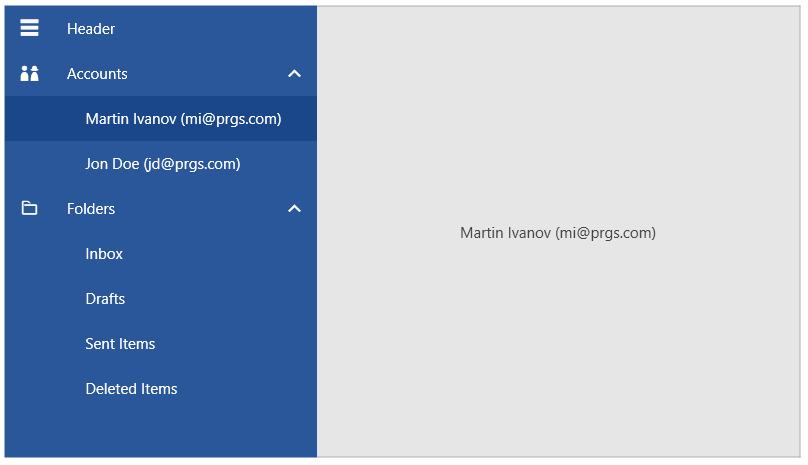
Figure 1: RadNavigationView with sub items
Note that for every business object from the data bound collection, RadNavigationView will generate a RadNavigationViewItem container representing this object.