RadGlyph
With the R1 2018 release, the Telerik UI for WPF suite provides the RadGlyph which is a FrameworkElement that enables seamless visualization of font glyphs.
Benefits
Apart from the shorter load time compared to the ordinary glyphs, the RadGlyph provides out-of-the-box design-time support. In addition, it respects the FlowDirection property in the same manner as a standard Path element, for example. Last but not least, it inherits the Foreground property from its parent element if it is not set explicitly.
Usage
The RadGlyph can be used both standalone and as a markup extension. Examples 1 and 2 demonstrate both approaches, respectively.
Example 1: Define a RadGlyph in XAML
<Label x:Name="label">
<telerik:RadGlyph Glyph="" Foreground="Black" FontSize="100" />
</Label>
Example 1: Define a RadGlyph in code-behind
var glyph = new RadGlyph() { Glyph = "\uE91E", Foreground = Brushes.Black, FontSize = 100 };
this.label.Content = glyph;
Example 2: Use the RadGlyph markup extension
<Image Source="{telerik:RadGlyph Glyph={StaticResource GlyphCs}, Foreground=Black}" />
Figure 1: The result from examples 1 and 2

In order to use the glyph references (such as GlyphCs in Example 2) as static resources in a project, you need to include the Telerik.Windows.Controls.dll and merge the FontResources.xaml dictionary in the application resources as demonstrated in Example 3. A list of the available glyphs and their resource keys can be found in the Glyphs Reference Sheet article.
Example 3: Adding the FontResources.xaml dictionary
<ResourceDictionary Source="/Telerik.Windows.Controls;component/Themes/FontResources.xaml"/>
Properties
The RadGlyph class exposes the following properties:
Glyph: The actual text to be displayed. It is of type String.
Foreground: The foreground of the element which would color the rendered glyph. It is of type Brush.
Background: The background of the element. It is of type Brush.
Font: The name of the font to be used. It is of type String and corresponds to one of the registered fonts.
FontSize: The font size of the element. It is of type Double.
The RadGlyphExtension on the other hand provides this set of properties:
- Glyph: The actual text to be displayed. It is of type Object.
- Foreground: The foreground of the element which would color the rendered glyph. It is of type Brush.
- Font: The name of the font to be used. It is of type String and corresponds to one of the registered fonts.
- Size: The font size of the element. It is of type Double.
- Type: Explicitly sets type of the exported glyph. It is of type GlyphExportType which is an enumeration with the values None (default), Image (which returns an ImageSource) and Path (which returns a Geometry).
The RadGlyphExtension cannot be set inline to the Value property of a Style Setter element. Instead, it should be set through the Setter.Value XAML tag.
Example 4: Set Setter.Value XAML tag
<Style TargetType="telerik:RadButton">
    <Setter Property="Content">
        <Setter.Value>
            <telerik:RadGlyph Glyph="{StaticResource GlyphCs}"/>
        </Setter.Value>
    </Setter>
</Style>
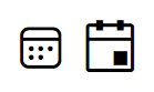
Fonts
The default font family used by the glyphs is the TelerikWebUI. A list of the available glyphs can be found in the Glyphs Reference Sheet article.
Another font that comes out of the box since the R2 2022 release is the TelerikFluentIcons which contains a similar set of icons as the TelerikWebUI but with different visual appearance.
Example 5 demonstrates the difference in appearance between the two fonts.
Example 5: Calendar glyph in TelerikFluentIcons and TelerikWebUI fonts respectively
<StackPanel Orientation="Horizontal">
<Label>
<telerik:RadGlyph Font="TelerikFluentIcons" Glyph="" Foreground="Black" FontSize="40"/>
</Label>
<Label>
<telerik:RadGlyph Glyph="" Foreground="Black" FontSize="40"/>
</Label>
</StackPanel>
Figure 2: The calendar icon in the TelerikFluentIcons and TelerikWebUI fonts respectively
Register Fonts
If you wish to use a custom font in your project, you first have to register it by calling the static RadGlyph.RegisterFont method. It has the following 4 overloads:
- RegisterFont(string fontName)
- RegisterFont(FontFamily fontFamily)
- RegisterFont(FontFamily fontFamily, string fontName)
- RegisterFont(Uri fontUri, string fontName)
Example 3 shows how to register the Webdings typeface, which is included in all versions of Microsoft Windows since Windows 98.
Example 6: Register the Webdings typeface
static MainWindow()
{
    RadGlyph.RegisterFont("Webdings");
}
Example 7: Register the Webdings typeface
static MainWindow()
{
    var font = new FontFamily(new Uri("pack://application:,,,/"), "./Fonts/#Webdings");
    RadGlyph.RegisterFont(font, "Webdings");
}
Example 8: Use the Webdings glyphs
<Path Data="{telerik:RadGlyph Font=Webdings, Glyph=ü}" Fill="{telerik:Office2016Resource ResourceKey=IconBrush}" Width="50" Height="50" Stretch="Uniform" />
Figure 3: The resulting Webdings glyph

Use Glyphs as Geometry
Example 9: Set a RadPathButton's PathGeometry in XAML
<telerik:RadPathButton Width="50" Height="50" PathGeometry="{telerik:RadGlyph Glyph={StaticResource GlyphButton}}" />
Figure 4: The RadPathButton in normal and hovered states in the Office2016 theme

The same result can be achieved in code behind as demonstrated in Example 6. Note that it uses the static RadGlyph.GetGeometry method which takes two parameters - a glyph string and a font family.
Example 10: Set a RadPathButton's PathGeometry in code-behind
private RadPathButton CreateButton()
{
    var button = new RadPathButton();
    button.Width = 50;
    button.Height = 50;
    button.PathGeometry = RadGlyph.GetGeometry(this.GetGlyph(""), "TelerikWebUI");
    return button;
}

private string GetGlyph(string hexCode)
{
    string glyphInt = hexCode.Substring(3, 4);
    var character = (char) int.Parse(glyphInt, NumberStyles.HexNumber);
    return character.ToString();
}
Please note that in this scenario we use the custom GetGlyph method to transform the 8-character code to a single character. This is required as otherwise all 8 characters will be displayed as-is.
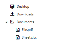
Use Glyphs as ImageSource
Example 11: Provide ImageSource for RadTreeView items
<telerik:RadTreeView>
    <telerik:RadTreeViewItem Header="Desktop"
                                    DefaultImageSrc="{telerik:RadGlyph Type=Image, Glyph={StaticResource GlyphToggleFullScreenMode}}" />
    <telerik:RadTreeViewItem Header="Downloads"
                                    DefaultImageSrc="{telerik:RadGlyph Type=Image, Glyph={StaticResource GlyphDownload}}" />
    <telerik:RadTreeViewItem Header="Documents"
                                    IsExpanded="True"
                                    DefaultImageSrc="{telerik:RadGlyph Type=Image, Glyph={StaticResource GlyphFolder}}"
                                    ExpandedImageSrc="{telerik:RadGlyph Type=Image, Glyph={StaticResource GlyphFolderOpen}}">
        <telerik:RadTreeViewItem Header="File.pdf"
                                        DefaultImageSrc="{telerik:RadGlyph Type=Image, Glyph={StaticResource GlyphPdf}}"/>
        <telerik:RadTreeViewItem Header="Sheet.xlsx"
                                        DefaultImageSrc="{telerik:RadGlyph Type=Image, Glyph={StaticResource GlyphExcel}}"/>
    </telerik:RadTreeViewItem>
</telerik:RadTreeView>
Figure 5: The resulting RadTreeView in the Office2016 theme