Menu Items
In RadMenu basically there are three types of menu items which provide different ways to display the data in a hierarchical structure. They are as follows:
RadMenuItem
RadMenuItem is the main menu item in RadMenu. It is used for the top-level menu and each RadMenuItem can have other RadMenuItems as children in order to create sub-menus. Its Header property accepts plain text as well as other objects, it can be set the following ways:
<telerik:RadMenu>
    <!--1-->
    <telerik:RadMenuItem Header="File" />

    <!--2-->
    <telerik:RadMenuItem>
        <telerik:RadMenuItem.Header>Edit</telerik:RadMenuItem.Header>
    </telerik:RadMenuItem>

    <!--3-->
    <telerik:RadMenuItem>
        <telerik:RadMenuItem.Header>
            <TextBlock Text="View" />
        </telerik:RadMenuItem.Header>
    </telerik:RadMenuItem>
    ...
</telerik:RadMenu>
And here is the result:

You can also set an Icon of RadMenuItem which is done by its Icon property. The property accepts an object.
For more detailed information about setting an Icon to RadMenuItem, please check the Icons article.
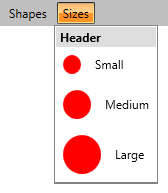
RadMenuGroupItem
RadMenuGroupItem inherits from RadMenuItem class and it is used as container of a RadMenuItem dropdown. In other words any UI element can be placed inside of RadMenuGroupItem. By default the background color of RadMenuGroupItem is White and there is no Icon area with different color unlike RadMenuItem, so you can easily use different sized Icons in the dropdown. In addition to this RadMenuGroupItem also has a Header property which is displayed on the top of all the group items.
<telerik:RadMenu VerticalAlignment="Top">
    <telerik:RadMenuItem Header="Shapes" />
    <telerik:RadMenuItem Header="Sizes">
        <telerik:RadMenuGroupItem Header="Header">
            <telerik:RadMenuItem Header="Small" IconTemplate="{StaticResource IconTemplate}" IconColumnWidth="35" Height="35" />
            <telerik:RadMenuItem Header="Medium" IconTemplate="{StaticResource IconTemplate}" IconColumnWidth="45" Height="45" />
            <telerik:RadMenuItem Header="Large" IconTemplate="{StaticResource IconTemplate}" IconColumnWidth="55" Height="55" />
        </telerik:RadMenuGroupItem>
    </telerik:RadMenuItem>
</telerik:RadMenu>
And this is the result:
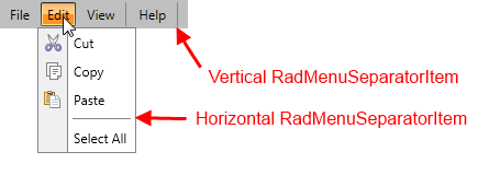
RadMenuSeparatorItem
RadMenuSeparatorItem also inherits from RadMenuItem. It is a menu item used to separate RadMenuItems/RadMenuGroupItems. Its orientation can be horizontal and vertical and it is automatically set depending on the menu orientation.
<telerik:RadMenu>
    ...
    <telerik:RadMenuSeparatorItem />
    ...
</telerik:RadMenu>