Enable\Disable Grid Elements
RadGridView is an advanced control, that allows you to enable/disable its different parts. You can set the boolean property IsEnabled to each one of the following objects:
RadGridView
GridViewRow
GridViewCell
Having this in mind, you can control the behavior and enable/disable different parts of your grid view according to some internal logic of yours.
GridViewDataColumn.IsEnabled property cannot be actually used. It is a dependency property inherited from ContentElement.
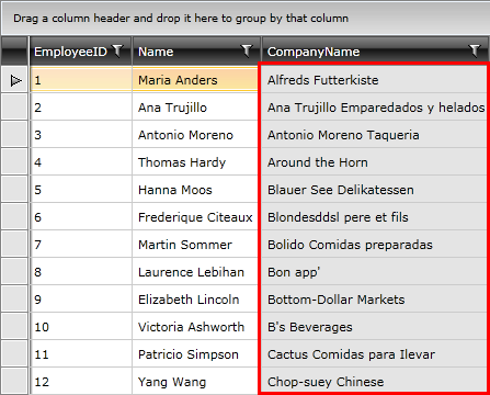
You can disable whole column by changing the IsEnabled property of each one of its cells. This property gets or sets a value indicating whether this element is enabled in the user interface (UI). This is a dependency property inherited from UIElement.
<Style x:Key="disabledStyle" TargetType="telerik:GridViewCell">
    <Setter Property="IsEnabled" Value="False"/>
</Style>
<telerik:GridViewDataColumn DataMemberBinding="{Binding CompanyName}" CellStyle="{StaticResource disabledStyle}"/>
To disable all the rows you need to apply a Style targeting the GridViewRow element.
<Style TargetType="telerik:GridViewRow">
    <Setter Property="IsEnabled" Value="False"/>
</Style>
To apply the disabled style to some rows only, you can consider RowStyleSelector.