Add ToolTip for Columns and Headers
This article demonstrates how to set the tooltip of the gridview's rows, columns and column headers.
If you are using the implicit styles approach for theming the controls with the NoXaml binaries, you need to base your styles on the default styles for the controls.
First you should add a GridView to the user control and bind it to some data.
Example 1: Bind RadGridView in XAML
<telerik:RadGridView x:Name="gridView" ItemsSource="{Binding}" />
ToolTip for Column's Cells
You can check the source code below on how to set a ToolTip for a specific column. The ToolTip will use a DataTemplate with TextBlocks and will show information from the currently hovered row. The final result should look like this:

To achive that you can define a DataTemplate for the ToolTipTemplate property for the column.
Example 2: Setting ToolTipTemplate property
<telerik:GridViewDataColumn DataMemberBinding="{Binding ID}" >
    <telerik:GridViewColumn.ToolTipTemplate>
        <DataTemplate>
            <StackPanel Orientation="Horizontal">
                <TextBlock Text="{Binding ID}" Foreground="Red" />
                <TextBlock Text=" - " />
                <TextBlock Text="{Binding Text}" Foreground="Blue" />
            </StackPanel>
        </DataTemplate>
    </telerik:GridViewColumn.ToolTipTemplate>
</telerik:GridViewDataColumn>
You can define the DataTemplate as a StaticResource and then directly assign the ToolTipTemplate property of the GridViewColumn.
The duration of the tooltip enabled with the ToolTipTemplate, set the ToolTipShowDuration property of the associated GridViewColumn element.
Example 3: Setting ToolTipShowDuration property
<telerik:GridViewDataColumn DataMemberBinding="{Binding ID}"
                ToolTipTemplate="{StaticResource MyColumnToolTipDataTemplate}"
                ToolTipShowDuration="8000" />
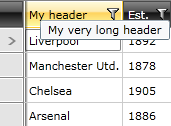
ToolTip for a Column's Header Cell
To add a ToolTip to the header cells you can set a custom style to the HeaderCellStyle property. Or you can use the Header property of the column.
If you're using the NoXAML binaries, you need to base your style on the GridViewHeaderCellStyle.
- Predefine the HeaderCellStyle for the column.
Example 4: Setting custom style to the HeaderCellStyle property
<telerik:GridViewDataColumn DataMemberBinding="{Binding Name}">
    <telerik:GridViewDataColumn.HeaderCellStyle>
        <Style TargetType="telerik:GridViewHeaderCell">
            <Setter Property="ToolTipService.ToolTip" Value="My very long header"/>
        </Style>
    </telerik:GridViewDataColumn.HeaderCellStyle>
</telerik:GridViewDataColumn>
You can define the DataTemplate as a StaticResource and then directly assign the HeaderCellStyle property of the GridViewColumn.
- Predefine the Header for the column.
Example 5: Predefining the Header of the column
<telerik:GridViewDataColumn DataMemberBinding="{Binding Name}">
    <telerik:GridViewDataColumn.Header>
        <TextBlock Text="Name" ToolTipService.ToolTip="My very long header"/>
    </telerik:GridViewDataColumn.Header>
</telerik:GridViewDataColumn>
ToolTip for a GridViewRow
To add a ToolTip to the grid view row, you can create an implicit style that targets GridViewRow and set the ToolTipService.ToolTip attached property.
If you're using the NoXAML binaries, you need to base your style on the GridViewRowStyle.
Example 6: Adding ToolTip to the GridViewRow
<Style TargetType="telerik:GridViewRow">
    <Setter Property="ToolTipService.ToolTip" Value="MyToolTipText"/>
</Style>