Customizing PieChart Series
This article demonstrates how you can change the default look of the RadPieChart series.
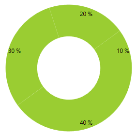
Customizing Pie Series
DefaultSliceStyle
This series expose the DefaultSliceStyle property. It is of type Style and determines the appearance of the Path element used to visualize the PieSeries. Your custom style should target the native Path component. You can set the property like this:
<telerik:PieSeries.DefaultSliceStyle>
  <Style TargetType="Path">
      <Setter Property="Fill" Value="YellowGreen"/>
  </Style>
</telerik:PieSeries.DefaultSliceStyle>
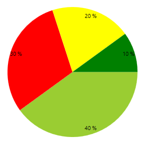
SliceStyles
This series also expose the SliceStyles property. It is of type ObservableCollection and gets or sets a collection of styles that will be consecutively applied on all slices of the PieSeries. This means that if you have more slices than Styles defined, the RadPieChart will repeatedly apply the collection so that the number of the applied styles equals the number of the slices. You can define the collection in XAML like this:
<telerik:PieSeries.SliceStyles>
    <Style TargetType="Path">
      <Setter Property="Fill" Value="YellowGreen"/>
    </Style>
    <Style TargetType="Path">
      <Setter Property="Fill" Value="Red"/>
    </Style>
    <Style TargetType="Path">
      <Setter Property="Fill" Value="Yellow"/>
    </Style>
    <Style TargetType="Path">
      <Setter Property="Fill" Value="Green"/>
    </Style>
</telerik:PieSeries.SliceStyles>
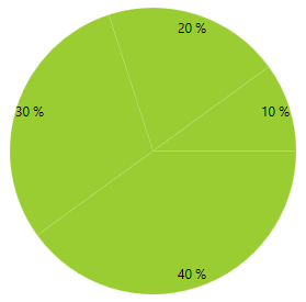
Customizing Doughnut Series
DefaultSliceStyle
This series expose the DefaultSliceStyle property. It is of type Style and determines the appearance of the Path element used to visualize the DoughnutSeries. Your custom style should target the native Path component. You can set the property like this:
<telerik:DoughnutSeries.DefaultSliceStyle>
  <Style TargetType="Path">
      <Setter Property="Fill" Value="YellowGreen"/>
  </Style>
</telerik:DoughnutSeries.DefaultSliceStyle>
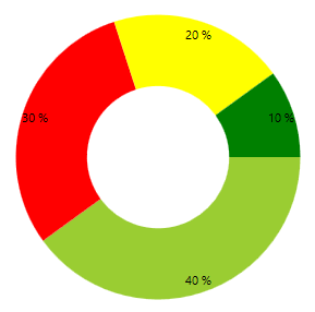
SliceStyles
This series also expose the SliceStyles property. It is of type ObservableCollection and gets or sets a collection of styles that will be consecutively applied on all slices of the PieSeries This means that if you have more slices than Styles defined, the RadPieChart will repeatedly apply the collection so that the number of the applied styles equals the number of the slices. You can define it like this:
<telerik:DoughnutSeries.SliceStyles>
  <Style TargetType="Path">
      <Setter Property="Fill" Value="YellowGreen"/>
  </Style>
  <Style TargetType="Path">
      <Setter Property="Fill" Value="Red"/>
  </Style>
  <Style TargetType="Path">
      <Setter Property="Fill" Value="Yellow"/>
  </Style>
  <Style TargetType="Path">
      <Setter Property="Fill" Value="Green"/>
  </Style>
</telerik:DoughnutSeries.SliceStyles>