Views
The RadAIPrompt control provides 3 default items that have as their content the dfault views. They will need to be included in its Items collection. The control supports only one instance of each view to be defined in this collection.
Setting the ItemsSource collection of the RadAIPrompt control is not supported. The Items collection has to be used instead.
Input view
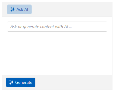
The input view is represented by the RadAIPromptInputItem class. This view contains an input textbox that the user can type their request in. It also displays the custom suggestions defined in the Suggestions collection of the RadAIPrompt control.
For more information on the suggestions feature of the component, check this article.
Adding the input view in the RadAIPrompt
<telerik:RadAIPrompt>
    <telerik:RadAIPromptInputItem/>
</telerik:RadAIPrompt>

Output view
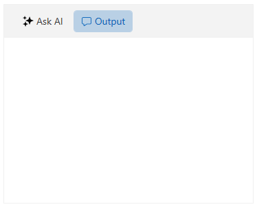
The output view is represented by the RadAIPromptOutputItem class and it displays the responses from your AI service. Each response is represented by an AIPromptOutputItem element, whose DataContext is the AIPromptOutputItemModel class.
The AIPromptOutputItemModel class provides the following properties:
-
Title—This property gets or sets the title of the AIPromptOutputItem element. -
InputText—This property gets or sets the input text that end-user has requested and it is displayed by the AIPromptOutputItem element. -
ResponseText—This property gets or sets the response text provided by your AI model that the AIPromptOutputItem will display. -
Rating—This property gets or sets the rating of the end-user for the response returned by your AI model.
Check the Requesting a Response section of the Getting Started article of the component's documentation to see how to add a new item in this view.
Adding the output view in the RadAIPrompt
<telerik:RadAIPrompt>
    <telerik:RadAIPromptInputItem/>
    <telerik:RadAIPromptOutputItem/>
</telerik:RadAIPrompt>

Commands View
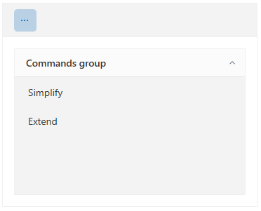
The commands view is an additional view that will display the commands set to the Commands collection of RadAIPrompt. This view is repsented by a RadAIPromptCommandsItem class and it displays the Commands collection of the control via a RadPanelBar element.
To learn more about the commands functionality of RadAIPrompt, check the Commands documentation article.
Adding the commands view in the RadAIPrompt
<telerik:RadAIPrompt Commands="{Binding MyCommandsCollection}">
    <telerik:RadAIPromptCommandsItem/>
</telerik:RadAIPrompt>

Common Properties
Each view that is supported by the RadAIPrompt extends the RadAIPromptItem class. This class exposes the following properties that you can set for each view:
-
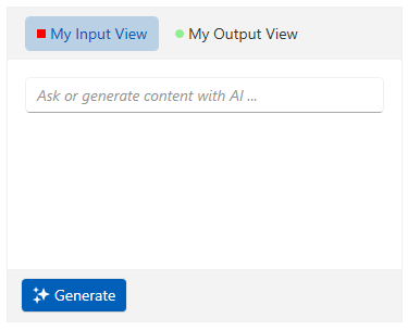
Icon—Gets or sets an icon to the view instance. This property is of the type of object. -
IconTemplate—Gets or sets aDataTemplate, whoseDataContextwill be the value set to theIconproperty, for customizing the icon of the view instance.
Additionally, the RadAIPromptItem class derives from the native WPF HeaderedContentControl class. The properties that are exposed by it can also be set.
Customizing the views
<telerik:RadAIPrompt>
    <telerik:RadAIPromptInputItem Header="My Input View">
        <telerik:RadAIPromptInputItem.IconTemplate>
            <DataTemplate>
                <Rectangle Width="8" Height="8" Fill="Red"/>
            </DataTemplate>
        </telerik:RadAIPromptInputItem.IconTemplate>
    </telerik:RadAIPromptInputItem>
    <telerik:RadAIPromptOutputItem Header="My Output View">
        <telerik:RadAIPromptOutputItem.IconTemplate>
            <DataTemplate>
                <Ellipse Width="8" Height="8" Fill="LightGreen"/>
            </DataTemplate>
        </telerik:RadAIPromptOutputItem.IconTemplate>
    </telerik:RadAIPromptOutputItem>
</telerik:RadAIPrompt>
