Ribbon Button
The RadRibbonButton represents the basic button in the set of the RadRibbonView buttons. It inherits the native Microsoft.UI.Xaml.Controls.Button control and extends its functionality in order to provide a better interaction with the RadRibbonView control.
You can access the RadRibbonButton control through an alias pointing to the Telerik.UI.Xaml.Controls namespace:
xmlns:telerik="using:Telerik.UI.Xaml.Controls"
Example 1: Declare RadRibbonButton
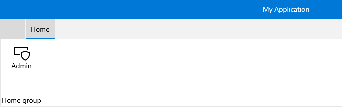
<telerik:RadRibbonView>
    <telerik:RadRibbonTab Header="Home">
        <telerik:RadRibbonGroup Header="Home group"  >
            <telerik:RadRibbonGroup.Variants>
                <ribbonView:GroupVariant Variant="Small"/>
                <ribbonView:GroupVariant Variant="Medium"/>
                <ribbonView:GroupVariant Variant="Large"/>
            </telerik:RadRibbonGroup.Variants>
            <telerik:RadRibbonButton CollapseToSmall="WhenGroupIsSmall"
                                    CollapseToMedium="WhenGroupIsMedium"
                                    IsAutoSize="True"
                                    Size="Large"
                                    Text="Admin" >
                <telerik:RadRibbonButton.SmallIcon>
                    <SymbolIcon Symbol="Admin"/>
                </telerik:RadRibbonButton.SmallIcon>
                <telerik:RadRibbonButton.LargeIcon>
                    <SymbolIcon Symbol="Admin"/>
                </telerik:RadRibbonButton.LargeIcon>
            </telerik:RadRibbonButton>
        </telerik:RadRibbonGroup>
    </telerik:RadRibbonTab>
</telerik:RadRibbonView>
Figure 1: RadRibbonButton Example