Ribbon RadioButton
The RadRibbonRadioButton represents an extension of the Microsoft.UI.Xaml.Controls.RadioButton. It provides an easier interaction with the RadRibbonView control. What is special about the RadRibbonRadioButton is that it has two states: checked and unchecked. To switch between these states just click on it. Adding several RadRibbonRadioButtons to a RadRibbonGroup allows you to have only one checked at a time.
Note that once the button has been checked, it stays in the checked state unless another radio button in the same RadRibbonGroup is clicked. If the button is used alone, it can be unchecked after it has been selected once.
Example 1 demonstrates how we can declare RadRibbonRadioButton in XAML.
You can access the RadRibbonRadioButton control through an alias pointing to the Telerik.UI.Xaml.Controls namespace:
xmlns:telerik="using:Telerik.UI.Xaml.Controls"
Example 1: Declare RibbonRadioButton
<telerik:RadRibbonView>
    <telerik:RadRibbonTab Header="Home">
        <telerik:RadRibbonGroup Header="Home group"  >
            <telerik:RadRibbonGroup.Variants>
                <ribbonView:GroupVariant Variant="Small"/>
                <ribbonView:GroupVariant Variant="Medium"/>
                <ribbonView:GroupVariant Variant="Large"/>
            </telerik:RadRibbonGroup.Variants>
            <telerik:RadRibbonRadioButton CollapseToSmall="WhenGroupIsSmall"
                                    CollapseToMedium="WhenGroupIsMedium"
                                    IsAutoSize="True"
                                    Size="Large"
                                    Text="AlignLeft" >
                        <telerik:RadRibbonRadioButton.SmallIcon>
                            <SymbolIcon Symbol="AlignLeft"/>
                </telerik:RadRibbonRadioButton.SmallIcon>
                        <telerik:RadRibbonRadioButton.LargeIcon>
                            <SymbolIcon Symbol="AlignLeft"/>
                </telerik:RadRibbonRadioButton.LargeIcon>
            </telerik:RadRibbonRadioButton>
        </telerik:RadRibbonGroup>
    </telerik:RadRibbonTab>
</telerik:RadRibbonView>
As all buttons in the RadRibbonView's set slightly expose the same functionality, take a look at the Overview topic.
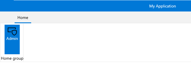
This button has its initial size set to Large and its text label set to "Admin". As the IsAutoSize property is set to True, the button will change its size depending on the RadRibbonGroup's size.
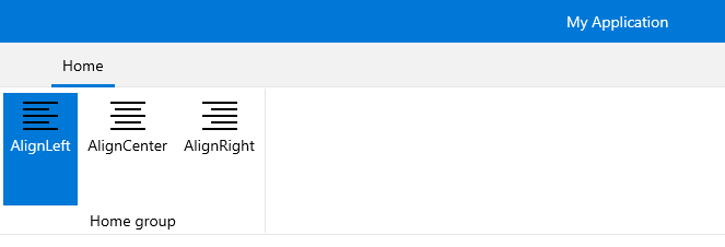
Here is an example of a RadRibbonGroup that contains two RadRibbonRadioButtons.
Example 2: Create RibbonGroup with two RibbonRadioButtons
<telerik:RadRibbonView>
    <telerik:RadRibbonTab Header="Home">
        <telerik:RadRibbonGroup Header="Home group"  >
            <telerik:RadRibbonGroup.Variants>
                <ribbonView:GroupVariant Variant="Small"/>
                <ribbonView:GroupVariant Variant="Medium"/>
                <ribbonView:GroupVariant Variant="Large"/>
            </telerik:RadRibbonGroup.Variants>
            <telerik:RadRibbonRadioButton CollapseToSmall="WhenGroupIsSmall"
                                    CollapseToMedium="WhenGroupIsMedium"
                                    IsAutoSize="True"
                                    Size="Large"
                                    Text="AlignLeft" >
                        <telerik:RadRibbonRadioButton.SmallIcon>
                            <SymbolIcon Symbol="AlignLeft"/>
                </telerik:RadRibbonRadioButton.SmallIcon>
                        <telerik:RadRibbonRadioButton.LargeIcon>
                            <SymbolIcon Symbol="AlignLeft"/>
                </telerik:RadRibbonRadioButton.LargeIcon>
            </telerik:RadRibbonRadioButton>
            <telerik:RadRibbonRadioButton CollapseToSmall="WhenGroupIsSmall"
                            CollapseToMedium="WhenGroupIsMedium"
                            IsAutoSize="True"
                            Size="Large"
                            Text="AlignCenter" >
                <telerik:RadRibbonRadioButton.SmallIcon>
                    <SymbolIcon Symbol="AlignCenter"/>
                </telerik:RadRibbonRadioButton.SmallIcon>
                <telerik:RadRibbonRadioButton.LargeIcon>
                    <SymbolIcon Symbol="AlignCenter"/>
                </telerik:RadRibbonRadioButton.LargeIcon>
            </telerik:RadRibbonRadioButton>
            <telerik:RadRibbonRadioButton CollapseToSmall="WhenGroupIsSmall"
                            CollapseToMedium="WhenGroupIsMedium"
                            IsAutoSize="True"
                            Size="Large"
                            Text="AlignRight" >
                <telerik:RadRibbonRadioButton.SmallIcon>
                    <SymbolIcon Symbol="AlignRight"/>
                </telerik:RadRibbonRadioButton.SmallIcon>
                <telerik:RadRibbonRadioButton.LargeIcon>
                    <SymbolIcon Symbol="AlignRight"/>
                </telerik:RadRibbonRadioButton.LargeIcon>
            </telerik:RadRibbonRadioButton>
        </telerik:RadRibbonGroup>
    </telerik:RadRibbonTab>
</telerik:RadRibbonView>
Handling Changes in the Button's Checked State
Besides the Click event, the RadRibbonRadioButton control exposes two additional events - Checked and Unchecked. They are meant to notify for changes in the checked state of the radio button.
Example 2: Subscribe to Checked/UnChecked event of the RadRibbonRadioButton
<telerik:RadRibbonRadioButton Checked="RadRibbonRadioButton_Checked"
                              Unchecked="RadRibbonRadioButton_Unchecked" />
Example 3: Checked/UnChecked event handler
private void RadRibbonRadioButton_Checked(object sender, RoutedEventArgs e)
{
}
private void RadRibbonRadioButton_Unchecked(object sender, RoutedEventArgs e)
{
}