Implicit Styling
The DataGrid enables you to style its specific inner elements by using its implicit styling feature.
Setup
All examples in this article will use the setup shown in the following example.
Populate the DataGrid
public sealed partial class MainPage : Page
{
    public MainPage()
    {
        this.InitializeComponent();

        var collection = new List<Data>();

        for (int i = 0; i < 10; i++)
        {
            collection.Add(new Data() { Category = "Category " + i, Value = i });
        }
        this.DataContext = collection;
    }
}

public class Data
{
    public string Category { get; set; }

    public double Value { get; set; }
}
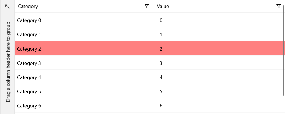
DataGridHoverControl
The following example shows how to change the appearance of a cell or row (depending on the current SelectionUnit) when the mouse hovers over the element.
Style the DataGridHoverControl
<Grid xmlns:telerikGrid="using:Telerik.UI.Xaml.Controls.Grid"
      xmlns:gridPrimitives="using:Telerik.UI.Xaml.Controls.Grid.Primitives">
    <telerikGrid:RadDataGrid x:Name="grid" ItemsSource="{Binding}">
        <telerikGrid:RadDataGrid.Resources>
            <Style TargetType="gridPrimitives:DataGridHoverControl">
                <Setter Property="Background" Value="Red"/>
                <Setter Property="Opacity" Value="0.5"/>
            </Style>
        </telerikGrid:RadDataGrid.Resources>
    </telerikGrid:RadDataGrid>
</Grid>
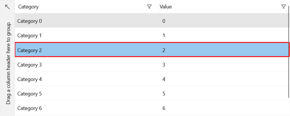
SelectionRegionBorderControl
The following example shows how to change the appearance of the selected cell or row (depending on the current SelectionUnit). The SelectionRegionBorderControl overlays the decorations of the selected cell or row.
Style the SelectionRegionBorderControl
<Grid xmlns:telerikGrid="using:Telerik.UI.Xaml.Controls.Grid"
      xmlns:gridPrimitives="using:Telerik.UI.Xaml.Controls.Grid.Primitives">
    <telerikGrid:RadDataGrid x:Name="grid" ItemsSource="{Binding}">
       <telerikGrid:RadDataGrid.Resources>
            <Style TargetType="gridPrimitives:SelectionRegionBorderControl">
                <Setter Property="BorderBrush" Value="Red"/>
            </Style>
        </telerikGrid:RadDataGrid.Resources>
    </telerikGrid:RadDataGrid>
</Grid>
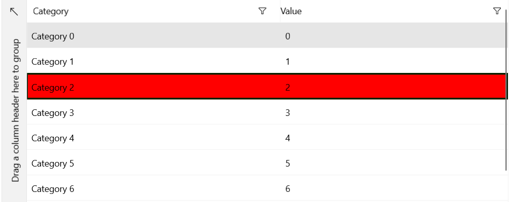
SelectionRegionBackgroundControl
The following example shows how to change the appearance of the selected cell or row (depending on the current SelectionUnit). Note that the SelectionRegionBorder control is rendered over the SelectionRegionBackground control.
Style the SelectionRegionBackgroundControl
<Grid xmlns:telerikGrid="using:Telerik.UI.Xaml.Controls.Grid"
      xmlns:gridPrimitives="using:Telerik.UI.Xaml.Controls.Grid.Primitives">
    <telerikGrid:RadDataGrid x:Name="grid" ItemsSource="{Binding}">
        <telerikGrid:RadDataGrid.Resources>
            <Style TargetType="gridPrimitives:SelectionRegionBackgroundControl">
                <Setter Property="Background" Value="Red"/>
                <Setter Property="BorderBrush" Value="Green"/>
                <Setter Property="BorderThickness" Value="2"/>
            </Style>
        </telerikGrid:RadDataGrid.Resources>
    </telerikGrid:RadDataGrid>
</Grid>
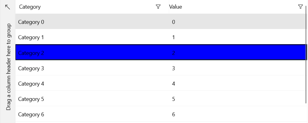
DataGridCurrencyControl
The following example shows how to change the appearance of the DataGridCurrencyControl, that is, the appearance of the current item.
Style the DataGridCurrencyControl
<Grid xmlns:telerikGrid="using:Telerik.UI.Xaml.Controls.Grid"
      xmlns:gridPrimitives="using:Telerik.UI.Xaml.Controls.Grid.Primitives">
    <telerikGrid:RadDataGrid x:Name="grid" ItemsSource="{Binding}">
        <telerikGrid:RadDataGrid.Resources>
            <Style TargetType="gridPrimitives:DataGridCurrencyControl">
                <Setter Property="Background" Value="Blue"/>
            </Style>
        </telerikGrid:RadDataGrid.Resources>
    </telerikGrid:RadDataGrid>
</Grid>
DataGridColumnDragControl
The following example shows how to change the appearance of the column header while executing a drag operation.
Style the DataGridColumnDragControl
<Grid xmlns:telerikGrid="using:Telerik.UI.Xaml.Controls.Grid"
      xmlns:gridPrimitives="using:Telerik.UI.Xaml.Controls.Grid.Primitives">
    <telerikGrid:RadDataGrid x:Name="grid" ItemsSource="{Binding}">
        <telerikGrid:RadDataGrid.Resources>
            <Style TargetType="gridPrimitives:DataGridColumnDragControl">
                <Setter Property="Background" Value="Red"/>
                <Setter Property="Foreground" Value="Green"/>
            </Style>
        </telerikGrid:RadDataGrid.Resources>
    </telerikGrid:RadDataGrid>
</Grid>

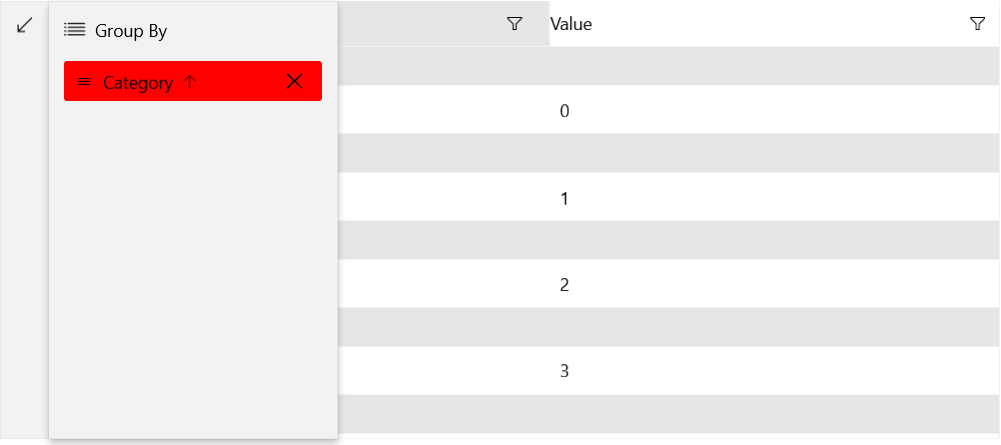
DataGridFlyoutGroupHeader
The following example shows how to change the appearance of the group header in the flyout.
Style the DataGridFlyoutGroupHeader
<Grid xmlns:telerikGrid="using:Telerik.UI.Xaml.Controls.Grid"
      xmlns:gridPrimitives="using:Telerik.UI.Xaml.Controls.Grid.Primitives">
    <telerikGrid:RadDataGrid x:Name="grid" ItemsSource="{Binding}">
        <telerikGrid:RadDataGrid.Resources>
            <Style TargetType="gridPrimitives:DataGridFlyoutGroupHeader">
                <Setter Property="Background" Value="Red"/>
            </Style>
        </telerikGrid:RadDataGrid.Resources>
    </telerikGrid:RadDataGrid>
</Grid>
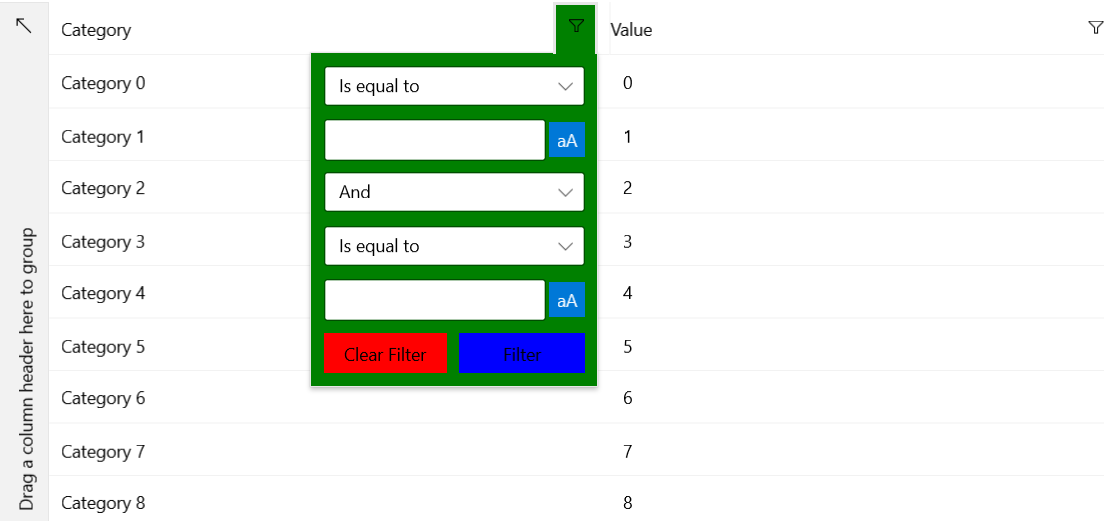
DataGridFilteringFlyout
The following example shows how to change the appearance of the filtering flyout. You can use its ClearFilterButtonStyle and FilterButtonStyle properties to style the Clear Filter and Filter buttons respectively.
Style the DataGridFilteringFlyout
<Grid xmlns:telerikGrid="using:Telerik.UI.Xaml.Controls.Grid"
      xmlns:gridPrimitives="using:Telerik.UI.Xaml.Controls.Grid.Primitives"
      xmlns:primitivesCommon="using:Telerik.UI.Xaml.Controls.Primitives.Common">
    <telerikGrid:RadDataGrid x:Name="grid" ItemsSource="{Binding}">
        <telerikGrid:RadDataGrid.Resources>
            <Style TargetType="gridPrimitives:DataGridFilteringFlyout">
                <Setter Property="Background" Value="Green"/>
                <Setter Property="ClearFilterButtonStyle">
                    <Setter.Value>
                        <Style TargetType="primitivesCommon:InlineButton">
                            <Setter Property="Background" Value="Red"/>
                        </Style>
                    </Setter.Value>
                </Setter>
                <Setter Property="FilterButtonStyle">
                    <Setter.Value>
                        <Style TargetType="primitivesCommon:InlineButton">
                            <Setter Property="Background" Value="Blue"/>
                        </Style>
                    </Setter.Value>
                </Setter>
            </Style>
        </telerikGrid:RadDataGrid.Resources>
    </telerikGrid:RadDataGrid>
</Grid>