Decorations
The DataGrid exposes properties that allow you to quickly customize its look.
Properties
-
GridLinesVisibility—Gets or sets theGridLinesVisibilityvalue that defines which grid lines are currently visible.- (Default)
Both—Both horizontal and vertical grid lines are visible. -
Horizontal—Only the horizontal grid lines are visible. -
Vertical—Only the vertical grid lines are visible. -
None—No grid lines are visible.
- (Default)
-
GridLinesThickness—Gets or sets theWidthof the vertical grid lines and theHeightof the horizontal grid lines. -
GridLinesBrush—Gets or sets the brush value that defines the appearance of the grid lines. -
RowBackground—Gets or sets the brush that defines the fill of each row. -
AlternationStep—A property of typeintthat gets or sets the step between each two alternate rows. The modulus (%) operand is applied over this value. -
AlternationStartIndex—A property of typeintthat gets or sets the zero-based index of the row which is considered as alternation start. -
AlternateRowBackground—Gets or sets the brush that defines the fill of the alternate rows as defined by theAlternationStepproperty.
Example
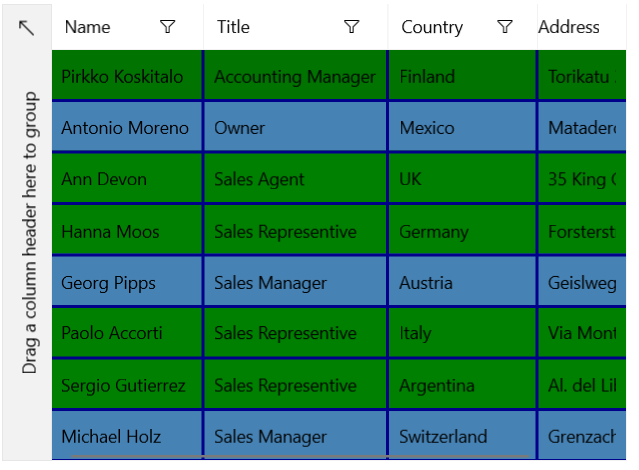
The following examples show how to display both gridlines and decorate alternating rows starting from the first index with a step of 3.
Add the DataGrid in XAML
<Grid xmlns:telerikGrid="using:Telerik.UI.Xaml.Controls.Grid"
      xmlns:gridPrimitives="using:Telerik.UI.Xaml.Controls.Grid.Primitives" >
    <telerikGrid:RadDataGrid ItemsSource="{Binding Items}"
                         Width="500"
                         VerticalAlignment="Center"
                         RowBackground="Green"
                         GridLinesVisibility="Both"
                         GridLinesBrush="DarkBlue"
                         GridLinesThickness="2"
                         AlternationStep="3"
                         AlternationStartIndex="1"
                         AlternateRowBackground="SteelBlue">
        <telerikGrid:RadDataGrid.DataContext>
            <local:ViewModel/>
        </telerikGrid:RadDataGrid.DataContext>
    </telerikGrid:RadDataGrid>
</Grid>
Model and ViewModel Definition
public class Data
{
    public string Name { get; set; }

    public string Title { get; set; }

    public string Country { get; set; }

    public string Address { get; set; }
}

public class ViewModel
{
    public List<Data> Items { get; set; }

    public ViewModel()
    {
        Items = CreateData();
    }

    public List<Data> CreateData()
    {
        List<Data> list = new List<Data>();
        list.Add(new Data { Name = "Pirkko Koskitalo", Title = "Accounting Manager", Country = "Finland", Address = "Torikatu 38" });
        list.Add(new Data { Name = "Antonio Moreno", Title = "Owner", Country = "Mexico", Address = "Mataderos 2312" });
        list.Add(new Data { Name = "Ann Devon", Title = "Sales Agent", Country = "UK", Address = "35 King George" });
        list.Add(new Data { Name = "Hanna Moos", Title = "Sales Representive", Country = "Germany", Address = "Forsterstr. 57" });
        list.Add(new Data { Name = "Georg Pipps", Title = "Sales Manager", Country = "Austria", Address = "Geislweg 14" });
        list.Add(new Data { Name = "Paolo Accorti", Title = "Sales Representive", Country = "Italy", Address = "Via Monte Bianco 34" });
        list.Add(new Data { Name = "Sergio Gutierrez", Title = "Sales Representive", Country = "Argentina", Address = "Al. del Libertador 900" });
        list.Add(new Data { Name = "Michael Holz", Title = "Sales Manager", Country = "Switzerland", Address = "Grenzacherweg 237" });

        return list;
    }
}
