Visual Structure
This article presents the visual elements of the DataGrid component.
-
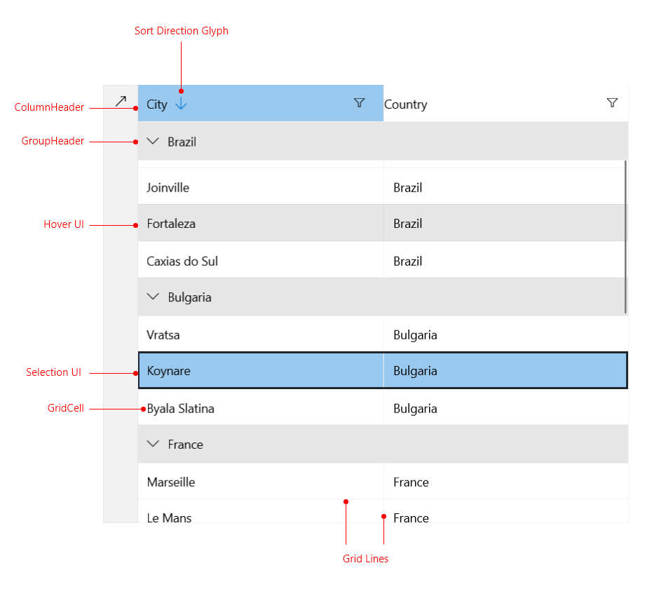
ColumnHeader—Displays the
Headerproperty of each column. For more information, refer to the article on styling the header. - SortingDirectionGlyph—This element displays the sort direction of the columns.
- GroupHeader—This is the UI element that hosts and displays group records. The group row allows for expanding and collapsing the records in the group. For more information, refer to the article on styling the group header.
- Selection UI—Provides UI for selecting grid items.
- Hover UI—Provides UI for hovering grid items.
- GridLine—A visual separation between rows and cells. For more information, refer to the article on decorations.
- GridCell—Shows the value for one property of a data item. For more information, refer to the article on styling the DataGrid cells.