Cards
RadChat offers different cards to display data in a structured layout. Thus, the visually ordered information is easier to digest for the user. In addition, it may respond to users' action.

Depending on the information that is presented, the cards can be one of the following types:
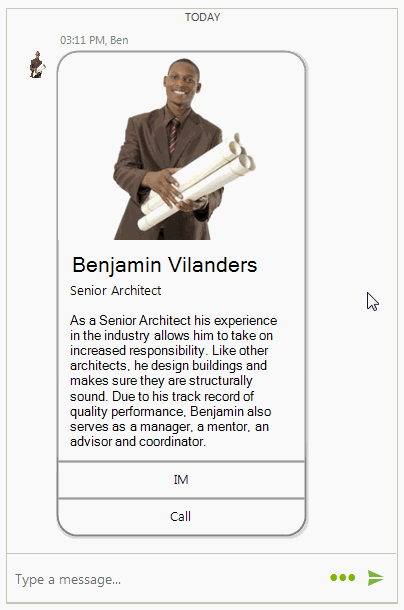
ChatImageCardElement
ChatImageCardElement illustrates an image and several fields with additional information. It resembles a business card.
Figure 1: ChatImageCardElement

Adding a ChatImageCardElement programmatically
Telerik.WinControls.UI.ChatImageCardDataItem imageCard = new ChatImageCardDataItem(Properties.Resources.architect, "Benjamin Vilanders", "Senior Architect",
                                                                                                                                                            "As a Senior Architect his experience in the industry allows him to take on increased responsibility. Like other architects, he design buildings " +
                                                                                                                                                            "and makes sure they are structurally sound. Due to his track record of quality performance, Benjamin also serves as a manager, a mentor, an advisor and coordinator.",
    null, null);
Author author = new Author(Properties.Resources.architect, "Ben");
ChatCardMessage message = new ChatCardMessage(imageCard, author, DateTime.Now);
this.radChat1.AddMessage(message);
Dim imageCard As Telerik.WinControls.UI.ChatImageCardDataItem = New ChatImageCardDataItem(My.Resources.architect, "Benjamin Vilanders", _
                                                                                          "Senior Architect", "As a Senior Architect his experience in the industry allows him to take on increased responsibility. Like other architects, he design buildings " & _
                                                                                          "and makes sure they are structurally sound. Due to his track record of quality performance, Benjamin also serves as a manager, a mentor, an advisor and coordinator.", Nothing, Nothing)
Dim author As Author = New Author(My.Resources.architect, "Ben")
Dim message As ChatCardMessage = New ChatCardMessage(imageCard, author, DateTime.Now)
Me.radChat1.AddMessage(message)
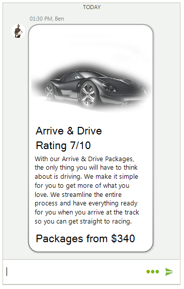
Chat Product Card Element
ChatProductCardElement illustrates an image and several fields with additional information. It resembles a product brochure.
Figure 2: ChatProductCardElement
Adding a ChatProductCardElement programmatically
ChatProductCardDataItem productCard = new ChatProductCardDataItem(Properties.Resources.TV_car1, "Arrive & Drive", "Rating 7/10",
                                                                                                                              "With our Arrive & Drive Packages, the only thing you will have to think about is driving. We make it simple for you to get more of what you love. We streamline the " +
                                                                                                                              "entire process and have everything ready for you when you arrive at the track so you can get straight to racing.", "Packages from $340", null, null);
Author author = new Author(Properties.Resources.architect, "Ben");
ChatCardMessage message = new ChatCardMessage(productCard, author, DateTime.Now);
this.radChat1.AddMessage(message);
Dim productCard As ChatProductCardDataItem = New ChatProductCardDataItem(My.Resources.TV_car1, "Arrive & Drive", "Rating 7/10", _
                                                                         "With our Arrive & Drive Packages, the only thing you will have to think about is driving. We make it simple for you to get more of what you love. We streamline the " & _
                                                                         "entire process and have everything ready for you when you arrive at the track so you can get straight to racing.", "Packages from $340", Nothing, Nothing)
Dim author As Author = New Author(My.Resources.architect, "Ben")
Dim message As ChatCardMessage = New ChatCardMessage(productCard, author, DateTime.Now)
Me.radChat1.AddMessage(message)
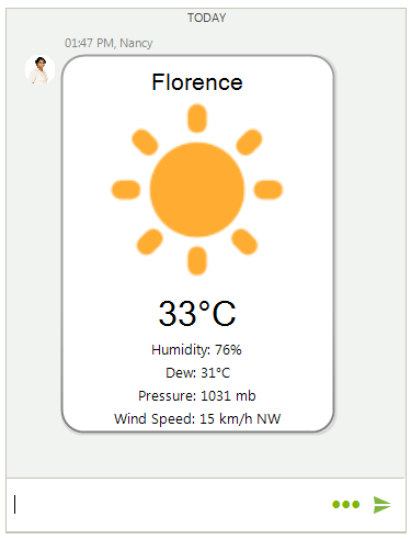
ChatWeatherCardElement
ChatWeatherCardElement illustrates a simple weather forecast.
Figure 3: ChatWeatherCardElement
Adding a ChatWeatherCardElement programmatically
ChatWeatherCardDataItem weatherCard = new ChatWeatherCardDataItem("Florence", Properties.Resources.sunny, "33°C", "Humidity: 76%", "Dew: 31°C",
    "Pressure: 1031 mb", "Wind Speed: 15 km/h NW");
Author author = new Author(Properties.Resources.nancy1, "Nancy");
ChatCardMessage message = new ChatCardMessage(weatherCard, author, DateTime.Now);
this.radChat1.AddMessage(message);
Dim weatherCard As ChatWeatherCardDataItem = New ChatWeatherCardDataItem("Florence", My.Resources.sunny, "33°C", "Humidity: 76%", "Dew: 31°C", "Pressure: 1031 mb", "Wind Speed: 15 km/h NW")
Dim author As Author = New Author(My.Resources.nancy1, "Nancy")
Dim message As ChatCardMessage = New ChatCardMessage(weatherCard, author, DateTime.Now)
Me.radChat1.AddMessage(message)
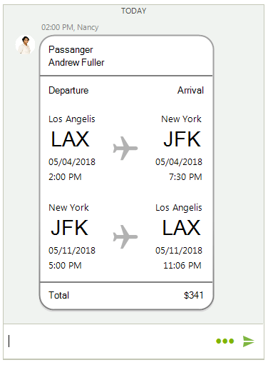
ChatFlightCardElement
ChatFlightCardElement illustrates flights' information in a structured and user-friendly layout.
Figure 4: ChatFlightCardElement
Adding a ChatFlightCardElement programmatically
List<FlightInfo> flights = new List<FlightInfo>();
flights.Add(new FlightInfo("Los Angelis", "LAX", DateTime.Now.AddDays(7), "New York", "JFK", DateTime.Now.AddDays(7).AddHours(5.5)));
flights.Add(new FlightInfo("New York", "JFK", DateTime.Now.AddDays(14).AddHours(3), "Los Angelis", "LAX", DateTime.Now.AddDays(14).AddHours(9.1)));
ChatFlightCardDataItem flightCard = new ChatFlightCardDataItem("Andrew Fuller", flights, Properties.Resources.CardPlane, "$341", null);
Author author = new Author(Properties.Resources.nancy1, "Nancy");
ChatCardMessage message = new ChatCardMessage(flightCard, author, DateTime.Now);
this.radChat1.AddMessage(message);
Dim flights As List(Of FlightInfo) = New List(Of FlightInfo)()
flights.Add(New FlightInfo("Los Angelis", "LAX", DateTime.Now.AddDays(7), "New York", "JFK", DateTime.Now.AddDays(7).AddHours(5.5)))
flights.Add(New FlightInfo("New York", "JFK", DateTime.Now.AddDays(14).AddHours(3), "Los Angelis", "LAX", DateTime.Now.AddDays(14).AddHours(9.1)))
Dim flightCard As ChatFlightCardDataItem = New ChatFlightCardDataItem("Andrew Fuller", flights, My.Resources.CardPlane, "$341", Nothing)
Dim author As Author = New Author(My.Resources.nancy1, "Nancy")
Dim message As ChatCardMessage = New ChatCardMessage(flightCard, author, DateTime.Now)
Me.radChat1.AddMessage(message)
The above examples demonstrates how to add the different card types in a simple ChatCardMessage. RadChat offers ChatCarouselMessage which allows adding and visualizing multiple card elements. Additional information is available in the Messages help article.
Figure 5: ChatCarouselMessage

Card Actions
Each card allows you to add a certain action that can be handled:
Adding ChatCardActions
List<ChatCardAction> actions = new List<ChatCardAction>();
actions.Add(new ChatCardAction("IM"));
actions.Add(new ChatCardAction("Call"));
Telerik.WinControls.UI.ChatImageCardDataItem imageCard = new ChatImageCardDataItem(Properties.Resources.architect, "Benjamin Vilanders", "Senior Architect",
                                                                                                                                                            "As a Senior Architect his experience in the industry allows him to take on increased responsibility. Like other architects, he design buildings " +
                                                                                                                                                            "and makes sure they are structurally sound. Due to his track record of quality performance, Benjamin also serves as a manager, a mentor, an advisor and coordinator.",
    actions, null);
Author author = new Author(Properties.Resources.architect, "Ben");
ChatCardMessage message = new ChatCardMessage(imageCard, author, DateTime.Now);
this.radChat1.AddMessage(message);
Dim actions As List(Of ChatCardAction) = New List(Of ChatCardAction)()
actions.Add(New ChatCardAction("IM"))
actions.Add(New ChatCardAction("Call"))
Dim imageCard As Telerik.WinControls.UI.ChatImageCardDataItem = New ChatImageCardDataItem(My.Resources.architect, "Benjamin Vilanders", "Senior Architect", "As a Senior Architect his experience in the industry allows him to take on increased responsibility. Like other architects, he design buildings " & "and makes sure they are structurally sound. Due to his track record of quality performance, Benjamin also serves as a manager, a mentor, an advisor and coordinator.", actions, Nothing)
Dim author As Author = New Author(My.Resources.architect, "Ben")
Dim message As ChatCardMessage = New ChatCardMessage(imageCard, author, DateTime.Now)
Me.radChat1.AddMessage(message)
The RadChat.CardActionClicked event is fired once a user clicks on the action's text. The CardActionEventArgs gives you access to the ChatCardAction and user's data.
Handling ChatCardActions
private void radChat1_CardActionClicked(object sender, CardActionEventArgs e)
{
    if (e.Action.Text == "IM")
    {
        RadMessageBox.Show("IM is clicked.");
    }
    else if (e.Action.Text == "Call")
    {
        RadMessageBox.Show("Call is clicked");
    }
}
Private Sub radChat1_CardActionClicked(ByVal sender As Object, ByVal e As CardActionEventArgs)
    If e.Action.Text = "IM" Then
        RadMessageBox.Show("IM is clicked.")
    ElseIf e.Action.Text = "Call" Then
        RadMessageBox.Show("Call is clicked")
    End If
End Sub
Figure 6: Handling ChatCardActions