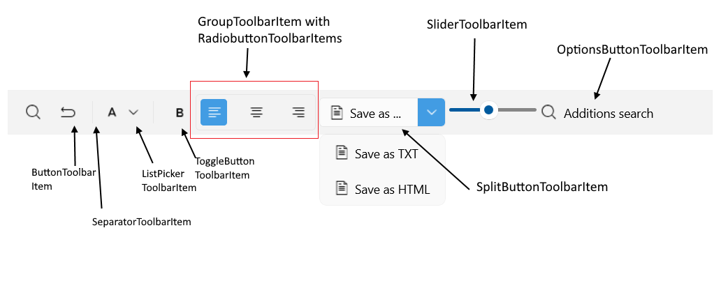
.NET MAUI Toolbar Visual Structure
Here are described all visual elements used in the Toolbar for .NET MAUI.

Legend
| Toolbar Item | Description |
|---|---|
ButtonToolbarItem |
Represents a button in the Toolbar control. |
ToggleButtonToolbarItem |
Represents a toggle button in the Toolbar control. |
RadioButtonToolbarItem |
Represents a radio button in the Toolbar control. |
NavigationButtonToolbarItem |
Represents a navigation button in the Toolbar control. |
SplitButtonToolbarItem |
Represents a split button in the Toolbar control. Works as an advanced drop-down menu. |
OptionsButtonToolbarItem |
Represents a button displaying an options panel in the RadToolbar control. |
SliderToolbarItem |
Represents a slider in the Toolbar control |
ListPickerButtonToolbarItem |
Represents a list picker button in the Toolbar control. |
LabelToolbarItem |
Represents a label in the Toolbar control. The label can display a text and optionally an image next to it. |
SeparatorToolbarItem |
Represents a separator(which is an UI element) in the Toolbar control. |
GroupToolbarItem |
Organize toolbar items in a group. |
All built-in toolbar items are described in the Toolbar Items section.