Getting Started with the .NET MAUI Toolbar control
This guide provides the information you need to start using the Telerik UI for .NET MAUI Toolbar by adding the control to your project.
At the end, you will achieve the following result.
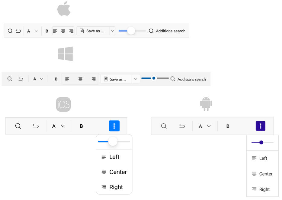
Prerequisites
Before adding the Toolbar, you need to:
Define the Control
1. When your .NET MAUI application is set up, you are ready to add a Toolbar control to your page.
<telerik:RadToolbar x:Name="toolbar"/>
2. Add the following namespace:
xmlns:telerik="http://schemas.telerik.com/2022/xaml/maui"
RadToolbar
control:
<telerik:RadToolbar x:Name="toolbarButtons"
AutomationId="toolbarButtons">
<telerik:ButtonToolbarItem Text="Button">
<telerik:ButtonToolbarItem.ImageSource>
<FontImageSource Glyph="{x:Static telerik:TelerikFont.IconUndo}"
FontFamily="{x:Static telerik:TelerikFont.Name}"
Size="16" />
</telerik:ButtonToolbarItem.ImageSource>
</telerik:ButtonToolbarItem>
<telerik:SeparatorToolbarItem />
<telerik:ToggleButtonToolbarItem Text="ToggleButton">
<telerik:ToggleButtonToolbarItem.ImageSource>
<FontImageSource Glyph="{x:Static telerik:TelerikFont.IconBold}"
FontFamily="{x:Static telerik:TelerikFont.Name}"
Size="16" />
</telerik:ToggleButtonToolbarItem.ImageSource>
</telerik:ToggleButtonToolbarItem>
<telerik:SeparatorToolbarItem />
<telerik:GroupToolbarItem>
<telerik:RadioButtonToolbarItem Text="RadioButton">
<telerik:RadioButtonToolbarItem.ImageSource>
<FontImageSource Glyph="{x:Static telerik:TelerikFont.IconAlignLeft}"
FontFamily="{x:Static telerik:TelerikFont.Name}"
Size="16" />
</telerik:RadioButtonToolbarItem.ImageSource>
</telerik:RadioButtonToolbarItem>
<telerik:RadioButtonToolbarItem Text="RadioButton">
<telerik:RadioButtonToolbarItem.ImageSource>
<FontImageSource Glyph="{x:Static telerik:TelerikFont.IconAlignCenter}"
FontFamily="{x:Static telerik:TelerikFont.Name}"
Size="16" />
</telerik:RadioButtonToolbarItem.ImageSource>
</telerik:RadioButtonToolbarItem>
<telerik:RadioButtonToolbarItem Text="RadioButton">
<telerik:RadioButtonToolbarItem.ImageSource>
<FontImageSource Glyph="{x:Static telerik:TelerikFont.IconAlignRight}"
FontFamily="{x:Static telerik:TelerikFont.Name}"
Size="16" />
</telerik:RadioButtonToolbarItem.ImageSource>
</telerik:RadioButtonToolbarItem>
<telerik:RadioButtonToolbarItem Text="RadioButton">
<telerik:RadioButtonToolbarItem.ImageSource>
<FontImageSource Glyph="{x:Static telerik:TelerikFont.IconAlignJustify}"
FontFamily="{x:Static telerik:TelerikFont.Name}"
Size="16" />
</telerik:RadioButtonToolbarItem.ImageSource>
</telerik:RadioButtonToolbarItem>
</telerik:GroupToolbarItem>
</telerik:RadToolbar>
4. Register the Telerik controls through the Telerik.Maui.Controls.Compatibility.UseTelerik
extension method called inside the CreateMauiApp
method of the MauiProgram.cs
file of your project:
using Telerik.Maui.Controls.Compatibility;
public static class MauiProgram
{
public static MauiApp CreateMauiApp()
{
var builder = MauiApp.CreateBuilder();
builder
.UseTelerik()
.UseMauiApp<App>()
.ConfigureFonts(fonts =>
{
fonts.AddFont("OpenSans-Regular.ttf", "OpenSansRegular");
});
return builder.Build();
}
}