.NET MAUI Toolbar Configuration
This article describes all configuration options available in the .NET MAUI Toolbar control.
Orientation
- By setting the
Orientation(enum of typeTelerik.Maui.Controls.ToolbarOrientation) property you can specify the orientation of the toolbar. The available options areHorizontalandVertical. The default value isHorizontal.
Spacing between the toolbar items
-
ItemSpacing(double)—Specifies the spacing in pixels between the items in the toolbar. The default value is8.
Spacing between the elements in the toolbar items
LineSpacing(double)—Specifies the spacing in pixels between the lines of items in the toolbar. This property has effect when the toolbar is in a multi-line wrap overflow mode. The default value is8.OptionsPanel(Telerik.Maui.Controls.RadToolbarOptionsPanel)—Specifies the options panel associated with this toolbar.
Toolbar Items
-
Items(IList<ToolbarItem>)—Read-only collection ofToolbarItems.
All built-in toolbar items are described in the Toolbar Items section.
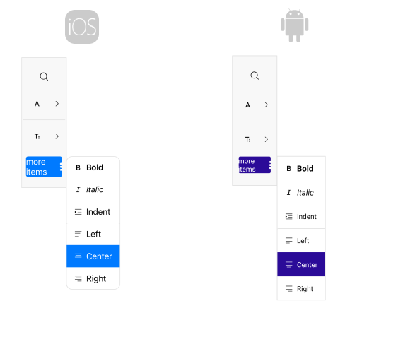
Overflow menu
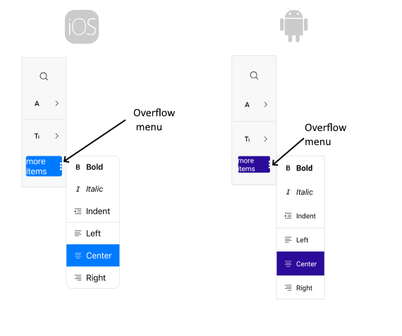
When the items cannot fit in the toolbar available space an overflow menu is displayed. The properties related to the Overflow menu are:
-
OverflowMode(enum of typeTelerik.Maui.Controls.ToolbarOverflowMode)—Specifies the overflow mode when the items in the toolbar cannot fit in the available space. The available options are:-
DropDown(the default mode)—When the toolbar items cannot fit in the available space, they are placed in the overflow drop-down menu. -
Scroll—When the toolbar items cannot fit in the available space, they are scrolled horizontally or vertically, based on the orientation of the toolbar. -
Wrap—When the toolbar items cannot fit in the available space, they are wrapped horizontally or vertically on multiple lines, based on the orientation of the toolbar. -
Clip—When the toolbar items cannot fit in the available space, they are clipped.
-
-
OverflowMenuButtonVisibility(enum of typeTelerik.Maui.Controls.ToolbarButtonVisibilityMode)—Specifies the visibility mode of the overflow menu button in the toolbar. The available options are:-
Auto(the default mode)—The button visibility is determined automatically, based on the associated command. -
Visible(the default mode)—The button is always visible in the toolbar, regardless of the associated command. -
Hidden(the default mode)—The button is always hidden from the toolbar, regardless of the associated command.
-
OverflowMenuButtonTemplate(ControlTemplate)—Defines theControlTemplateapplied to the overflow menu button in the toolbar.-
OverflowItems(IReadOnlyList<ToolbarItem>)—Read-only collection ofTelerik.Maui.Controls.ToolbarItemsthat are in the overflow area of the toolbar. -
OverflowMenuButtonStyle(Stylewith target typeTelerik.Maui.Controls.OverflowMenuButtonToolbarItemView)—Specifies the style applied to the Overflow menu button. The properties that can be applied through style are the properties applicable for DropDownButtonToolbarItemView, ButtonToolbarItemView, ToolbarItemView and LabelToolbarItemView.
Separator between the toolbar items
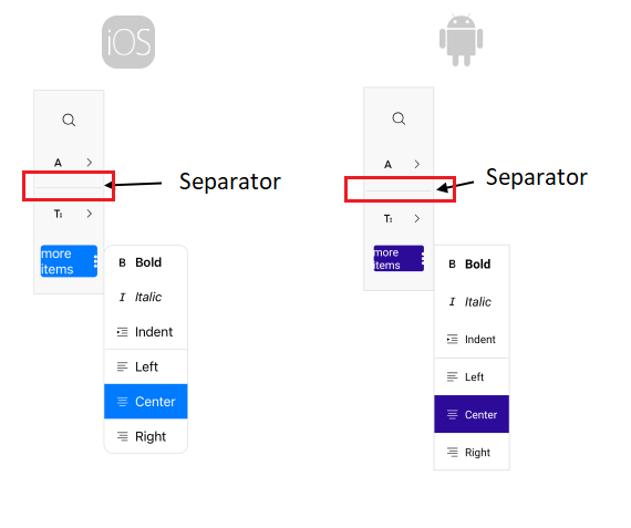
You can separate the toolbar items using the [SeparatorToolbarItem](/devtools/maui/controls/toolbar/items/separator).
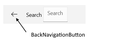
Back navigation button
-
BackNavigationButtonVisibility(enum of typeTelerik.Maui.Controls.ToolbarButtonVisibilityMode)—Specifies the visibility mode of the back navigation button in the toolbar. The available options are:-
Auto(the default mode)—The button visibility is determined automatically, based on the associated command. -
Visible(the default mode)—The button is always visible in the toolbar, regardless of the associated command. -
Hidden(the default mode)—The button is always hidden from the toolbar, regardless of the associated command.
-
BackNavigationButtonTemplate(ControlTemplate)—Defines theControlTemplateapplied to the back navigation button in the toolbar.-
BackNavigationButtonStyle(Stylewith target typeTelerik.Maui.Controls.BackNavigationButtonToolbarItemView)—Specifies the style applied to the back navigation button.
Scroll buttons
Properties related to the scroll buttons configuration are:
-
ScrollButtonsVisibility(enum of typeTelerik.Maui.Controls.ToolbarButtonVisibilityMode)—Specifies the visibility mode of the scroll buttons in the toolbar. The available options are:-
Auto(the default mode)—The button visibility is determined automatically, based on the associated command. -
Visible(the default mode)—The button is always visible in the toolbar, regardless of the associated command. -
Hidden(the default mode)—The button is always hidden from the toolbar, regardless of the associated command.
-
ScrollForwardButtonTemplate(ControlTemplate)—Defines theControlTemplateapplied to the scroll button in the toolbar.-
ScrollForwardButtonStyle(Stylewith target typeTelerik.Maui.Controls.ScrollForwardButtonToolbarItemView)—Defines the style applied to the scroll button in the toolbar. -
ScrollBackwardButtonTemplate(ControlTemplate)—Defines theControlTemplateapplied to the backward scroll button in the toolbar. -
ScrollBackwardButtonStyle(Stylewith target typeTelerik.Maui.Controls.ScrollBackwardButtonToolbarItemView)—Defines the style applied to the backward scroll button in the toolbar.