.NET MAUI TimeSpanPicker Visual Structure
This article describes all visual elements that are used in the TimeSpanPicker for .NET MAUI.
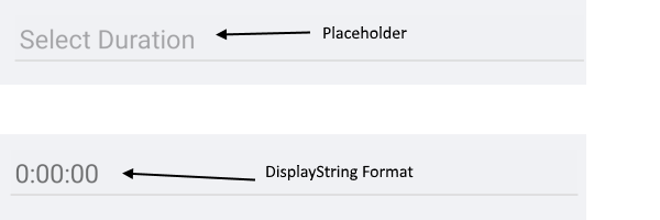
Before and After Time Interval Selection

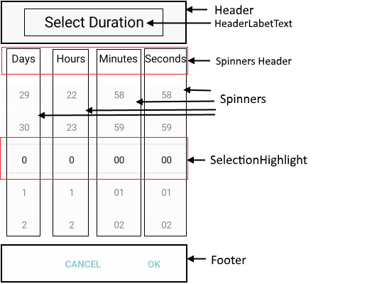
Popup Visual Structure
Currently, the TimeSpanPicker does not provide spinners for milliseconds.

Legend
Placeholder—The text visualized before the user picks a date/time. You can customize the placeholder through thePlaceholderTemplateproperty.DisplayStringFormat—The text visualized after a date/time is picked.HeaderandHeaderLabelText—The text displayed in the popup header. You can set it to a direct text input through theHeaderLabelTextproperty or customize the popup header by using theHeaderTemplateproperty.SpinnersHeader—The text visualized for the spinner header depending on the values that will be picked. For example, if theSpinnerFormatisg, the text visualized for the spinner header will be Days Hours Minutes Seconds.Spinner—Displays time interval values in a list.SelectionHighlight—Highlights the currently selected time interval when the popup is open.Footer—The footer of the popup. By default, it contains the OK and Cancel buttons. You can customize it through theFooterTemplateproperty.