.NET MAUI TimePicker Styling
The TimePicker control for .NET MAUI provides styling options for customizing its appearance. You can style the TimePicker itself, as well as its popup or dropdown depending on the PickerMode setting.
The control supports the following styling properties:
-
BackgroundColor—Defines the background color of the picker. -
BorderColor—Defines the border color of the picker. -
BorderThickness—Specifies the border thickness of the picker. The default value isnew Thickness(0,0,0,1). -
CornerRadius—Specifies the corner radius of the picker. -
ClearButtonStyle(of typeStylewith target typeRadButton)—Defines the style applied to the Clear button. -
ToggleButtonStyle(of typeStylewith target typeRadButton)—Specifies the style of the Toggle button. -
PlaceholderLabelStyle(of typeStylewith target typeLabel)—Defines the style applied to the placeholder label. -
DisplayLabelStyle(of typeStylewith target typeLabel)—Defines the style applied to the label which is visualized when time is selected.
The following Style properties are related to the spinner controls inside the popup/dropdown:
-
SpinnerStyle(of typeStylewith target typetelerikDataControls:RadSpinner)—Defines the style applied to the spinner item and to the selected item. -
SpinnerHeaderStyle(of typeStylewith target typeLabel)—Specifies the style applied to the spinner header labels. -
SelectionHighlightStyle(of typeStylewith target typetelerikPrimitives:RadBorder)—Specifies the style applied to the selection inside the popup.
Namespaces
When defining some of these styles, you need to include additional namespaces, so that the target types are properly resolved.
When you use SelectionHighlightStyle and SpinnerStyle, you need to add the following namespace:
xmlns:telerik="http://schemas.telerik.com/2022/xaml/maui"
Example
The following example shows how the styling properties can be applied.
Define the RadTimePicker
<telerik:RadTimePicker PickerMode="Popup"
                       DefaultHighlightedTime="10:30"
                       DisplayStringFormat="HH:mm"
                       AutomationId="timePicker">
    <telerik:RadTimePicker.PopupSettings>
        <telerik:PickerPopupSettings PopupOutsideBackgroundColor="#D9D9D9CC"
                                     PopupViewStyle="{StaticResource popupViewStyle}"
                                     HeaderStyle="{StaticResource headerStyle}"
                                     HeaderLabelText="Time Picker"
                                     HeaderLabelStyle="{StaticResource headerLabelStyle}"
                                     FooterStyle="{StaticResource footerStyle}"
                                     AcceptButtonStyle="{StaticResource acceptButtonStyle}"
                                     CancelButtonStyle="{StaticResource cancelButtonStyle}"
                                     AcceptButtonText="{StaticResource acceptButtonText}"
                                     CancelButtonText="{StaticResource cancelButtonText}"/>
    </telerik:RadTimePicker.PopupSettings>
</telerik:RadTimePicker>
Define the SpinnerStyle
<Style TargetType="telerik:RadSpinner" x:Key="spinnerStyle">
    <Setter Property="ItemStyle">
        <Setter.Value>
            <Style TargetType="telerik:SpinnerItemView">
                <Setter Property="TextColor" Value="#797979" />
                <Setter Property="BackgroundColor" Value="#F2F2F2" />
                <Setter Property="CornerRadius" Value="10" />
                <Setter Property="Margin" Value="6, 4" />
            </Style>
        </Setter.Value>
    </Setter>
    <Setter Property="SelectedItemStyle">
        <Setter.Value>
            <Style TargetType="telerik:SpinnerItemView">
                <Setter Property="TextColor" Value="#00B5DC" />
                <Setter Property="BackgroundColor" Value="#E4F3F9" />
                <Setter Property="CornerRadius" Value="10" />
                <Setter Property="Margin" Value="6, 4" />

            </Style>
        </Setter.Value>
    </Setter>
    <Setter Property="HeightRequest" Value="240"/>
</Style>
Define the SelectionHighlightStyle
<Style TargetType="telerik:RadBorder" x:Key="selectionHighlightStyle">
    <Setter Property="BorderColor" Value="#00B5DC"/>
    <Setter Property="BorderThickness" Value="1"/>
    <Setter Property="Padding" Value="0,6,0,6"/>
    <Setter Property="HeightRequest" Value="40"/>
    <Setter Property="VerticalOptions" Value="Center"/>
    <Setter Property="BackgroundColor" Value="#F9F9F9"/>
</Style>
Define the PlaceholderLabelStyle
<Style TargetType="Label" x:Key="placeholderLabelStyle">
    <Setter Property="TextColor" Value="#4A4949"/>
    <Setter Property="VerticalTextAlignment" Value="Center"/>
    <Setter Property="HorizontalTextAlignment" Value="Center"/>
    <Setter Property="Margin" Value="10"/>
</Style>
Define the DisplayLabelStyle
<Style TargetType="Label" x:Key="displayLabelStyle">
    <Setter Property="TextColor" Value="#151950"/>
    <Setter Property="VerticalTextAlignment" Value="Center"/>
    <Setter Property="HorizontalTextAlignment" Value="Center"/>
    <Setter Property="Margin" Value="10"/>
</Style>
Define the ClearButtonStyle
<Style TargetType="telerik:RadButton" x:Key="clearButtonStyle">
    <Setter Property="TextColor" Value="#8660C5"/>
</Style>
Define the ToggleButtonStyle
<Style TargetType="telerik:RadButton" x:Key="toggleButtonStyle">
    <Setter Property="TextColor" Value="#7C59B6"/>
</Style>
Namespaces
In addition, add the following namespaces:
xmlns:telerik="http://schemas.telerik.com/2022/xaml/maui"
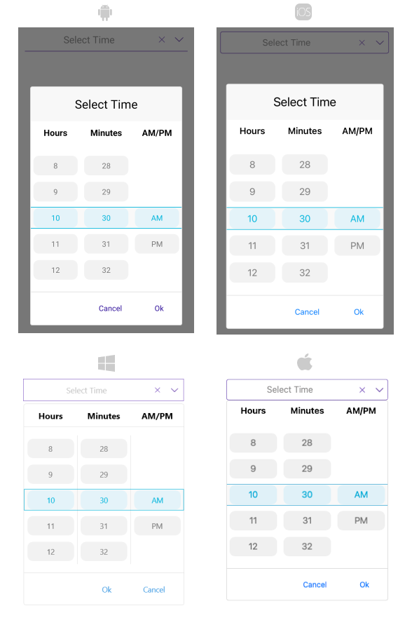
The following image shows how the TimePicker control looks when the styles described above are applied.